Download
1 / 4
40 likes | 155 Views
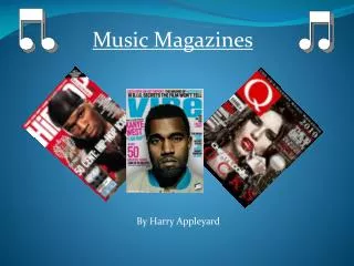
Dive into the captivating world of music magazines, exploring the impactful elements of covers, mastheads, pull quotes, and more. Discover how these design features shape reader engagement and magazine identity, with a focus on the vibrant rock music scene. From exclusive cover images to detailed contents pages, unravel the storytelling power behind each spread. Experience the thrill of the double-page spread, unveiling insights into upcoming album releases and artist interviews. Immerse yourself in the dynamic layout and color schemes that define the rock culture aesthetic, drawing readers into a world of music passion and storytelling. Explore the intricate details and design techniques that make music magazines a visual and informative delight.

E N D
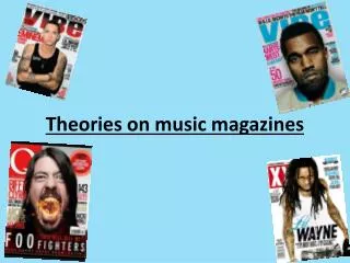
Music magazine covers Masthead Brand Name Masthead - are suppose to have a high impact on the reader, making the magazine stand out from the rest. Pull Quote Pull Quote – subject matter (drug) that suppose to pull the reader in. Bar Code Bar Code Bar Code Pull Quote Cover Picture’s Main Cover Image Cover Lines –special word exclusive which is highlighted in a special font and style. Main Cover Image – This will have the major attraction (The star) and relates to the main article.
Music Magazine Contents The biggest image on the page relates to the most important story of the magazine. Most of the page is dedicated to bring me the horizon, The text below informs you of this and these guys are also on the main page. This would be the main Story so they want the reader to focus the attention straight on the image. The contents page is filled with eye catching material that may interest the reader. The consistent theme gives it a professional look and the design had a bright yellow on a black background. Taking the tension away from anything else, to immediately inform the reader. For instance the bright yellow text at the top left of the page. On most content pages of magazines these usually a editor’s column to inform the reader a little bit about the editor life and what's been going on there and what they can expecting in the magazine without giving away to much. This make the magazine feel like it trying to connect with it’s audience. Some may think that she's a typical editor doing this for the money, but kerrang want to be involved with it’s audience and like to let it’s reader know that they care, also how she has this big love for rock music which may not be emphasised by the picture. This part of the contents page is suppose to look ragged and busy, it managers to do this by filling the page with bright yellow and red. Something that we might condone with danger. Giving it the typical rock feel. So of the more important story's all have images indicating their Importance. The yellow on black immediately tells you wants featured in this issue.
Music Magazine Double Page Spread In response to his return, they give you a insight to their new album that’s soon to be released. The main headline clear out lines this with large bold text and then white text with a rugged black background to enhance the rock culture. The first you notice is the main image of the lead singer in a position that loud and positive and is their to also emphasize the pull quote. This pull quote say “I feel more clear-headed, more awake” the image emphasizes the (more awake) part from the positioning of his body, also showing his good health now. Finally the article of the story behind all the headlines and pull quotes. Telling us what the story is all about. The questions from the interviewer are highlighted in blue sticking with the theme.