1 / 11

Analyzing Data with Scatterplots and Line of Best Fit

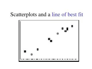
Learn how to visually represent data using scatterplots, interpret correlation, and draw a line of best fit to make predictions. This comprehensive guide will help you understand the relationship between variables and enhance your data analysis skills.

ferris
Download Presentation

Analyzing Data with Scatterplots and Line of Best Fit

An Image/Link below is provided (as is) to download presentation Download Policy: Content on the Website is provided to you AS IS for your information and personal use and may not be sold / licensed / shared on other websites without getting consent from its author. Content is provided to you AS IS for your information and personal use only. Download presentation by click this link. While downloading, if for some reason you are not able to download a presentation, the publisher may have deleted the file from their server. During download, if you can't get a presentation, the file might be deleted by the publisher.

E N D

More Related