Download
1 / 12
120 likes | 161 Views
Learn the four basic steps of effective layout design: contrast, repetition, alignment, and proximity in PowerPoint and web page design. Enhance your visual communication with these principles.

E N D
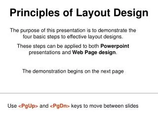
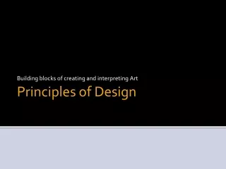
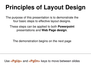
Principles of Layout Design The purpose of this presentation is to demonstrate the four basic steps to effective layout designs. These steps can be applied to both Powerpoint presentations and Web Page design. The demonstration begins on the next page Use <PgUp> and <PgDn> keys to move between slides
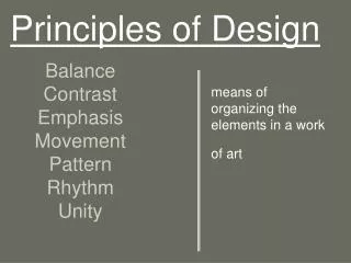
Principles of Layout Design • Contrast– use separation for unlike elements • Bold, Whiting, Line Thickness, Sizes • Repetition – repeating aspects of design • Titles (36 pt), underlining, hyperlink (blue), shapes • Alignment – justifying to emphasize key points • Left, right, center, top, bottom, flush (text to picture) • Proximity – limit and separate unlike elements • Separate elements with white space, lines, colors
Highlights of the NCCE Conference 2001 Dream Weaver Design for the Non-Designer Visual Web Design Instructional Materials Jahn/Justino Contrast (black/white; text/graphics)Repetition (repeating a pattern such as underlining boldfacing titles and major points, theme form slide to slide, shapes, …)Alignment (left, right center, top, bottom, flush justifying …. Blending text and graphics together)Proximity (putting relevant elements together and separating unrelated elements using whitespace, lines, textboxes, …)
Highlights of the NCCEConference 2001 Dream Weaver Design for the Non-Designer Visual Web Design Instructional Materials Jahn/Justino Proximity: Single space title (keep relevant elements together). Leave extra white space to separate elements Delete one graphic (distracts from text)
Highlights of the NCCEConference 2001 Dream Weaver Design for the Non-Designer Visual Web Design Instructional Materials Jahn/Justino Contrast: Bold and enlarge title
Highlights of the NCCE Conference 2001 Dream Weaver Design for the Non-Designer Visual Web Design Instructional Materials Jahn/Justino Contrast: add black block to enhance contrast
Dream Weaver Design for the Non-Designer Visual Web Design Instructional Materials Jahn/Justino Highlights of the NCCE Conference 2001 Proximity: keep key points together; separate elements that distract from each other
Dream Weaver Design for the Non-Designer Visual Web Design Instructional Materials Jahn/Justino Highlights of the NCCE Conference 2001 Contrast: Optical illusion of subtitles being similar in size to title, therefore enlarge the title.
Dream Weaver Design for the Non-Designer Visual Web Design Instructional Materials Jahn/Justino Highlights of the NCCEConference 2001 Alignment: Right and left justification to improve alignment. Right justify the subtitles; left justify the title. Proximity: Separate the ‘authors’ from the subtitles (they are ‘unlike’ entities)
Dream Weaver Design for the Non-Designer Visual Web Design Instructional Materials Jahn/Justino Highlights of the NCCEConference 2001 Alignment: align the image by resizing and left justifying and bottom justifying.
Highlights of the NCCE Conference 2001 OriginalSlide OriginalSlide Dream Weaver Design for the Non-Designer Visual Web Design Instructional Materials Jahn/Justino Contrast (black/white; text/graphics)Repetition (repeating a pattern such as underlining boldfacing titles and major points, theme form slide to slide, shapes, …)Alignment (left, right center, top, bottom, flush justifying …. Blending text and graphics together)Proximity (putting relevant elements together and separating unrelated elements using whitespace, lines, textboxes, …)
Principles of Layout Design • Contrast– use separation for unlike elements • Bold, Whiting, Line Thickness, Sizes • Repetition – repeating aspects of design • Titles (36 pt), underlining, hyperlink (blue), shapes • Alignment – justifying to emphasize key points • Left, right, center, top, bottom, flush (text to picture) • Proximity – limit and separate unlike elements • Separate elements with white space, lines, colors