Graphical Analysis
Graphical Analysis. Why Graph Data?. Graphical methods Require very little training Easy to use Massive amounts of data can be presented more readily Can provide an understanding of the distribution of the data

Graphical Analysis
E N D
Presentation Transcript
Why Graph Data? • Graphical methods • Require very little training • Easy to use • Massive amounts of data can be presented more readily • Can provide an understanding of the distribution of the data • May be easier to interpret for individuals with less mathematical background than engineers
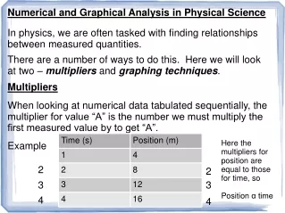
Graphical methods • Quantitative data (numerical data) • Cost of a computer (continuous) • Number of production defects (discrete) • Weight of a person (continuous) • Parts produced this month (discrete) • Temperature of etch bath (continuous) • Graphical tools • Line charts • Histograms • Scatter charts
Graphical methods • Qualitative data (categorical and attribute) • Type of equipment (Manual, automated, semi-automated) • Operator (Tom, Nina, Jose) • Graphical tools • Bar charts • Pie charts • Pareto charts
Getting Started • Classify data • Quantitative vs. Qualitative • Continuous or discrete (quantitative) • Chose the right graphical tool • Chose axes and scales to provide best “view” of data • Label graphs to eliminate ambiguity
Graphical Analysis Examples
Bar or Column Graph • Displays frequency of observations that fall into nominal categories
4.5 4 3.5 3 2.5 Scan Time (Seconds) 2 1.5 1 0.5 0 Scan Average Average Low Light Max Pitch Max Skew Controlled Bright Light Normal Light Freehand Scan Performance Category CCD1 CCD2 LR LCCD CMOS Line Chart • Shows trends in data at equal intervals
Graphical methods • Acceptable graph
Graphical methods • Better graph
Graphical Analysis Details • Always label axis with titles and units • Always use chart titles • Use scales that are appropriate to the range of data being plotted • Use legends only when they add value • Use both points and lines on line graphs only if it is appropriate – don’t use if the data is discrete
Histograms • Histograms are pictorial representations of the distribution of a measured quantity or of counted items. It is a quick tool to use to display the average and the amount of variation present.
The Pareto principle Dr. Joseph Juran (of total quality management fame) formulated the Pareto Principle after expanding on the work of Wilfredo Pareto, a nineteenth century economist and sociologist. The Pareto Principle states that a small number of causes is responsible for a large percentage of the effect--usually a 20-percent to 80-percent ratio.
ENGR 112 Fitting Equations to Data
Introduction • Engineers frequently collect paired data in order to understand • Characteristics of an object • Behavior of a system • Relationships between paired data is often developed graphically • Mathematical relationships between paired data can provide additional insight
Regression Analysis Regression analysis is a mathematical analysis technique used to determine something about the relationship between random variables.
Regression Analysis Goal To develop a statistical model that can be used to predict the value of a variable based on the value of another
Regression Analysis • Regression models are used primarily for the purpose of prediction • Regression models typically involve • A dependent or response variable • Represented as y • One or more independent or explanatory variables • Represented as x1, x2, …,xn
Regression Analysis Our focus? • Models with only one explanatory variable • These models are called simple linear regression models
Regression Analysis • A scatter diagram is used to plot an independent variable vs. a dependent variable
Regression Analysis Remember!! • Relationships between variables can take many forms • Selection of the proper mathematical model is influenced by the distribution of the X and Y values on the scatter diagram
Y Y Y Y X X X X Regression Analysis
Regression Analysis Model SIMPLE LINEAR REGRESSION MODEL • However, both b0 and b1 are population parameters • ei Represents the random error in Y for each observation i that occurs Yi = b0 + b1Xi + ei
Regression Analysis Model • Since we will be working with samples, the previous model becomes Where • b0 = Y intercept (estimate of b0) Value of Y when X = 0 • b1 = Slope (estimate of b1) Expected change in Y per unit change in X • Yi = Predicted (estimated) value of Y ^ Yi = b0 + b1Xi ^
Regression Analysis Model • What happened with the error term? • Unfortunately, it is not gone. We still have errors in the estimated values
Regression Analysis • Find the straight line • That BEST fits the data
Regression Analysis Positive Straight-Line Relationship Yi = b0 + b1Xi Y b1 e4 e2 b0 e5 e3 e1 0 X 0
Min Least Squares Method • Mathematical technique that determines the values of b0 and b1 • It does so by minimizing the following expression
Least Squares Method Resulting equations Equations (1) and (2) are called the “normal equations” (1) (2)
Least Squares Method • Assume the following values • Resulting equations
Assessing Fit • How do we know how good a regression model is? • Sum of squares of errors (SSE) • Good if we have additional models to compare against • Coefficient of determination r2 • A value close to 1 suggests a good fit Where do we get these values?