Download
1 / 20
250 likes | 398 Views
Introduction to Graphical Analysis. PAT. Session 2.1. Learning Objectives. By the end of this session, participants should be able to: Describe the advantages of different types of graphs and charts and which is best used with particular types of data

E N D
Introduction to Graphical Analysis PAT Session 2.1. Price Analysis Training
Learning Objectives By the end of this session, participants should be able to: • Describe the advantages of different types of graphs and charts and which is best used with particular types of data • Scale graphs in accordance with units used, and explain the meaning and intent of each of the axes on a graph • Identify the trends (dispersion, volatility, increasing/ decreasing) depicted by a graph • Identify the breaks in a data series and explain whether they are real or indicate problems with the data • Explain how to deal with missing data Price Analysis Training
Graphical Analysis: Why? “One picture is worth a thousand words.” Graphs: • can portray much valuable information • useful tools for summarizing data • are efficient means of communicating numerical info Research shows people retain info presented in graphs more than the same info written as prose Price Analysis Training
Exercise 2.1.a.Charts and Graphs – Strengths & Limitations Analyse the charts assigned to your team and discuss: • What types of data are being presented (e.g. discrete events or trends)? • What are the main messages the chart is trying to communicate to senior management? • What are the chart’s strengths/weaknesses in communicating these data/messages? • What recommendations can you make for improving presentation of this information? Price Analysis Training
Debriefing • Review charts in order: 1, 2, 3…etc. • Data types? Messages? • Strengths/weaknesses? • Recommendations? What lessons have you learned from this exercise? What will you do differently in the future? Price Analysis Training
Strengths of Graphical Analysis • Visual rather than numeric: provides for relatively clear communication of complex phenomena • With Excel charts: easy to visualize effects of changes in quantities of particular variables • Previously unseen patterns – e.g., seasonal price patterns – can emerge and help with (cautious!) forecasting Price Analysis Training
Limitations: Graphical analysis… • Graphical analysis shows relationship between prices but does not quantify degree of this relationship • Graphical analysis doesn’t give clear understanding of direction of relationship (i.e. direction of price transmission) • Apparent relationship between prices on a graph (convergence, divergence) does not necessarily indicate meaningful relationship between them Price Analysis Training
Limitations: Graphical analysis… • Co-movement of price series in different locations at same time could be due to common factors affecting prices – e.g., seasonality, inflation, drought, war, prohibition, trade barriers – rather than to meaningful causal relationship in trade between the different locations • Interpretation of graph may need additional info: relationship between variables (prices) could be lagged, instantaneous, linear, non-linear, symmetric, or asymmetric Price Analysis Training
Example: “Other Factors” North Korean Grain Prices Price index Jan 05 Ban on private trade in grain (revive state dist system) Jul 06 Floods Jan 06 Nuclear test, UN sanctions imposed Apr 07 Trading restrictions imposed Aug 07 Floods Dec 07 Chinese export controls, NK trading activity ban Apr 08 Trading activity controls tightened May 08 Military stocks reportedly ordered released May 08 US aid announcement 9. Jun 08 1st US aid arrives at Nampo 500 400 300 200 100 Price Analysis Training 2005 (1) 2006 (2) (3) 2007 (4) (5) (6) 2008 (7) (8) (9)
The key messages… Use caution in extrapolating from price series! Know the underlying conditions / factors Price Analysis Training
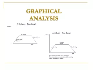
Sample Price Analysis Graph: Increasing/Decreasing Trends Real millet prices in regions of Niger, 1995-2005 Price Analysis Training
Sample Price Analysis Graph: Increasing/Decreasing Trends Price Analysis Training
Sample Price Analysis Graph: Dispersion Coefficient of variation of grain prices across provinces, 2004-08 Coefficient .6 .5 .4 .3 .2 .1 0 Corn Rice 2004 2005 2006 2007 2008 2009 Price Analysis Training
Sample Price Analysis Graph: Volatility Volatility of average national sorghum prices across time Price Analysis Training
Charting with Excel: Points to ponder Choice of chart type & orientation: Keep it simple! Data labels & markers “Appropriate imprecision” Make the data table available for complex graph (as annex) What about missing data…? 1 2 3 ? ? 6 7 ? 9 ? 11 12 13 ? 15 ? 17 3.0869437%? or 3.09% or 3.1%? or 3% Price Analysis Training
Dealing with Missing Data Do nothing: Delete missing data records Data Imputation: • Mean substitution: Replace missing value with mean value (of previous and subsequent data values) for that particular attribute • Case Substitution: Replace missing value with historical value from similar cases. (We can not use value from current sample for case substitution; it must be from previous observations.) Price Analysis Training
Questions about using Excel? Price Analysis Training
Exercise 2.1.b. The Marketastan File: Excel Charts for Senior Managers • Aim of the exercise: Learning to communicate clearly to senior managers • Turn to Workbook Exercise 2.1.b. • Read the statements and then, with your partner, using Excel file (“2.1. b. Charts for WFP-Marketastan Senior Managers – Excel File.xls”), create a chart/graph for each statement, depicting the key message(s) implied by each statement Price Analysis Training
Marketastan 2.1.b. Debriefing • Northern HHs food expenses • Wheat price trends by province • Seasonal patterns of wheat prices • Real wage trend • Food insecurity by livelihood group Price Analysis Training
Wrap-up: Graphical Analysis Data Quality • Review & clean data first: then decide how you will deal with missing data Presentation: • Image should clarify the message – not require additional effort by the user to understand what you are presenting • …and remember: keep it simple, please! Price Analysis Training