RIDDLE
RIDDLE. What goes around the world but stays in a corner?. Typography. Font styles evoke different moods. Select a font that continues the theme of your design e.g Retro or Gothic, traditional or modern etc . Type continues the message. Font style can communicate a message

RIDDLE
E N D
Presentation Transcript
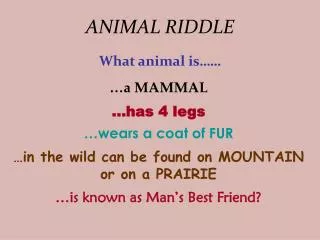
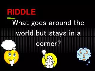
RIDDLE What goes around the world but stays in a corner?
Font styles evoke different moods • Select a font that continues the theme of your design e.g Retro or Gothic, traditional or modern etc
Type continues the message • Font style can communicate a message • Selecting the wrong font can spoil a good design
Type and layout • Typography can enhance a design • Combine images and letters to create a successful, and eye catching example of graphic design
Legibility • Change direction, size, style e.g. bold, italic, light etc to improve legibility - your design is a form of visual communication, ensure the onlooker gets the message!
Picture font • Create an image with words and letters of varying sizes
Exercise Write your first name in a typeface aimed at the following age groups: • 17-25 years • 4-7 years • 50-70 years Use only black and white (no colour) Consider the layout / composition of your typeface
Exercise • Work in pairs • Write your partner’s name using a typeface that you feel best represents their character • Use only text (no images) • Add colour if you think it helps communicate the message • Consider composition I.e. where the name is placed within the space of an A4 page
Typeface • Serif and Sans Serif
Typeface • A typeface may be named after its original designer: Baskerville, Bodoni, Garamond, Goudy • For its use: Times roman was designed for the London Times Avant Garde was designed for magazines • For its characteristics: Excelsior, Paragon were designed for high legibility • Or for its designer’s fancy: Perpetua, Centaur • Typeface are also given brand names: Geneva, English
Parts of the letter: Type Anatomy • Spine: The main left to right curving stroke • Serif: The thin projection at the end of main strokes • Descender: The part of the lowercase letter below the baseline • Ascender: The part of the lowercase letter above the mean line • Bowl: main curved part • Counter: enclosed circular section • Ligature: where two or more letters are joined • Stem: main vertical stroke
How to recognize typefaces 1 5 4 3 2 The point of letter strokes rising above the lowercase characters The point of letter strokes descending below the characters The point on which all characters and symbols rest The point that determines the height of lower case characters The point that determines the height of capital letters
Family • A typeface can have a number ofvariantswithin the family: Bold, Italic, Roman, Normal The popular type Helvetica has a family of over 50 variantswhereas other more decorative fonts may have only one variant e.g. Algerian
Exercise Open up a blank Google Doc, type and select a suitable typeface for the following words: