Download
1 / 60
600 likes | 860 Views
Elements of Design: Color. Global Connections Seminar. Color. Color is not essential to a good design. Black and white and shades of gray can create 'color' that is just as effective as reds, blues, and greens.

E N D
Elements of Design: Color Global Connections Seminar
Color • Color is not essential to a good design. • Black and white and shades of gray can create 'color' that is just as effective as reds, blues, and greens. • However, color is an added dimension that can evoke moods and make powerful statements when used wisely.
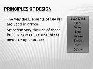
Value • Value is present in all design. • It is the lightness or darkness of an object, regardless of color. • Value is relative to the background color and other items on the page.
Use Value to… Increase/Decrease Contrast • The greater the difference in value between an object and its background, the greater the contrast • Choose the value that creates the amount of contrast and effect that you want for your design. • In the examples, the lighter value recedes into the light background. • The design with the greatest contrast makes the darker object more dominant.
Use Value to… Create Movement • Objects of the same value create a static design with all objects equal in visual importance. • Introducing varying values gives the page a more dynamic appearance and creates a 'pecking order‘ among the objects. • Some stand out while others recede. • Mix elements of different values to add visual movement to your design or to create a hierarchy of importance.
Use value to… Lead the Eye • By creating a pattern of dark to light values, even when the objects are equal in shape and size, it leads the eye in the direction of dark to light
Use color to change the effect of value: • Color has the power to override the effects of value. • In a high contrast black & white design, introducing a single, small bit of color will change the focus and balance of the design. • The eye is drawn to that spot of color even if other elements are designed to draw the eye in some other direction or the objects are otherwise equal.
Technical Aspects of Color • Color works differently in print and digital displays
Color Talk • Traditional Colors • RED, YELLOW, and BLUE • Mix two primary colors to get the complementary colors • Traditional complementary colors are ORANGE (Red plus Yellow), GREEN (Yellow plus Blue), and PURPLE (Blue plus Red).
Color Talk • The visible spectrum of light breaks down into three color regions: RED, GREEN, and BLUE. • Add RED, GREEN, and BLUE (RGB) light to create WHITE light. Because you ADD the colors together to get White, we call these the additive primaries. • Subtract one of the colors from the other three and you are left with yet another color. • RGB minus RED leaves CYAN. RGB minus the BLUE leaves YELLOW. • RGB minus GREEN leaves MAGENTA. • These are called the subtractive primaries (CMY)
Color Talk • Your computer monitor emits light so it stands to reason that the computer uses the three color regions of RED, GREEN, and BLUE to reproduce the colors we see. • Working with images destined for the screen or the Web, we designate colors by the amount of RED, GREEN, or BLUE in the color. • A number between 1-255 designates the amount of each color RED, GREEN, or BLUE.
Hues, tints, shades, & saturation • Although we often depict the color wheel with blocks of solid color. It is really millions of colors that blend one into another as we move around the wheel. Similar to this color wheel:
Hues, tints, shades, & saturation • Each of those individual colors is a hue. Red is a hue. Blue is a hue. Purple is a hue. • You can change the saturation of a hue by adding black (shadow) or white (light). The amount of saturation gives us our shades and tints. • Add varying amounts of black to get shades. • Add varying amounts of white to get tints.
Combining/Contrasting Color • http://www.jellocube.com/screendesign/harmonies.swf
Our perception of color • The right colors can bring a design to life, or destroy an otherwise excellent piece. However, color can't rescue a piece that isn't well-designed in the first place. • Colors fall into three general categories: warm, cool, and neutral. • The way we mix those colors along with attention to value, can add interest, enhance the design concept, or convey specific messages.
Warm Colors • Warm Colors (exciting): Red, Yellow, Orange (& Black)
Cool Colors • Cool Colors (calming): Blue, Green (& White)
Mixed Cool/Warm Colors • Mixed Cool/Warm Colors: Purple
Natural Colors • Neutral Colors (good for backgrounds): Brown, Tan, Beige, Gray, Silver, Black, White
Color perception • Color is non-verbal communication. • Colors have symbolism and meanings that go beyond ink • the eye and the mind perceive certain colors differently • Sometimes colors create • a physical reaction (red has been shown to raise blood pressure) • a cultural reaction (in the U.S. white is for weddings, in some Eastern cultures, white is the color for mourning and funerals). • Colors follow trends as well. Avocado, a shade of green, is synomous with the 60s and 70s in the minds of some consumers.
Red & Pink: Love & War • Red is hot. • It's a strong color that conjures up a range of seemingly conflicting emotions from passionate love to violence and warfare. • Red is Cupid and the devil. • Use red to grab attention and to get people to take action.
Red & Pink: Love & War • Red • Power (red carpet) • speed (combined with confidence or a dash of danger) • happiness and prosperity; attracts good luck (China) • worn by brides in the East • In combination with green, red is a Christmas color — a joyful season. In some cultures, red denotes purity, joy, and celebration • Pink is a softer, less violent red. • sweet side of red (both colors denote love but while red is hot passion, pink is romantic and charming) • Use pink to convey playfulness (hot pink flamingoes) and tenderness (pastel pinks)
Red goes with… • Harmonizing colors: • Complimentary Colors: • Opposite Color:
Yellow & Gold: Hope & Happiness • Yellow is sunshine • On the one hand it denotes happiness and joy but on the other hand it's the color of cowardice and deceit • Use the color to • lift spirits and project optimism (yellow ribbons for loved ones deployed) • welcome home loved ones • perk up a more subdued palette of blues and grays • carry out a healthy, summery, citrus theme.
Yellow & Gold: Hope & Happiness • Because of the high visibility of bright yellow, it is often used for hazard signs and some emergency vehicles. • A cousin to yellow (and orange and brown) is gold. While green may be the color of money (U.S. money, that is) gold is the color of riches. While 'all that glitters is not gold' the color gold still suggests grandeur, and perhaps on the downside, the excesses of the rich. Glittery gold denotes richness from money while an earthy, orange gold can suggest more emotional riches from family and friends
Yellow & Gold: Hope & Happiness • Harmonizing colors: • Complimentary Colors: • Opposite Color:
Victorian Colors 1960s Colors (slightly subdued for mellow effect)
Orange • Orange is vibrant, denotes energy, warmth • Less intensity than red, calmed cheerfulness of yellow • Use orange to • Stimulate emotions, even appetite • Get attention without screaming • Be friendly (like peaches) • Promote good health (Vitamin C) • Get people thinking/talking (sociable)
Orange • Harmonizing colors: • Complimentary Colors: • Opposite Color:
Blue • Blue is calming • Significant in many religious beliefs, blue brings peace and keeps evil away • Often used by corporations • Use blue to • Show superiority (Navy) • Bring confidence without being sinister • Show intelligence, stability, unity, conservatism • Light blue + dark blue = trust & truthfulness (banking) • Blue + green = nature, water • Cools down reds and yellows
Blue • Harmonizing colors: • Complimentary Colors: • Opposite Color:
Green and Teal • Green is life • Teal reveals liveliness • Use green to • Show abundance, renewal, environment • Create jealousy or envy • Unveil inexperience • Denote balance, harmony, and stability • Convey quiet contemplation
Green • Harmonizing colors: • Complimentary Colors: • Opposite Color:
Purple & Lavender • Purple is royalty, nobility, and spirituality • Deep/bright purple suggests riches • Lighter purples are more romantic and delicate • Associated with creativity & moodiness • Eggplant + neutral tans = earthy, conservative, mysterious • Sacred in nature (many purple flowers) suggest uniqueness, refinement, intrigue
Purple • Harmonizing colors: • Complimentary Colors: • Opposite Color: