GRAPHING RULES
Learn when to use bar graphs or line graphs, the key components of each, and how to create accurate and informative graphs.

GRAPHING RULES
E N D
Presentation Transcript
GRAPHING RULES • The purposes of creating graphs are to: • Display data in a different format • Make it easier for you to see patterns, trends and relationships. • While are there are several types of graphs; we will focus on: • bar graphs • line graphs
BAR GRAPHS When is it best to choose to draw a bar graph? • When you are comparing the total number of things (such as data from surveys, polls or discrete measurements) Colors of M & Ms in a 3 ounce bag Number of M & Ms % Respondents Types of Newtons Color
According to graph 1, a total of _____ students between grades ____ and ____ ride the bus. • According to graph 2, ________________ is • the students’ favorite sport. • Which sport has half as many votes as basketball? ____ Number of Students 5 6 7 8 Grade Grade
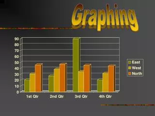
Multiple Bar Graph • Double (or triple) bar graphs are also used to show and compare total number of things, but each group of data is divided into two (or three) • Because you are comparing more than one group of data, you should have a key or legend.
Line Graphs When is it best to choose to draw a line graph? • Often used to show a change over a period of time (continuous data). • They show relationships in data, meaning that they visibly show how one variable is affected by the other. • A trend,(a general direction in which something is developing or changing) can be observed. • They enable the viewer to make predictions about the results of data not yet recorded.
Single or multiple line graphs • use a single line when you are showing only one variable level • Multiple line graphs can be used if there are multiple trials or variables shown. Each line is drawn on one graph. • Because you are displaying more than one group of data, you should have a key.
Single line graph • The independent variable in graph A is ___________ • The dependent variable in graph A is _____________ Trash Collection at FWH Weight of Trash (kg) Days of the Week
Multiple line graph Population growth Avg. Growth Rate % • The independent variable in graph B is ____________________ • The dependent variable in graph B is ____________________ • The purple line represents: ______________________ • The blue line represents: ______________________ • How did you figure out the levels/groups being measured? ______________ Population Growth between 1950 and 2000 Population (to nearest billion) Year
Graphing Rules • Use a bar graph when making comparison of data and a line graph to show continuous change over time. 1. Draw the axes • Use the entire graph paper to set up x- and y-axes. Margins below x-axis and next to y-axis should be no larger than one inch (about 2.5 cm). • Be Neat.Use a ruler to draw margins. 2. Identify the variables a. The x-axis is horizontal axis and the y-axis is the vertical axis. • The x-axis represents the independent variable • The y-axis represents the dependent variable
Graphing Rules, continued 3. Determine a Scale for Each Axis Your goal in determining a scale for the axes is to fit the entire range of data over the available space on the graph paper. To select an appropriate scale, you need to: • Determine the variable range (max-min) for each axis. • Count the number of (blue) lines along the x and y axes. Each line represents an interval. 3. Divide the Range by the number of Intervals and round up. When rounding up, choose a number that is not much greater than original number. 4. Count by that value along the appropriate axis.
Graphing Rules, continued 4. Number and Label each Axis • Mark the scale values on each axis • Label each axis with the type of data and unit
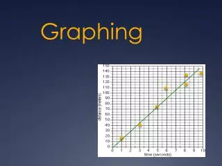
5. Plot the data points and Draw the Graph • On a line graph: 1) plot each pair of data values (dependent-independent pair) on the graph with a dot 2) draw a curve or line that best fits the data points (using a ruler). 3) you may have multiple sets of dependent-independent data. If so, use a different color to plot each set of data pairs. • On a bar graph: make all bars the same width, evenly space out the bars (not touching). If you are creating a multiple bar graph, the sets of data which belong to each category on x-axis can touch the bars in the same set. color or shade the bars differently for each category on x-axis
6. Include a Key, if necessary • Place in upper right or left hand corner of graph; use when graphing two or more sets of data (multiple bar or line graph) to identify all of the groups or variable levels. • Use different colored pencils to represent the different groups or variable levels.
Title your graph It should clearly describe the information (data/experimental results). Place title at top-center of graph. (“The Effect of IV on DV” or IV vs. DV)


