Download
1 / 34
340 likes | 383 Views
Learn how to organize data using tables and various graphs like line, bar, and circle graphs. Improve critical thinking skills through graph interpretation exercises.

E N D
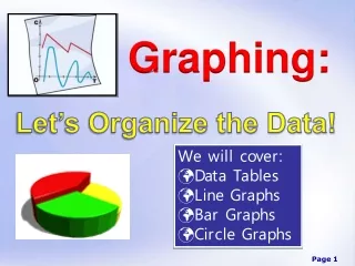
Graphing: Let’s Organize the Data! • We will cover: • Data Tables • Line Graphs • Bar Graphs • Circle Graphs
Introduction Whenever data is collected, it is often presented in a meaningful way so that others can view and make sense of it. Often the data will be presented in a _________ or a _____. Data tables are a way of _________ the information. Graphs are _______________ that represent ______________. data table graph organizing pictorial diagrams numerical data
As a student, it is important that you master these essential skills: • 1. Interpreting and reading graphs • 2. Constructing data tables • Constructing different types of graphs (line graphs, bar graphs, circle graphs) • Critical thinking and problem solving
Interpreting Graphs • What information is being shown in this graph? • This graph shows the effect of different concentrations of fertilizer on the growth of three different types of plants. Study the line graph and answer the following questions.
Describe the results shown for corn plants. • For corn plants, the higher the concentration of fertilizer, the taller the plants will grow.
Describe the results shown for oak seedlings. • As the concentration of fertilizer is increased, growth of oak seedlings is improved, up to a certain point.
Describe the results shown for rose bushes. • For rose bushes, increasing the concentration of fertilizer inhibits plant growth.
At what fertilizer concentration do oak seedlings stop improving? • At concentrations above 150 mg/L, oak seedling growth is inhibited.
What was the height of the tallest plant used in this experiment? • Corn grew to an average height of around 33 cm when the fertilizer concentration was 250 mg/L.
For which plant is this fertilizer least effective at higher concentrations? • Rose bushes.
Which plant shows the best growth when the fertilizer concentration is 100 mg/L? • Oak seedlings
Predict how tall corn plants might be when the fertilizer concentration is 75 mg/L. • The plants will be approximately 12 - 13 cm in height.
Consider the three types of plants used in this experiment. What reasons might explain why the results turned out as they did? • Possible answers: Plants that produce a large fruit (corn) need more fertilizer. Plants that produce a large woody stem (oak trees) grow best with moderate concentrations of fertilizer.
Study the bar graph to the right and answer the following questions: • Do fish grow to a larger weight in pond water or in tap water? • Pond water. • What is the average weight of female fish when grown in pond water? • Approximately 6.4 g. • Which grow larger, the males or the females? • Females
Study the bar graph to the right and answer the following questions: • What is the average weight of male fish when grown in tap water? • Approximately 5.5 grams. • Why do you suppose the fish grow the best in pond water? • Some possible answers might include: The tap water contains chlorine and fluorine, which might affect the growth of fish. Tap water does not contain all the various minerals and ions that might be found in pond water.
Making a Data Table As scientists collect data, it must be recorded in an organized fashion. Any time data is collected in an experiment, it is most often presented in a table.
Making a Data Table The data table must have a title, rows, columns, and heads. The title should be placed at the top and tells the observer what information is contained in the table. At the top of each column should be a “head” that tells you what information is in the column.
Example 1: Make a data table for the following information The following data were collected for the growth of a plant. On day 0, there was 0 growth. On day 1, there was 2.0 cm of growth. On day 2, there was 5.3 cm of growth. On day 3, there was 6.1 cm of growth. On day 4, there was 8.4 cm of growth. On day 5, there was 11 cm of growth. The growth of a plant in centimeters Day Growth 0 cm 2.0 cm 5.3 cm 6.1 cm 8.4 cm 11 cm In the top row, place the title of your data table. In the next row, place the two column heads. In the remaining rows, fill in the data.
Example 2: Make a data table for the following information The number of cricket chirps was recorded on two different nights at various temperatures (Celsius). On night 1, the following data was obtained: Temp 16, cricket chirps 33; Temp 18, cricket chirps 38; Temp 20, cricket chirps 42; Temp 22, cricket chirps 46; Temp 24, cricket chirps 50. On night 2, the following data was obtained: Temp 16, cricket chirps 32; Temp 18, cricket chirps 36; Temp 20, cricket chirps 41; Temp 22, cricket chirps 43; Temp 24, cricket chirps 51. The number of cricket chirps recorded at different temperatures Night 1 Night 2 Temp # Chirps Temp # Chirps 16 18 20 22 24 16 18 20 22 24 33 38 42 46 50 32 36 41 43 51
Making a Line Graph Line graphs show data plotted as points that are connected by a line. Line graphs are often used to show change over time and can be used to compare two or more sets of data. Before a line graph can be constructed, you must identify the two variables that will serve as x and y coordinates on the graph. These are called the “independent variable” and the “dependent variable”. The independent variable is the one being manipulated or changed during the experiment. It is always placed on the x-axis or horizontal axis. The dependent variable is the observed result of the independent variable being changed. The dependent variable is always placed on the y-axis or vertical axis.
Using the grid below, make a line graph using the information from data table 1. First determine which variable to place on the horizontal (x) axis and which variable to place on the vertical (y) axis. The Growth of Plants in Centimeters 2 4 6 8 10 12 Label each axis appropriately. Growth (cm) Scale each axis appropriately. Title your graph. 0 1 2 3 4 5 6 Plot the points on the graph. Time (days)
HOMEWORK: Using the grid below, make a line graph using the information in data table 2. 10 20 30 40 50 16 18 20 22 24
Making a Bar Graph Bar graphs are useful for showing comparisons of data collected by counting. A bar graph has two axes, a horizontal axis and a vertical axis. Generally the horizontal axis is labeled and the vertical axis is divided. The data are not related so the bars do not touch.
Making a Circle Graph Circle graphs are used less often in science reporting, but they are often seen in newspapers and magazines. A circle graph is a convenient way to show the relative sizes of the parts that form an entire body of data.
Suppose that in a particular high school, the number of students taking a science class is as follows: 50% are taking biology, 30% are taking chemistry, 10% are taking physics and 10% are taking some other type of science class. Use the circle below to represent this data in pictorial form. Chemistry 30% Biology 50% Physics 10% Other 10%
Analysis Questions • Under what circumstance would each of the following types of graphs be best used? • Line Graph: • Line graphs are often used to show change over time and can be used to compare two or more sets of data. Always shows one variable relative to another. • Bar Graph: • Bar graphs are useful for showing comparisons of data collected by counting. One variable may not be affected by the other • Circle Graphs: • Circle graphs are best used to give the viewer an overall or broad picture view of smaller groups of data and how the smaller groups fit into the whole.
Analysis Questions • 2. How is a graph similar to a data table? • Both are methods of organizing information. • Does a steep curve on a line graph indicate a rapid or slow rate of change? • Rapid.
Analysis Questions • You are conducting a photosynthesis experiment to determine how much oxygen is produced over a 24 hour period of time. You are measuring the oxygen production every hour for 24 hours. • What type of graph is best used to represent this data? • Line graph • When you construct a graph of your data, which variable will be placed along the x-axis? • Time • When you construct a graph of your data, which variable will be placed along the y-axis? • Oxygen production
Analysis Questions • What is an advantage of using multiple lines on the same graph? • It allows you to show comparisons between different groups of data.
HOMEWORK: Using the grid below, make a line graph using the information in data table 2. • First determine which variable to place on the horizontal (x) axis and which variable to place on the vertical (y) axis. Number of Cricket Chirps Recorded at Various Temperatures • Label each axis • appropriately. # cricket chirps 10 20 30 40 50 • Scale each axis • appropriately. • Title your graph. • Plot the points on the • graph. 16 18 20 22 24 • Since this graph will have two different lines, be sure to label each line. Temp (°C)
T.A.I.L T – TITLE A – AXIS – HAVE YOU CORRECTLY IDENTIFIED YOUR VARIABLES AND ARE THEY IN THE CORRECT PLACE? I – INCREMENTS – ARE YOU USING THE ENTIRE GRAPH? L – LABELS or LEGEND