Graphing
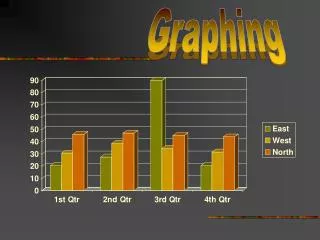
When creating graphs, it is crucial to ensure clarity and accuracy in data presentation. Start with a descriptive title that encapsulates what the data represents. Label your x-axis and y-axis clearly with appropriate units. If you have multiple data sets, include a key or legend for easy reference. Make sure the numerical scale on the axes increases incrementally, maintaining equal intervals. If necessary, use a break symbol to indicate discontinuity in data. For additional help, refer to online resources like the NCES Graphing Tutorial and Excel graphing guides.

Graphing
E N D
Presentation Transcript
Graphing • Be sure to: • Have a title that describes what your data represents • Have an x-axis label with units • Have a y-axis label with units • Have a key/legend if there are multiple sets of data • Have the scale/numbers increasing incrementally (equally) on the axes • Use a break symbol ( )if necessary Helpful Websites http://nces.ed.gov/nceskids/Graphing/ (graphing tutorial) http://ed.fnal.gov/data/life_sci/data/tutorials/excel.shtml (creating graphs with Microsoft Excel)


