Pioneering Investigators: Clear Images, Detailed Descriptions
Explore examples of practically perfect investigations with clear and understandable images, but lacking captions. The detailed information is accurate, comprehensive, and includes interesting quotes. Learn about the investigative process through a variety of visual aids and detailed text with parenthetical citations. The presentation showcases a mix of real photos, clip art, and hand-drawn elements, creatively arranged on a clear and easy-to-understand layout. Dive into the world of investigative work with this informative and visually appealing poster.

Pioneering Investigators: Clear Images, Detailed Descriptions
E N D
Presentation Transcript
Some Practically Perfect Investigation Examples
Images are clear and understandable—but no captions!Info accurate and detailedParagraph titles are clear—interesting font choiceNo border!Timeline looks unplanned—it’s the wrong direction and has too much infoPoster title could be more interesting
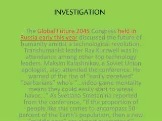
Interesting background imageBorder (Russian flags) is simple but clearImage captions clear, but could be more specificText very detailedGives two interesting quotes AND explains why they are importantOK title
Images are clear and very easy to understand—but no captions!!Border is simple but creative (Pulitzer was a journalist and newspaper owner)Student couldn’t find a pre-made chart, so he made one using ExcelHandwritten titles were carefully written on blue paperGood title “Joseph Pulitzer: Eclectic Newspaperman”
Captions are clear and informativePoster title made from images is creative and easy to understandPre-made chart has additional writing to make it easier to interpretText is highly detailed, including parenthetical citations (uses parentheses, author last name, and page numbers)
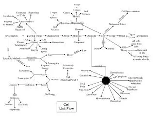
Student created poster entirely on the computer!Paragraph titles are clear and large—but not too bigBorder images are a mix of clip art and real photosCentral image (a map) is an interesting way to visually connect all the paragraphsPoster title could be more interesting/descriptive
Shape is creative and clever—acts like a borderText is detailed and specificAdditional subtopics givenEach subtopic has a good titlePoster title is interestingClearly took time to plan and lay out b/c of the shape
Some Not Quite Right Investigation Examples
Random squiggle borderLayout seems crowded, unplannedUninteresting titleImages clear and easy to understand; most have detailed captionsHighly detailed text with parenthetical citations—almost too much infoWell-chosen quotes are explained clearly
Layout leaves a lot of blank space, seems unplannedParagraphs colored to match and uninteresting title, but not done neatlyImages are a good size, but no captionsText lacks detailNo quotes/borderTitle hand-cut, but unfinished and not well planned
Images are too big, causing them to overlapCaptions and quotes are placed at odd anglesParagraphs are colored in a way that makes the poster confusingLayout seems very cluttered and unplannedText is detailed, but doesn’t seem like the student’s own wordsNo border
Uninteresting titleShort paragraphs lack detailOnly one picture has a very very brief captionQuotes aren’t explainedLayout is colorful, but not well planned
Highly detailed text—but too much text!Clear image—should be several more, with captionsGood title—so small that it’s not very noticeableToo much time spent on content, not enough on presentation
Good quotes—no explanationsGood ideas for info-graphics—no captionsClear images—no captionsUninteresting borderHighly detailed textInteresting layout
Student chose to mix hand-drawn and clipart imagesCaptions are ok—could be more detailedQuotes are integrated into the paragraphsBorder of Chinese characters is simple but clearly took time to makeTitle could be more interesting
Layout is extremely clear and easy to understand • Poster title could be more interesting • Images are extremely clear—captions could be more detailed • Very specific text • Uses parenthetical citations • Uninteresting border
Paragraphs clearSubtitles need more interestGives a few “fun facts”Good image choicesCaptions could be more detailedUninteresting border/title
Very clear images—mix of photos and other imagesClear, detailed timeline at the bottomHighly detailed text with parenthetical citationOK title “Martin Van Buren: The Eighth President of the United States”Border is too plain
Very neat—designed entirely on the computerInteresting layoutBorder images represent the interests and experiences of the presidentClear images, but incomplete captionsHighly detailed text
Interesting image placementSome images have specific captionsInformational graphic is unique (a pinwheel that shows jobs, relatives, and connections to other presidents)Text is highly detailed with parenthetical citationsUninteresting border/title
Variety of images—shows person at many stages of lifeHighly detailed text with parenthetical citations and interesting quotesColorful and interesting…but it’s almost getting clutteredOK borderUninteresting titleNo captions
Stapled flaps of text make the layout seem cluttered, unplannedImages are clear; captions too briefText is highly detailedWell-chosen quotationsInfo-graphic is clear and interesting