Download
1 / 4
40 likes | 46 Views
Your brand website sells 24/7. SEO and conversion and retention rates drive your website's revenue.<br><br>This is easier said than done. . Australian internet shopping will have 83,095 businesses by 2023. Australian online shopping is becoming more popular, increasing competition.

E N D
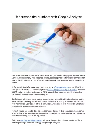
Understand the numbers with Google Analytics Your brand’s website is your virtual salesperson 24/7, with sales taking place beyond the 9-5 workday. Fundamentally, your website’s fiscal success depends on its visibility on the search engine (SEO), followed by how efficiently and effectively it converts and retains prospective visitors. Unfortunately, this is far easier said than done. In the eCommerce sector alone, 80-90% of startups eventually fail. And according to the Online Shopping industry in Australia , there are 83,095 registered online businesses in 2023. As Australian consumers opt to shop online, the domestic competition is bound to ramp up. Our Brisbane full-service brand agency understands the considerable obstacles that restrict online success. One key element that’s often overlooked is what your website numbers tell you. Intermediate user data is a font of knowledge, when tapped into, reveals the underlying strengths and weaknesses of your website. Fret not, you do not need a diploma or a bachelor’s degree in data analytics to make sense of the numbers! A rudimentary understanding of customer behaviour is more than enough to unearth the missing links in the big picture. Today, our branding and digital agency will share 3 expert tips on how to revise, reinforce and reorganise your website strategy using Google Analytics.
1. Understanding Bounces Upon first logging into your website’s official Google Analytics account, you’ll be greeted by a dashboard highlighting key statistics about your website. The first statistic we’d like to highlight is the ‘bounce rate’. The website’s aggregate bounce rate tells you the percentage of visitors that leave after visiting or interacting with a single subpage on your website. As a rule of thumb, 26-40% is considered the ‘optimal bounce rate’, where the majority of visitors have chosen to interact with at least 2 or more subpages on your website. However, it’s worth noting that bounce rates are not industry-agnostic. Depending on the nature of your business, a high bounce rate may not be the death knell of your brand. If your website’s primary focus is to provide high-quality information quickly and effectively, less so selling and conversions, high bounce rates might indicate ‘business as usual’. But if your business follows a traditional approach to maximising sales and conversions, a high bounce rate indicates that there are weaknesses discouraging users from staying. However, an aggregate bounce rate doesn’t tell you which pages need investigating. In the dropdown menu on the left, select ‘behaviour’, followed by ‘site content’ under it. Under the preceding sub-menus, click on the ‘All-Pages’ prompt. The ‘All-Pages’ table on the bottom half of your browser shows you all the pages and their respective bounce rates. By drilling down into the pages with the most bounces, you can triage and remedy the pages that are lagging. Common reasons for high bounce rates include broken 404 links, low-quality graphics or copy, or poor UI/UX. Ascertaining the culprit pages is the first step. 2. Conversion Events Typically, a transaction is the mother of all conversions. But not all businesses share the same business model! For instance, our Brisbane brand agency strongly deviates from the norm. The bespoke nature of our services limits our ability to ‘mass sell’ our services. Thus, our website serves both as an introduction to our brand and a point of contact. For us, a filled-up request or contact form is indicative that our website strategy is performing optimally. Your mileage may vary depending on the industry you’re in. Nonetheless, we want Google Analytics to detect and classify these conversion events. Thankfully, Google has kindly set up a page outlining the steps required to set up each conversion event.
3. Behaviour Flow Every brand should fully grasp how its target audience behaves. The ‘Behaviour Flow’ chart visually illustrates the journeys users take based on the number of interactions they make with pages on the site before converting or bouncing. The sections highlighted in green reflect the users who chose to stay on your website. The waterfall plots in red represent the number of drop-offs or website exits at each webpage. You may choose to select the duration of the time series (day, week, month etc.). This step follows the same logic as steps 1 and 2! However, the ‘Behaviour Flow chart helps business owners visualise consumer behaviour patterns on their websites. The pages that encourage the most interaction indicate a high level of success in the digital sales funnel. Pages with a high volume of exits tell us that those pages are failing to qualify leads or retain their interest. Performing a site-wide content and SEO audit can help reveal technical or subjective inadequacies. Understanding the data is the first step, and fixing those niggling errors is the second. It’s all about understanding the visitor or buyer’s journey. 4. Cohort Analysis We’re now entering the advanced territory. If you want to understand your customers, you need to organise them into segments. The Cohort Analysis tool is an incredibly flexible and precise tool for grouping customers in cohorts based on similar behaviours. The default behaviour that Google tracks is ‘user-retention’. The first column (y-axis) shows the date of customer acquisition and the number of visitors on that given day. Additionally, the first row (y-axis) shows each day users return to interact with your website. The datasets falling between both axes represent the percentage of users that return to your website. Do take note that you can adjust the time series and behaviour that you’d like to track and organise into cohorts. Beneficially, businesses can pinpoint user-specific behaviours, such as elapsed time between them or the percentage of return users. Knowing how your customers think and feel allows you to create unique solutions such as targeted advertising or campaigns to convert those return visitors. Data Tells All Google Analytics' ability to capture and analyse primary and intermediate user data is 100% a value-add to people in the business and marketing professions. However, these tips I’ve just shared with you barely scratch the surface of its capabilities. For that, we suggest you defer to our team’s data expertise. As a brand agency, our data-driven approach to marketing and branding allows us to identify critical paths towards maximising both reach and conversions. Working backwards, we can fully grasp the intricacies of audience behaviour and initiate targeted improvements.
But data analysis isn’t our only skillset. Our in-house team offers a full spectrum of marketing and branding services , both traditional and digital. From captivating copy to high-quality web design, we want to build you a better brand fit for a lifetime. If you’re ready to make sense of the numbers, give us a message or a call . We’d love to hear more about you and your business ambitions. So what are you waiting for? Let’s talk. Don’t be a stranger.