Download
1 / 41
410 likes | 528 Views
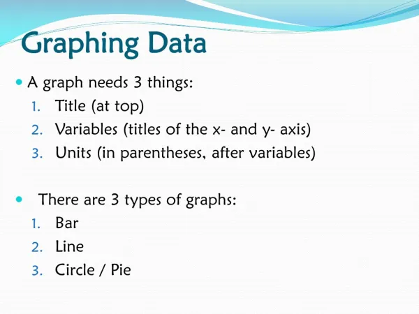
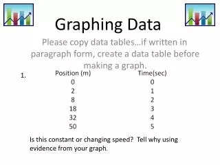
Graphing Data. The Basics. Ordinate. About ¾ of t he length o f the X axis. Y axis. Start at 0. X axis. Abscissa. Graphs of Frequency Distributions. The Frequency Polygon The Histogram The Bar Graph The Stem-and-Leaf Plot. The Frequency Polygon.

E N D
The Basics Ordinate About ¾ of the length of the X axis Y axis Start at 0 X axis Abscissa
Graphs of Frequency Distributions • The Frequency Polygon • The Histogram • The Bar Graph • The Stem-and-Leaf Plot
The Frequency Polygon • To convert a frequencydistribution table into a frequency polygon: • Put your X values on the X axis (the abscissa). • Find the highest frequency and use it to determine the highest value for the Y axis. • For each X value go up and make a dot at the corresponding frequency. • Connect the dots.
The Histogram • Follow the same steps for creating a frequency polygon. • Instead of connecting the dots, draw a bar extending from each dot down to the X axis. • A histogram is not the same as a bar graph, there should be no gaps between the bars in a histogram (there should be no gaps in the data).
Grouped Frequency Distributions • We can group the previous data into a smaller number of categories and produce simpler graphs • Use the midpoint of the category for your dot
Relative Frequency Polygon • Use the following formula to find out what percentage of scores falls in each category: • Use the percentage on your Y axis instead of the frequency.
So what’s the point? • Graphs of relative frequency allow us to compare groups (samples) of unequal size. • Much of statistical analysis involves comparing groups, so this is a useful transformation.
Activity #1 A researcher is interested in seeing if college graduates are less satisfied with a ditch-digging job than non-graduates. Because of the small number of college graduates digging ditches, the researcher could not get as many college graduate participants. Below are the scores on a job satisfaction survey for each group (possible values are 0 – 30, 30 being the most satisfied): College: 11, 3, 5, 12, 18, 6, 4, 1, 2, 6, 2, 17, 12, 10, 8, 3, 9, 9 No College: 19, 3, 15, 11, 13, 12, 12, 9, 2, 6, 21, 15, 11, 8, 6, 25, 17, 1, 14, 15, 9, 7, 20, 4, 2, 19, 7, 12
Activity #1 College: 11, 3, 5, 12, 18, 6, 4, 1, 2, 6, 2, 17, 12, 10, 8, 3, 9, 9 No College: 19, 3, 15, 11, 13, 12, 12, 9, 2, 6, 21, 15, 11, 8, 6, 25, 17, 1, 14, 15, 9, 7, 20, 4, 2, 19, 7, 12 • Create a frequency distribution table with about 10 categories (for each group) • Convert the frequency to relative frequency (percentage) • Construct a relative frequency polygon for each group on the same graph (see p. 43 for an example) • Put your name on your paper.
Cumulative Frequency Polygon • Create a column for cumulative frequency and make the Cum f value equal to the frequency plus the previous Cum fvalue (see ch. 3 for a review) • Plot the resulting values just as you did for a frequency distribution polygon
Cumulative Percentage Polygon • Using cumulative frequency data, calculate the cumulative percentage data. • Make your Y axis go to 100% • Plot the data as normal.
Bar Graph • Used when you have nominal data. • Just like a frequency distribution diagram, it displays the frequency of occurrences in each category. • But the category order is arbitrary.
Example • The number of each of 5 different kinds of soda sold by a vendor at a football stadium.
Line Graphs • Line graphs are useful for plotting data across sessions (very common in behavior analysis). • The mean or some other summary measure from each session is sometimes used instead of raw scores (X). • The line between points implies continuity, so make sure that your data can be interpreted in this way.
Example Rats are trained to perform a chain of behavior and then divided into two groups: drug and placebo. The average number of chains performed each minute is plotted across sessions.
Venn Diagrams Not in your book, but make sure you understand the basics.
Example Freda’s Friends Sports Classes Dorm
Activity #2 Work with a group and fix these 3 graphs:
Homework • Prepare for Quiz 4 • Read Chapter 5 • Finish Chapter 4 Homework (check WebCT/website)