Download
1 / 23
230 likes | 239 Views
Graphing Data . Stem – and – leaf Diagrams (Stemplots) Histograms Symmetric distribution Negatively skewed distribution – skewed left Positively skewed distribution – skewed right Scatter Graphs and Correlations Strong positive correlation Strong negative correlation

E N D
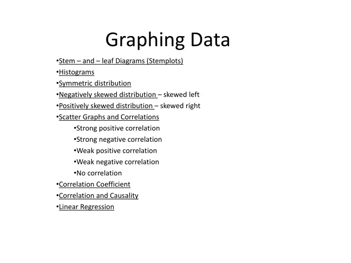
Graphing Data Stem – and – leaf Diagrams (Stemplots) Histograms Symmetric distribution Negatively skewed distribution – skewed left Positively skewed distribution – skewed right Scatter Graphs and Correlations Strong positive correlation Strong negative correlation Weak positive correlation Weak negative correlation No correlation Correlation Coefficient Correlation and Causality Linear Regression
Stem and Leaf Plot Stem – and – leaf Plots are used to show data by separating each value into a stem ( left most digit) and the leaf (remainder). • Write the data in increasing order to sort out the data • Write the stem in a vertical column with the smallest on top • Each leaf is represented in the row to the right of the stem in increasing order • You must remember to write a key Key: 4│6 = 46
Back-to-Back Stem-and-Leaf Plot Key: 1│6│ = 61 Key : 7│8 = 78
Distribution of DataHistograms are used to show continuous numerical data Symmetrical Distribution Symmetrically distributed data is shown on a histogram when the distribution of data that are smaller and larger than the midpoint are a mirror image of eachother Midpoint
Positively Skewed Distribution Right Skewed Data Also known as positively skewed data We know this is Right/Positively skewed as there is a long tail to the right of the graph. Examples occur: Number of children in a family Age at women marry
Negatively Skewed Distribution Left Skewed Data Also know as Negatively Skewed Data We know this is Left/Negatively Skewed as there is a long tail at the beginning/left of the graph. Examples occur: Reaction times for an experiment Daily maximum temps for a month in the summer
Scatter Graphs and Correlations • Scatter Graphs are used to investigate the relationship between two sets of numerical data • The explanatory variable goes on the horizontal axis • If the points on the scatter graph are close to forming a straight line then we can say that there is a strong correlation between the sets of data • (NB) this means that there is a strong relationship between the data sets. A change in one data set should result in a change in the other data set. • (eg) hours studied and results in a test • Years of education and start salary
Strong Positive CorrelationComment on the relationship between Calories consumed and Weight Gained
Weak Negative CorrelationComment on the relationship between GPA and Hours Per Week of TV Watched
No CorrelationComment on the relationship between the number of patient falls and staff vacancies
This is a strong correlation and I think this because soil temperature heats up plants, which might making them transpire more easily.
This is a weak negative correlation, so wind speed does not seem to be well correlated with evapotranspiration.
This was the strongest correlation I observed. I think it is because solar radiation directly causes water to evaporate
There is basically no correlation between relative humidity and evapotranspiration.
Negative Correlation • A negative correlation is said to exist when as one covariate increases the other covariate decreases. • An excellent example of a negative correlation would be number of hours spent socialising by a group of students and their eventual examination mark. • Going out too much seriously jeopardises your examination success.
Causality Causality is also a relationship between two things, but it is not mathematical, it is physical (or philosophical). Something causes something else if there is a chain of events between the first thing and the second thing, each of which causes the next thing in the chain to happen. Causality involves time; the first thing happens, and then later the second thing happens as a result. We say the first thing is the cause, and the second thing is the effect. Note that unlike correlation, the relationship is unsymmetrical. In general, just because there is a strong correlation does not mean that one variable is a cause of the other(correlation does not always imply causality) Pg. 36 Active Maths
Linear Regression and Line of Best Fit Once you have drawn the Scatter Plot you can then start to determine what kind of relationship exists between the two sets of data. • If you can establish a linear relationship (the plots look like a line) you can then work out the Correlation Coefficient – calculator or formula • We then have to find the line of best fit Steps: • Draw a line, by eye, through the data points so that it comes as close as possible to the points • This tries to minimise the distance between the points and the line of best fit • We then need to work out the equation of the line of best fit : • Get 2 sets of points on the line • Use the slope formula to get its slope • Fill into: • Rewrite in form : • Also used as :
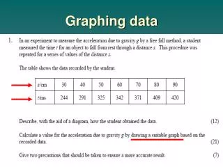
Finding the Equation of the “line of best fit” • Here are the results of an experiment comparing time to complete the task with an object’s mass. • What can you say about the relationship between the 2 sets of data? • Draw the line of best fit. • Calculate the equation of the line of best fit.