Download
1 / 28
320 likes | 473 Views
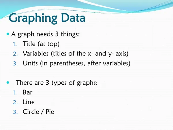
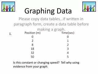
Graphing Data. Graphs show information we need. They can make it easy to read. There are many types of graphs. They include: Pictographs Bar Graphs Line Graphs. Pictograph. Pictographs display data Every pictograph has a title, pictures or symbols, key, and labels.

E N D
Graphs show information we need. They can make it easy to read. There are many types of graphs. They include: • Pictographs • Bar Graphs • Line Graphs
Pictograph • Pictographs display data • Every pictograph has a title, pictures or symbols, key, and labels The title of this pictograph tells you about the sports played by 3rd graders. This is the key. It tells you what the symbols in the graph represent.
How many students played baseball according to this pictograph? 5 10 50
Which sport did the fewest number of students play? baseball football hockey basketball
How many students does each pink crayon represent? 1 student 2 students 3 students 4 students
How many more students liked the color purple than the color blue? 3 2 1 5
Bar Graphs • Uses bars to show data • Used to compare counts of different categories called categorical data This bar graph shows how much money was spent on food each week.
Uses parallel bars (horizontal or vertical) to represent counts for several categories • One bar is used for each category • A space is left before, between, and after the bars These are vertical bars that represent 1 week.
Axis and Title on a Bar Graph • The axis displays the scale on a graph. It should extend one increment above the greatest recorded piece of data. • Each axis should be labeled, and the graph should be given a title. Title This is the axis.
Scale the Axis • The numbers that show the units used on a graph is called the scale. • The interval of the scale is 10 for this bar graph because the numbers count by 10. This is the scale.
Look at this bar graph. What is the title of this bar graph?
How many red pencils were sold? 100 115 110 105
How many red and blue pencils were sold? 10 205 210 215
What is the interval on this graph? Look at the scale to help you. 5 10 15 20
How many yellow pencils were sold? 85 90 95 80
How many more blue pencils than yellow pencils were sold? 185 15 10 110
Between which two stores was there the greatest difference in total cost? Park’s and Jenner’s Hoskin’s and Jenner’s Drake’s and Park’s Jenner’s and Park’s
Line Graphs • Shows how variables (things) change over time (increases, decreases, or stays the same) • Line graphs connect points together to show how the data has changed over time
Values along the horizontal axis represent data on a given variable, usually some measure of time (e.g., time in years, months, or days Horizontal axis
Values along the vertical axis are the scale and represent the frequency (how often) with which those values occur in the data set. Vertical axis
Values on the vertical axis should represent equal increments. The scale should extend at least one increment above the greatest recorded piece of data. The greatest recorded data. This is the scale. The interval is 5 because it counts by 5s. The scale extends beyond the greatest recorded data.
Each axis on a line graph should be labeled, and the graph should be given a title. • Line graphs tell whether something has increased, decreased, or stayed the same over time The title for the line graph. Labels for the horizontal and vertical axis.
About how high was the liquid in the tank at 8:00 a.m.? 20 feet 24 feet 20 inches 24 inches
How high was the liquid in the tank at 11:00 a.m.? 25 feet 20 feet 25 inches 20 inches
At what time was the liquid in the tank at its highest point? 8:00 a.m. 10:00 a.m. 11:00 a.m. 10:00 p.m.
How many feet lower was the level on Wednesday than on Monday? 3 ft. 5 ft. 15 ft. 25 ft.