Download
1 / 35
840 likes | 2.37k Views
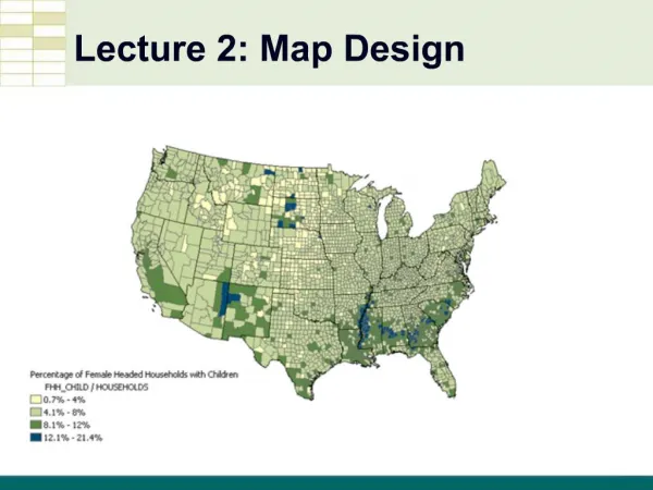
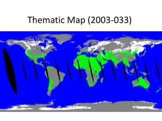
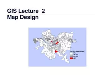
Thematic Map Design. Thematic Map: Map that represents a particular theme or topic. Population Density, Literacy Rate, Temperature, etc. >> A limited set of features is represented in order to focus attention on the thematic symbols – symbols that represent the map’s theme.

E N D
Thematic Map Design • Thematic Map: Map that represents a particular theme or topic. • Population Density, Literacy Rate, Temperature, etc. >> • A limited set of features is represented in order to focus attention on the thematic symbols – symbols that represent the map’s theme. • Map Design: Process in which maps are conceived and created. • Driven by the needs of the map user. • Primary Goal: Creation of simple, clear maps that effectively communicate geographic information. • Involves the appropriate selection and implementation of Map Elements – the building blocks of map making. • Map Elements…
Map Elements (Listed in the order of placement) • Frame Line • Defines the initial available space • Mapped Area • The geographic region being represented • Title & Subtitle • Title describes the map’s theme; • Subtitle further explains the title • Legend • Defines thematic symbols • Data Source • Describes origin of thematic data • Scale • Indicates amount of reduction, or allows the map user to take measurements • North Arrow • Indicates direction
General Rules • More important map elements should stand out; less important elements should not attract as much attention. • 2. Overall design should be well-balanced. >> General Order of Importance Not to be confused with the order of placement listed on the previous slide • 1. Mapped Area (Them. Symb.) • 2. Title, Subtitle • 3. Legend • 4. Data Source • 5. Scale • 6. North Arrow • 7. Frame Line
Frame Line • 1. Should always be used. • 2. A single, thin line should be used. Edge of page Frame Line
Mapped Area • 1. Should always be used - it isn’t a map without it! • 2. Should be as large as possible without being 'too close' to the frame line, and while leaving ample room for other map elements. >> • 3. Should be horizontally (side-to-side) and vertically (top-to-bottom) centered within the available space, as defined by the frame line.
Title • 1. Should always be used. • 2. Should express the map’s theme, preferably at the beginning. >> • 3. Should normally be the largest type on a map. • 4. Should be set in Title Case. >> • 5. Should be succinct - unnecessary words should be omitted. >> • 6. Abbreviations should be avoided. • 7. A legible type family should be used.
Title (continued) • 8. Should have a plain style (avoid bold and italic). >> • 9. Should be limited to one line. • 10. The word “map” should not appear. • 11. Should be horizontally (side-to-side) centered within the frame line if possible. • 12. Should be placed toward the top of the map if possible, vertically (top-to-bottom) centered between the mapped area and the frame line.
Subtitle • 1. Usually contains the date and/or geographic region. >> • 2. Should be visibly smaller than the title (at least 2 points smaller). • 3. Should be set in Title Case. • 4. Should employ the same typeface (type family and type style) as the title. • 5. Should be limited to one line. • 6. Should be horizontally centered with the title. >> • 7. Should be located directly below the title.
Legend • 1. Should always be used, unless the thematic symbols can be interpreted without it. • 2. Representative symbols should be placed on the left and defined on the right. >> • 3. Should be large enough to be used easily, but should not occupy vast areas of space. > • 4. Legend definitions should employ the same type family as the title. • 5. Should be horizontally and vertically centered within the available space.
Legend Heading • 1. Normally contains the unit of measure and/or enumeration unit (country, state, etc.) • 2. Should be smaller than the subtitle. • 3. Should be set in Title Case. • 4. Should employ the same typeface (type family and type style) as the title. • 5. Multiple lines of type should be horizontally centered with one another. >> • 6. The word “Legend” should not appear.
Legend Heading (continued) • 7. Should be horizontally centered with the legend. >> • 8. Should be placed directly above the legend.
Data Source • 1. Should always be used. • 2. Contains the source of thematic data. Similar to a bibliographic reference, but is usually less formal. >> • 3. Should be among the smallest type on a map. • 4. Should be set in Title Case. • 5. Should have the same typeface (type family and type style) as the title. • 6. Multiple lines of type should be horizontally centered with one another.
Data Source (continued) • 7. The word “Source:” should appear at the beginning. • 8. Should be horizontally centered with the legend. • 9. Should be located directly below the legend.
Scale (Representative Fraction) • 1. A scale should be used in most cases. >> • 2. Type should be among the smallest on a map. • 3. Should have the same typeface (type family and type style) as the title. • 4. Should be horizontally and vertically centered within the available space, below the mapped area if possible.
Scale (Bar Scale) • In addition to the previous rules: • 1. A bar scale is preferred to a representative fraction on most thematic maps. • 2. The maximum distance of a bar scale should be round and easy to work with. >> • 3. Bulky, complex bar scale designs should be avoided in favor of subtle, simple designs. • 4. Bar scales should not have excessive height. • 5. The bar scale should be long enough (wide enough) to be useful, but not so long as to be cumbersome. >>
North Arrow • 1. Should only be used if the map is not oriented with north at the top, or if the map will be used for navigation, surveying, orienteering, etc. • 2. Bulky and complex designs should be avoided in favor or subtle, simple designs. >> • 3. Should be relatively small. Go to Slide 18
Mapped Area • 1. Should always be used - it isn’t a map without it! • 2. Should be as large as possible without being 'too close' to the frame line, and while leaving ample room for other map elements. • 3. Should be horizontally (side-to-side) and vertically (top-to-bottom) centered within the available space, as defined by the frame line. Back to Slide 5
Title • 1. Should always be used. • 2. Should express the map’s theme, preferably at the beginning. • 3. Should normally be the largest type on a map. • 4. Should be set in Title Case. • 5. Should be succinct - unnecessary words should be omitted. • 6. Abbreviations should be avoided. • 7. A legible type family should be used. Back to Slide21
Title (continued) • 8. Should have a plain style (avoid bold and italic). • 9. Should be limited to one line. • 10. The word “map” should not appear. • 11. Should be horizontally (side-to-side) centered within the frame line if possible. • 12. Should be placed toward the top of the map if possible, vertically (top-to-bottom) centered between the mapped area and the frame line. Back to Slide 6 Back to Slide7
Subtitle • 1. Usually contains the date and/or geographic region. • 2. Should be visibly smaller than the title (at least 2 points smaller). • 3. Should be set in Title Case. • 4. Should employ the same typeface (type family and type style) as the title. • 5. Should be limited to one line. • 6. Should be horizontally centered with the title. • 7. Should be located directly below the title. Back to Slide 8
Subtitle • 1. Usually contains the date and/or geographic region. • 2. Should be visibly smaller than the title (at least 2 points smaller). • 3. Should be set in Title Case. • 4. Should employ the same typeface (type family and type style) as the title. • 5. Should be limited to one line. • 6. Should be horizontally centered with the title. • 7. Should be located directly below the title. Back to Slide 8
Legend • 1. Should always be used, unless the thematic symbols can be interpreted without it. • 2. Representative symbols should be placed on the left and defined on the right. • 3. Should be large enough to be used easily, but should not occupy vast areas of space. • 4. Legend definitions should employ the same type family as the title. • 5. Should be horizontally and vertically centered within the available space. Back to Slide 9
Legend • 1. Should always be used, unless the thematic symbols can be interpreted without it. • 2. Representative symbols should be placed on the left and defined on the right. • 3. Should be large enough to be used easily, but should not occupy vast areas of space. • 4. Legend definitions should employ the same type family as the title. • 5. Should be horizontally and vertically centered within the available space. Back to Slide 9
Legend Heading (continued) • 7. Should be horizontally centered with the legend. • 8. Should be placed directly above the legend. Back to Slide 11
Scale (Bar Scale) • In addition to the previous rules: • 1. A bar scale is preferred to a representative fraction on most thematic maps. • 2. The maximum distance of a bar scale should be round and easy to work with. • 3. Bulky, complex bar scale designs should be avoided in favor of subtle, simple designs. • 4. Bar scales should not have excessive height. • 5. The bar scale should be long enough (wide enough) to be useful, but not so long as to be cumbersome. Back to Slide 15
Data Source • 1. Should always be used. • 2. Contains the source of thematic data. Similar to a bibliographic reference, but is usually less formal. • 3. Should be among the smallest type on a map. • 4. Should be set in Title Case. • 5. Should have the same typeface (type family and type style) as the title. • 6. Multiple lines of type should be horizontally centered with one another. Back to Slide 12
Scale (Representative Fraction) • 1. A scale should be used in most cases. • 2. Type should be among the smallest on a map. • 3. Should have the same typeface (type family and type style) as the title. • 4. Should be horizontally and vertically centered within the available space, below the mapped area if possible. Back to Slide 14
Scale (Bar Scale) • In addition to the previous rules: • 1. A bar scale is preferred to a representative fraction on most thematic maps. • 2. The maximum distance of a bar scale should be round and easy to work with. • 3. Bulky, complex bar scale designs should be avoided in favor of subtle, simple designs. • 4. Bar scales should not have excessive height. • 5. The bar scale should be long enough (wide enough) to be useful, but not so long as to be cumbersome. Back to Slide 15
North Arrow • 1. Should only be used if the map is not oriented with north at the top, or if the map will be used for navigation, surveying, orienteering, etc. • 2. Bulky and complex designs should be avoided in favor of subtle, simple designs. • 3. Should be relatively small. Back to Slide 16
Title • 1. Should always be used. • 2. Should express the map’s theme, preferably at the beginning. • 3. Should normally be the largest type on a map. • 4. Should be set in Title Case. • 5. Should be succinct - unnecessary words should be omitted. • 6. Abbreviations should be avoided. • 7. A legible type family should be used. Back to Slide 6
General Rules • More important map elements should stand out; less important elements should not attract as much attention. • 2. Overall design should be well-balanced. General Order of Importance Not to be confused with the order of placement listed on the previous slide • 1. Mapped Area (Them. Symb.) • 2. Title, Subtitle • 3. Legend • 4. Data Source • 5. Scale • 6. North Arrow • 7. Frame Line Back to Slide 3
Legend Heading • 1. Normally contains the unit of measure and/or enumeration unit (country, state, etc.) • 2. Should be smaller than the subtitle. • 3. Should be set in Title Case. • 4. Should employ the same typeface (type family and type style) as the title. • 5. Multiple lines of type should be horizontally centered with one another. • 6. The word “Legend” should not appear. Back to Slide10
Title • 1. Should always be used. • 2. Should express the map’s theme, preferably at the beginning. • 3. Should normally be the largest type on a map. • 4. Should be set in Title Case. • 5. Should be succinct - unnecessary words should be omitted. • 6. Abbreviations should be avoided. • 7. A legible type family should be used. Back to Slide 6