Download
1 / 12
120 likes | 214 Views
Examining Relationships. Up to this point we have focused on understanding one variable from cases by looking at summary measures such as the mean and the standard deviation and by looking at the distribution of the variable. We might note that the distribution is symmetric or skewed.

E N D
Up to this point we have focused on understanding one variable from cases by looking at summary measures such as the mean and the standard deviation and by looking at the distribution of the variable. We might note that the distribution is symmetric or skewed. Next we bring two variables together and explore if the variables are related. You know about this just from being alive, but here we want you to get more detail. Are weekly sales for a company related to the dollar amount of advertising the company undertakes? Are final grades related to how many hours an individual studies? Note, some relationships between variables are stronger than others. Let’s turn to an example to explore some ideas.
On the previous slide I have a data set provided by the text that has information about various beers. By the way, I am not encouraging you to drink beers. If you do, don’t drive a car or operate heavy machinery. Be careful! To review earlier material, I look at the grams of carbohydrates in a beer (12 ounces). I note that not every beer (86 varieties) has the same number of carbs. I made a histogram and the data are not exactly symmetric. I note that few beers have more than 20 carbs in 12 ounces. So, why do all beers NOT have the same number of carbs?
Any easy answer is that the companies who make the beers did it this way. But that is not what we would do in a statistics class. We would maybe look to other characteristics of the beers to see if the other characteristics make a difference. So, carbs will be called the response variable because in some sense we have a feeling the level of carbs responds to something else. The other variable here will be called the explanatory variable because it is felt this variable may explain why the response variable behaves the way it does. In this example, the explanatory variable is the percent alcohol content. I show on the next slide some summary information about this variable.
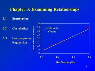
As we examine the relationship between two variables a useful place to start is to plot the data in what is called a scatterplot. The explanatory variable is put on the horizontal, or x, axis and the response variable is put on the vertical, or y, axis. I have a scatterplot for the variables on the next slide. You see that carbs are on the vertical axis and if you focus on the points from this perspective you see only 1 has more than 20 carbs. Note how many beers are in each “band” of carbs. Can you almost see the carbs histogram from this perspective? Note that each dot is a beer from the data. The data on a beer is kept together and plotted.
So in a scatterplot you first want to note the overall pattern and any striking features. There is a point way to the left that would be called an outlier. It is actually a low alcohol beer. Since it is the only beer of its kind in the data we may want to get rid of the data point and only talk about “regular alcohol content” beers. For now I will leave the data point in the analysis. On the next slide I put in lines that represent the mean or average value for both alcohol content (4.8) and carbs (11.1). With these in mind we can talk about the form of the relationship. Note that in the upper right those dots have values that are above the mean on both variables. In the upper left the dots have below mean value on the x variable, but above mean value on the y variable. Can you say what is going on in the lower left and lower right?
4.8 11.1
One item to note is the direction of the dots. Direction is discussed in terms of positive and negative directions. Two variables are positively associated when above average values of one tend to accompany above average values of the other (upper right), and below average values on one accompany below average values on the other (lower left). Two variables are negatively associated when above average values on one tend to accompany below average values on the other (lower right), and vice versa (upper left). Note the use of the word tend!!! In our example we have points in all fours areas marked off by the averages, but the tendency is a positive association between the variables.
Response variable Response variable Explanatory variable Explanatory variable Example of data that suggest a negative relationship between the variables. Example of data that suggest no relationship between the variables.