Download

1 / 28
280 likes | 440 Views
Chapter 3 Examining Relationships. 3.1a Target Goals: I can identify explanatory and response variables. I can make a scatterplot. I can describe direction, strength and form of a scatterplot. h.w: pg 158 – 1, 2, 5, 7, 10, 12. D1: Introduction.

E N D
Chapter 3Examining Relationships 3.1a Target Goals: I can identify explanatory and response variables. I can make a scatterplot. I can describe direction, strength and form of a scatterplot. h.w: pg 158 – 1, 2, 5, 7, 10, 12
D1: Introduction • In this chapter we will concentrate on relationships among several variables for the same group of individuals.
When Examining Data ask: 1.Individuals: what individuals is the data about? 2.Variables:what are they and how are they measured? 3. Quantitative or Categorical? With several variables, categorical datais often present and helps us organize the data.
Finally, do we want to: • Explore the relationship or • Determine if some of the variables explainorcause changesin others.
Response Variable (dependent): measures the outcome of a study. Explanatory Variable (independent):explains the observed outcomes.
Ex 1. Response or Explanatory Variable? a. Alcohol causes body temperature of mice to fall. Explanatory: Response: b. Are median math SAT and verbal scores in 50 states related? Explanatory: Response: Amount of alcohol Change in body temperature of mice Neither: just two related variables
c. Can I predict a states median SAT math if I know the median SAT verbal? Explanatory: Response: Remember: calling one variable explanatory and the other response does not mean one causes change in the other. Median verbal SAT Median math SAT
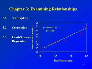
3.1 Scatterplots • The most effective way to display the relationship between two quantitative variables is ascatterplot.
Scatterplots • Explanatory always on the x axis. • Response always on the y axis. • Each individual data appears as a point in the plot.
Displaying Relationships: Scatterplots Make a scatterplot of the relationship between body weight and pack weight. Since Body weight is our eXplanatory variable, be sure to place it on the X-axis! Scatterplots and Correlation
Interpreting Scatterplots • Look for overall patterns. • Be able to describe form, direction and strength of relationship. • Deviations: An important kind of deviation is an outlier.
Interpreting Scatterplots • Form: two distinct clusters with no outliers. Why? (States that favor ACT vs. SAT) • Direction: (negative association) States with a higher percentage of students taking the SAT tend to have lower scores.
Strength of the relationship of a scatterplot. • Strength is determined by how closely the points follow a clear form. • This scatterplot is not strong. States with similar percents show quite a bit of scatter.
Interpreting Scatterplots Scatterplots and Correlation Direction: Two variables have a positive association when above-average values of one tend to accompany above-average values of the other, and when below-average values also tend to occur together. Two variables have a negative association when above-average values of one tend to accompany below-average values of the other. There is a moderately strong, negative, curved relationship between the percent of students in a state who take the SAT and the mean SAT math score. Further, there are two distinct clusters of states and two possible outliers that fall outside the overall pattern. Strength Direction Form
Here is an example of a stronger relationship with a clearer form.
Ex: Heating Degree-Days • Describe the direction and strength of the relationship. • Are the variables positively or negatively associated?
Direction and Strength • Strong:points are close together • Positive association: more degree days mean colder weather and then more gas is used.
Form • Describe the form of the association. Is it linear? yes • Strong relationships make accurate predictions possible.
Interpreting Scatterplots Scatterplots and Correlation Outlier • There is one possible outlier, the hiker with the body weight of 187 pounds seems to be carrying relatively less weight than are the other group members. Strength Direction Form • There is a moderately strong, positive, linear relationship between body weight and pack weight. • It appears that lighter students are carrying lighter backpacks.
Exercise: IQ and School Grades • Do students with higher IQ test scores tend to do better in school? The figure below is a scatter plot of school grade point average (GPA) for all 78 seventh-grade students in a rural Midwest school.
Positive Association • Say in words what a positive association between IQ and GPA would mean. Students with higher IQs tend to have higher GPAs and visa versa.
Form • What is the form of the relationship? Is it roughly linear? Is it very strong? Explain your answers. The relationship is positive, roughly linear, and moderately strong (except for the outliers).
Outliers c. At the bottom of the plot are several points we might call outliers. One student in particular has a very low GPA despite an average IQ score. What are the approximate IQ and GPA for this student? The lowest point on the plot is for a student with an IQ of about 103 and a GPA of about 0.5.
Exercise: Are Jet Skis Dangerous? • Group activity: • Propelled by a stream of pressurized water, jet skis and other so-called wet bikes carry from one to three people. Critics say that they are noisy, dangerous, and damaging to the environment. An article in the August 1997 issue of the Journal of the American Medical Association reported on a survey that tracked emergency room visits at randomly selected hospitals nationwide. Here are the data on the number of jet skis in use, the number of accidents, and the number of fatalities for the years 1987 – 1996.
Use the data and graph provided. • We want to examine the relationship between the number of jet skis in use and the number of accidents. Which is the explanatory variable? • Make a scatterplot of these data by hand. • Be sure to label the axis with variable names, not just x and y. • What does the scatterplot show about the relationship between these variables? c. Calculator scatterplot next.
Scatterplot with the calculator • Enter the explanatory variable on the first list. Number of jet skis in use • Enter the response variable in the second list. Number of accidents • STAT PLOT: first graph choice is a scatterplot. Xlist: 1st list Ylist: 2nd list • Cont.
Use ZoomStat to obtain the graph. The windows will automatically be set. • If you copy a scatterplot to your paper, make sure you scale and label the axis.Trace will help you get started.
Looking Ahead… In the next Sections… • We’ll learn how to describe linear relationships between two quantitative variables. • We’ll learn • Least-squares Regression line • Prediction • Residuals and residual plots • The Role of r2 in Regression • Correlation and Regression Wisdom