Download
1 / 32
320 likes | 455 Views
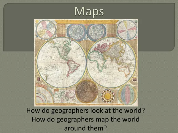
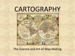
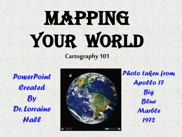
Mapping Your World Cartography 101. PowerPoint Created By Dr. Lorraine Hall. Photo taken from Apollo 17 Big Blue Marble 1972. A person who makes maps is a CARTOGRAPHER .

E N D
MappingYour WorldCartography 101 PowerPoint Created By Dr. Lorraine Hall Photo taken from Apollo 17 Big Blue Marble 1972
A person who makes maps is a CARTOGRAPHER. Amerigo Vespucci was a navigator, explorer, and cartographer. In fact, the North and South American continents were named for him. Carte= chart/map Graph=illustrate
Buzz Words • Distortion – twisting or changing the shape, size, area, direction, or some other characteristic of something. http://www.ilike2learn.com/ilike2learn/africa.html
Buzz Words • Scale – the representation or picture has the same dimensions as the real thing. For example, the map scale is 1:4 .
From Globes to Paper - Making PROJECTIONS • Map PROJECTIONS are the way we represent the curved surface on a plane or flat surface. • When you flatten a multi-dimensional object onto a flat surface, some type of DISTORTION occurs. • Some maps distort shape, some distort distances, etc.
Gross Greenland! • In most classroom maps, the further you travel from the Equator, the greater the distortion. Here’s why. • Most of these maps are cylindrical maps, where the “paper” that records the projection is wrapped around the globe at the Equator. • Therefore, the areas touching the globe are accurate, but polar areas furthest from the globe’s Equator are extremely distorted, making small areas appear huge.
The Real Story Conic Projection Showing Greenland Cylindrical Projection Note how in the map on the right Greenland is about the size of South America! To see the real story, compare the globe to your class room map.
90° Longitudes and Latitudes • Describe the latitude lines at the poles on this cylindrical map. • Compare these to the longitude lines on a globe, explaining why the higher latitudes are so distorted. • Particularly check out Greenland and Antarctica. • How do these compare in size to their images on the globe?
Polar Spread • The longitude lines do not meet at the Poles, as they do on a globe. • They are perpendicular to the latitude lines, not only at the Equator, but all the way up to the Poles. • Therefore, space has to be filled in to expand the area between these lines that on a globe come together. That is why areas such as Greenland look humongous! Areas expand more and more the farther they get from the Equator.
Note the Different Distortions (particularly in Greenland and Antarctica)
Three Projections … Three Distortions
Physical Map • Physicalmapsdepict (show) the physical or naturalfeatures such as various landforms (mountains, plains, deserts) and water bodies (lakes and rivers) present on the earth's surface. Different colors, lines, tints, shading and spot elevations are used to show the elevation and to differentiate (show the difference) lowlands from the mountains in physical maps. • Why would a person who is hiking in the wilderness want to have a physical map? • What is meant by the term elevation?
elevation Elevation is the height above a fixed point, such as sea level.
Relief map A relief map is an example of a purely physical map. It shows a picture of the earth’s surface, the elevation of mountains or the depths of the sea. What color is the coastal plain? What color indicates the highest mountains?
Can you ID Me? • This physical map is the oldest known map of Africa, dating back to 1389. It was produced in China, created on a 17 square meter piece of silk fabric. • First shown in 2002, it was part of an exhibition in South Africa, showing the ways Africa is perceived around the world. • The map clearly shows South Africa's Drakensberg mountain range and probably depict Lake Victoria and the River Nile, 14th century cartographers viewed it. • http://news.bbc.co.uk/2/hi/africa/2446907.stm http://news.bbc.co.uk/2/hi/africa/2446907.stm
Political maps • A POLITICAL MAP shows lines defining man-made political units, such as countries, states, counties, provinces, or territories. It shows which areas of the earth belong to whom. • Political maps may show cities, roads, schools, hospitals, etc. A road map is a great example of a political map. • Unlike physical boundaries, political boundaries change – often in the blink of an eye! Political boundaries often change as a result of ethnic or religious differences, war, or hegemony.
Buzz Words • Hegemony: ideas and beliefs or economic influence exerted by a dominant group over a less powerful group, not always with the weaker group’s consent. • Can you think of some examples of hegemony?
How POLITICAL MAPS change The map on the left shows the Austro-Hungarian Empire as it existed from 1867 to 1918, and the penciled-in boundaries drawn by the Versailles Treaty ending World War I. You can see how extensive that empire was and the countries that make the Austria and Hungary of today.
Political MapS Of Africa 1914 – European Colonial Rule 2010 - Independence
Political Boundaries Macedonia, Croatia, Serbia, Bosnia and Herzegovina, Slovenia, and Montenegro became independent states in 1992, following a series of ethnic civil wars. From 1943 until 1992, all of these countries made up the single state of the Socialist Federal Republic of Yugoslavia.
Political boundaries off and on • In 1963, Singapore became a part of the Malaysian Confederation, partly to form an alliance against threatening Communist groups. • Less than two years later, Singapore withdrew from the confederation because of political differences and disagreements over the civil rights of different ethnic groups.
PHYSICAL-POLITICAL map Most maps are a combination of physical and political, showing man-made features, as well as natural features, such as mountains, rivers, lakes, etc.
Topo or topographic maps • Topographical maps use precise measurements and engineering to portray the shapes and elevations of mountains, valleys, and plains; the network of streams and rivers; the location of cities, roads, political boundaries, and other human features. • In our country, the U.S. Geological Survey is responsible for preparing these maps and has over 54,000 maps that portray every square inch of the United States!
A Topo Map • TOPOGRAPHIC MAPS use a wide variety of symbols to represent human and physical features. Among the most striking are the topo maps' display of the topography or terrain of the area. Contour lines, called isolines, are used to represent elevation by connecting points of equal elevation.
contour mapwith isolines The number labels on the lines show the different elevations. The closer together the lines are, the steeper the incline – the more rapidly the elevation increases.
Most topographic maps are produced at a large enough scale to show individual buildings and all streets in cities. In urbanized areas, important buildings are represented in black though the urbanized area surrounding them is represented with a red shading.
“When I parked my car I recorded a waypoint on my GPS, labeled it as "PARKING" and skiied down the railtrail, stopping at three of the trail's landmarks to record and label waypoints. These were also downloaded from the eTrex into my computer using the TOPO! software. You can see the waypoints and the labels that I gave them in the field plotted on the map below. TOPO! automatically plotted them atop of a USGS 1:24,000 topo map. ”
The Key to reading a map • The LEGEND or KEY explains the meaning of various symbols on the map
Compass rose N Remember that west is on the left so that west to east on the map spells WE. NW NE E W SW SE S
TRICKY STUFF!!! • BEWARE! • Make sure you are measuring by the right scale. • 2.Remember: The larger the scale, the more detail. • If you see roads, buildings, etc., it is a LARGE SCALE map. Scale has nothing to do with the size of the map. Small scale maps have no detail. scale Short line =km
Sources Cited • http://www.nationalatlas.gov/articles/mapping/a_projections.html • http://www.trendhunter.com/photos/51632#14