Download
1 / 23
230 likes | 235 Views
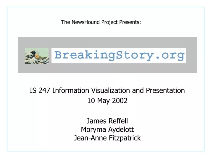
The NewsHound Project Presents:. IS 247 Information Visualization and Presentation 10 May 2002 James Reffell Moryma Aydelott Jean-Anne Fitzpatrick. Project Overview. Goals Exploration of themes in web-based news over time and by geographic region Purposes and target audiences

E N D
The NewsHound Project Presents: IS 247 Information Visualization and Presentation 10 May 2002 James ReffellMoryma AydelottJean-Anne Fitzpatrick
Project Overview • Goals • Exploration of themes in web-based news over time and by geographic region • Purposes and target audiences • For professional media critics, a overview tool that complements existing resources (Google, Lexis-Nexis) • For news enthusiasts, an exploration tool that is both informative and fun
Today’s presentation • Describe and demonstrate our system • Brief overview • Visualization aspects of system • Discuss and present concepts for future work
Data and Metadata • Data: • Text of international news web site front pages, collected daily • Metadata: • Geographical: region and country associated with each site • Temporal: date associated with each page • System features • Filtering: by date range and by geography or site • Aggregation: by date and by geography
Implementation • Data collection and initial HTML/text processing in Perl • MySQL database for hierarchical geographic metadata • Remaining functions in Java / JSP: • Indexing and search using Lucene • Custom routines for data aggregation and scaling • Chart applets using Kavachart
Related work • News: • ThemeScape / NewsMaps • Galaxy of News • Text data: • Conversation map • SeeSoft • General visualization principles: • Tufte • Kosslyn, McKinlay, Bertin
Approach: What we didn’t do • An extremely novel visualization
Approach: What we did • Line charts: • A familiar and readily understandable visualization • Overview with access to details (text and numerical data) on demand • Small multiples • Comparison • Detection of outliers • Multiple views combining graphical and tabular data • Single chart plus query preview table • Small multiple charts plus summary table • Full text with KWIC highlighting • Visual elements of UI design: • Pre-attentive cues (color) • Gestalt cues (grouping)
System Demo http://www.breakingstory.org
User Testing • User testing focused on interaction design, but also encompassed visualization • Questions: • Did users understand what chart data represented? • Was the single chart representation comprehensible and useful? • Were multiple charts comprehensible and useful? • How closely should the full text view match the source site layout? (Results: not at first, yes, yes, perfectly or not at all)
Design Changes • Major user test finding related to visualization: need to normalize data across charts (references per page per day, rather than just references per day) • Other visualization-related changes: • Y-axis values on small chart view • Improved X-axis scales, varied by time range • Highlighting entire sentence on full text view • Change icon to provide visual cue about availability of multiple query terms per chart
Future work • Many possibilities for visualization of this data! • System expansion possible in many areas (e.g., search capabilities, natural language processing, breadth or depth of corpus). Each of these changes would impact the visualization design. • One concept for visualization we’ve explored in detail: combining line chart with additional views, dynamic interaction
Conclusions • Affordances of visual representation complement text • Even for “simple” visualizations, understanding core principles aids design • Interaction design and visualization design may compete for attention, but both improve the resulting system
Questions? For more information on the NewsHound project, go to our project website:http://dream.sims.berkeley.edu/newshound To explore the Breaking Story system, go to: www.breakingstory.org To see a more comprehensive demo of the system, come to our final project presentation on Tuesday!