Download
1 / 33
330 likes | 406 Views
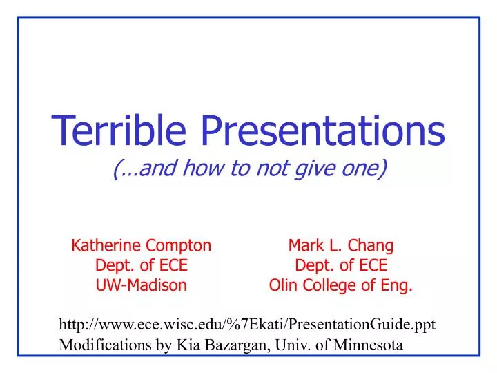
Terrible Presentations (…and how to not give one). Katherine Compton Dept. of ECE UW-Madison. Mark L. Chang Dept. of ECE Olin College of Eng. http://www.ece.wisc.edu/%7Ekati/PresentationGuide.ppt. Modifications by Kia Bazargan, Univ. of Minnesota. Tips For Presenting. Part I: You!

E N D
Terrible Presentations(…and how to not give one) Katherine Compton Dept. of ECE UW-Madison Mark L. Chang Dept. of ECE Olin College of Eng. http://www.ece.wisc.edu/%7Ekati/PresentationGuide.ppt Modifications by Kia Bazargan, Univ. of Minnesota
Tips For Presenting • Part I: You! • Attitude, habits, do’s and don’ts • Practice, practice, practice • Part II: flow of the presentation • Logical ordering of material • Audience, audience, audience • Revise, revise, revise • Part III: Slide formats • Best format for each topic • Graphs, text, animation
Powerpoint Addiction • YOU are the presentation, not the slides! • Don’t just read off your slides • Engage the audience • Look at them • Point at things • Modulate your voice
Dead Man Talking • Are you staring… • at your advisor/boss? • at your laptop? • at the screen? • Are you hidingbehind the podium? • Are your hands/facemotionless? • IF SO… you’re probably BORING!
Is This Thing On <tap tap>? • Feedback kills people! • Microphone: middle of your chest • Not 2mm from your mouth • Modulate your voice evenly
Your “Moves” • You have a set of “moves”that repeat during your talk • Do a practice for friends • Make sure they’re not too nice • What are your hand gestures? • Make sure they aren’tsilly looking • Don’t point with youmiddle finger From the movie“Hitch”
Common Laser Pointer Moves • The circle, the underline • DO NOT POINT AT EVERYTHING • DO NOT POINT AT AUDIENCE!!! • Don’t point at your laptop screen • They can’t see it
Ummmm… The… Uh… Yeah. • Practice makes perfect • Do not read your slides like a script • Most people lose 20 IQ points in front of an audience
How to Handle Questions… • If you don’t understand the question, don’t be shy: ask for clarification • If the question is too long/complex,simplify and repeat for the audience • Short answer is the key: get to the point • Handling questions needs practice
Slide Design • Goals: • Convey the necessary information • Understandable for THEM • Take-away message • Avoid: • Stuffing their heads with EVERY DETAIL of your work
Know Your Audience • Their background? • How much motivationfor your work? • How detailed should you get? • Go over your material: do they know where this part fits in the big picture?
Revise, Revise, Revise • When preparing slides: multiple iterations • Logical flow of material • Ask “why did I add this slide?” • Trim down material • Ask “what might be ambiguous in this slide?” • Ask a friend to listen to your talk
Anatomy of a Presentation • Intro / motivation • Why they should listen to this talk • WHAT you are trying to solve • Outline • Main work • Results • Conclusion / summary • Bring people back if they zoned out • Remind them why you’re great • Give “selling” points here: 30x performance increase with only 10% area penalty
README.TXT • Do not attempt to put all the text, code, or explanation of what you are talking about directly onto the slide, especially if it consists of full, long sentences. Or paragraphs. There’s no place for paragraphs on slides. If you have complete sentences, you can probably take something out. • If you do that, you will have too much stuff to read on the slide, which isn’t always a good thing. • Like the previous slide, people do not really read all the stuff on the slides. • That’s why it’s called a “presentation” and not “a reading” of your work • Practice makes perfect, which is what gets you away from having to have all of you “notes” in textual form on the screen in front of you. • Utilize the Notes function of PowerPoint, have them printed out for your reference. • The audience doesn’t need to hear the exact same thing that you are reading to them. • The bullet points are simply talking points and should attempt to summarize the big ideas that you are trying to convey • If you’ve reached anything less than 18 point font, for God’s sake, please: • Remove some of the text • Split up the text and put it on separate slides • Perhaps you are trying to do much in this one slide? • Reading a slide is annoying. • You should not simply be a text-to-speech converter.
“you probably can’t see this, but…” • Your audience is far fromthe screen Lucida Sans 32 pt 28 pt 24 pt 20 pt 18 pt 16 pt 14 pt 12 pt 10 pt Tahoma 32 pt 28 pt 24 pt 20 pt 18 pt 16 pt 14 pt 12 pt 10 pt TNR 32 pt 28 pt 24 pt 20 pt 18 pt 16 pt 14 pt 12 pt 10 pt Courier 32 pt 28 pt 24 pt 20 pt 18 pt 16 pt 14 pt 12 pt 10 pt
“you probably can’t see this, but…” 10 6 Energy Virtex 2 HARP alu4 apex2 apex4 des ex1010 ex5p misex3 pdc seq spla
System Architecture System Architecture • There’s a CPU, a RAM and an FPGA and they’re all connected - The FPGA connects to the CPU’s data cache - The bus is 32 bits wide - Blah blah blah blah • You have to visualize it yourself CPU data cache main memory 32 32 FPGA Picture This
Example Animation • Compute-intensive sections on hardware • Hardware reconfigured for each wwwwwwwwwww wwwwwwwwwww wwwwwwwww wwwwwwwwwwwwwww wwwwwwwwww wwwwwwwwwwwwww w wwwwwwwwwwwwwww wwwwwwwwww wwwwwwwwwwwww wwwwwwwwwwwwww wwwwwwwwww wwwwww wwwwwwwwwwwww w w FPGA Source code
Example Animation • Compute-intensive sections on hardware • Hardware reconfigured for each wwwwwwwwwww wwwwwwwwwww wwwwwwwww wwwwwwwwwwwwwww wwwwwwwwww wwwwwwwwwwwwww w wwwwwwwwwwwwwww wwwwwwwwww wwwwwwwwwwwww wwwwwwwwwwwwww wwwwwwwwww wwwwww wwwwwwwwwwwww w w FPGA Source code
You are not Pixar Studios • Previous slide(s) used “animation”… • Use only where it is USEFUL • Know if presentation system will handle • Different versions of PowerPoint, Macs, etc. • Or use multiple slides to safely animate • Flip-book style Animation Use it sparingly Can (it can be annoying) Be Very Distracting
And Sometimes You Are Pixar! 1 1 1 1 A pipelined version • IO Bound • 100% Efficient 2 2 2 2 3 3 3 3 4 4 4 4 5 5 5 5 6 6 6 6 7 7 7 7 8 8 8 8 9 9 9 9 10 10 10 10 11 11 11 11 12 12 12 12 13 13 13 13 14 14 14 14 15 15 15 15 16 16 16 16 Slide from: “A Systolic FFT Architecture for Real Time FPGA Systems”, P. Jackson, C. Chan, C. Rader, J. Scalera, and M. Vai, HPEC’04
Mommy, my eyes are burning! • Can you look at this for 45 minutes? • Colors look different on every LCD projector • Colors look different between transparencies and projector • Side note: if printing slides, may want to choose white background to save ink!
I See A Ghost • More contrast on monitor than projector • Different projectors == different results • Colors to avoid with white are: • Light Green • Light Blue • Pale Yellow • Your slides should have good contrast Usually can’t read this…
Equations • Ummm… okay…
g BB D N l h B A a FF HH EE q c V o F H n GG E DD VV YY R p II m h KK NN K JJ k Y OO L I CC t J O TT QQ C X f PP ZZ LL Q M MM P Z RR XX x r T y u SS d WW z G w UU S v W s b AA U e j Use Simple Examples • This isn’t one. It doesn’t help.
Sure you want to use a table? • 8 out of 10 circuits yield better delay. • 3% better delay on average, max 9.5% • This slide not that easy to digest • Graphs are your friends!
What type of graph? Scatter plot? Bar chart? Labels/axis visible? Define what the axis are showing Larger values good or bad? (e.g., speedup vs. runtime) Don’t just show the graph, talk about trends, meaning Graphs Scatter plot from: Rajeev R. Rao, Anirudh Devgan, David Blaauw, Dennis Sylvester, “Parametric Yield Estimation Considering Leakage Variability”, DAC 2004.
Bad Presentations • Audience won’t see your work as great • But will make fun of you fromthe back row What does that slide say? Those are some NASTY colors… Dunno, I’m playing minesweeper Hey – it matches my tie. Please let it be OVER… zzz
Good Presentations • Interesting topic, explained at audience’s level • Slides are understandable and easy to see • Good presentations reflect well on speaker! I understood this one! I wonder if this technique would work for my problem You shouldwith a PhD… Let’s talk to them at the break But it’s outsidemy main area I never thought of that! Interesting