Download
1 / 10
100 likes | 231 Views
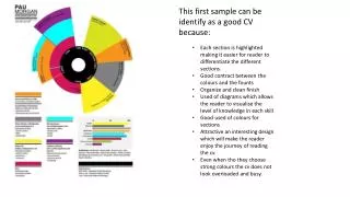
This first sample can be identify as a good CV because:. Each section is highlighted making it easier for reader to differentiate the different sections. Good contract between the colours and the founts Organize and clean finish

E N D
This first sample can be identify as a good CV because: • Each section is highlighted making it easier for reader to differentiate the different sections. • Good contract between the colours and the founts • Organize and clean finish • Used of diagrams which allows the reader to visualise the level of knowledge in each skill • Good used of colours for sections • Attractive an interesting design which will make the reader enjoy the journey of reading the cv. • Even when tho they choose strong colours the cv does not look overloaded and busy.
The example can also be identify as a good CV because: • Clear separation of each section • Good contact information display • Effective layout in each section • Mix of fonts and graphic correctly • Good balance between the colours chosen. • Easy to read and follow • Calm and neutral atmosphere
On this cv I found some good parts as well as some areas that could be modified: • Good balance colour combination • Graphics and fonts that makes the cv interesting • Each section is grouped on its own specific space • Too big the size of the name • Not very visible subheadings • Maybe too many graphics if it for a Interior design company • I like how they played with the alternation of the two colours
Similar to the previous cv example they are also good sides and aspect that could be modified in this cv design: • Good overall structure because it doesn’t look messy of disorganized • The colour chosen for the name and subheading are good but the description writhed on each section is a little difficult to read because the colour is too clear compare to the white background. • I like the graphics added at the button on the cv representing the grade of knowledge on the software’s • In a way it kind of feel like there is a lack of information and she used graphics to full the space
This cv is a clear example of a good cv design and layout. • Good contracts between colours • Interesting layout • Good collection of information but because of the design the cv doesn’t looked over packed • I think the name should have been smaller • Neat
This cv below has some points I found good done and others that could be modified those are: • I really love how the information has been distributed • Good combination of colours on the subheading section • Not clear understanding of the information of each section • Hard to read • I was a good design idea but along it look like she started to compress all the information in order to make them fit
This a clear example of a bad cv because: • Too much information • Even when she tried to introduce some colour to make the cv more interesting, it is still look boring • Busy • Non good coronation of font size
Good and bad facts: • The cv look like a menu list from a bar • It doesn’t look busy instead with lack of information • Good difference between headings and subheadings • Used of graphics which makes it eye-catching • The colour print looks poo quality and boring
This sample can be seen as ok depending of what kind of position applying for but overall: • Too busy • Too many graphics • Confusing • Distracted • I like how the timeline is displayed • The personal picture should has been bigger to be able to differentiate it from the rest of the images
Conclusion • GOOD CV • Organize • Easy to read and understand • Good correlation of colours and graphics • Neat • Clean • Professional look • Clear • BAD CV • Too many information • Over loaded with colours/graphics and fonts • Lack of personality • Boring • Messy • Hard to read