Creating Data Tables and Graphs
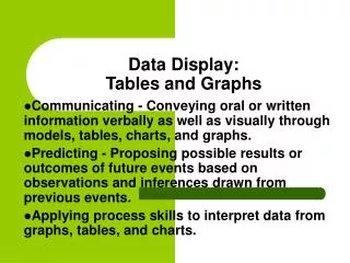
Creating Data Tables and Graphs. --All data tables and graphs must have titles. --Units should also be included (where appropriate). . Data Tables. Calories Burned in 30 Minutes of Activity. Data Tables. Data tables are used to organize and record measurements that you make.

Creating Data Tables and Graphs
E N D
Presentation Transcript
--All data tables and graphs must have titles. --Units should also be included (where appropriate).
Data Tables Calories Burned in 30 Minutes of Activity
Data Tables • Data tables are used to organize and record measurements that you make. • Include columns and rows. Those are labeled and include units.
Data Tables Calories Burned in 30 Minutes of Activity
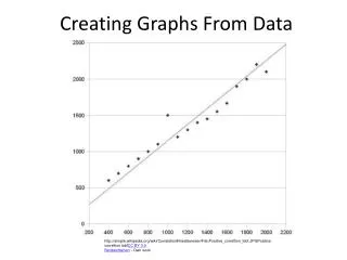
Bar and Line Graphs • Horizontal axis is the x-axis, vertical axis is the y-axis
Bar and Line Graphs • Make sure the each axis is labeled • The vertical axis (y-axis) should be labeled with the responding variable, the horizontal axis (x-axis) should be labeled with the manipulated variable • Include units
Line Graphs Minimum wage ($)
Line Graphs • Used to display data that shows how one variable (the responding variable) changes in response to another variable (the manipulated variable)
Bar Graphs • Used to display data in a number of separate categories • The lengths of the bars are used to represent and compare data.
Double Bar Graphs • Used to display data 2 sets of data. The two bars of each measurement are shown next to each other.
Pie Charts • Used to display data in a number of separate categories • Circle graphs can only be used when the data can be expressed as percentages of a whole.