Tables and Graphs
This guide focuses on organizing data using tables and graphs, highlighting best practices for visual representation. Learn how to create line graphs to show trends over time and bar graphs for comparing frequencies. Understand the importance of histograms and their role in displaying data intervals. Essential tips for success include proper labeling of axes, categories, and units of measure, along with maintaining clarity through titles. Engage in practical exercises to reinforce your skills and enhance your understanding of data visualization.

Tables and Graphs
E N D
Presentation Transcript
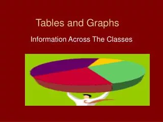
Tables and Graphs Information Across The Classes
Organizing Data in a Table • Practice Workbook page 19
Making a Graph from the data • Data that compares trends over time should be displayed on a line graph • Data that compares frequency of objects should be displayed on a bar graph • A histograph is a special bar graph that compares frequencies taking place in intervals
See the difference? See how the line graph shows how the individual company trends can be seen and compared to the other companies? This is the purpose of the line graph See how the visual display tends to just showcase each year’s comparison among companies? This is the purpose of a bar graph.
Hints for getting an A on graphs • Label x and y axis • Label the categories used • Make sure your units of measure are the same • Put a title on the graph! • Now your turn • Page 21 PWB #3
Wrap It Up • Homework tonight • Page 46 #11-19 All • Is your vocab list done? • Are you studying and attending tutoring? • 1: I am so lost!!!! • 5: With a little bit of studying I have this • 10: Yeah I have an A in this unit!!!!!