Download
1 / 14
250 likes | 427 Views
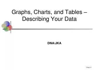
Graphs, Charts, and Tables - Describing Your Data. Frequency Distributions. A frequency distribution is the sum of a set of data that displays the number of observations in each of the distributions distinct categories or classes. Frequency Distribution of Years in College (Figure 2-1).

E N D
Frequency Distributions A frequency distribution is the sum of a set of data that displays the number of observations in each of the distributions distinct categories or classes.
Relative Frequency The relative frequency is the proportion of total observations contained in a given category.
Relative Frequency Distribution of Years in College(Figure 2-3)
Grouping Data Into Classes • Continuous data: Data whose possible values are uncountable and which may assume any value in an interval. • Data array: Data that have been sorted in ascending or descending order. • Mutually exclusive classes: Classes that do not overlap. • All inclusive classes: A set of classes that contains all the possible values. • Equal width classes: Distance between lowest possible value and highest possible value in each class is the same.
Steps for Grouping Data Into Classes • Step 1: Determine the number of groups or classes to use. • Step 2: Establish the class width.
Steps for Grouping Data Into Classes • Step 1: Determine the number of groups or classes to use. • Step 2: Establish the class width. • Step 3: Determine the class boundaries for each class.
Steps for Grouping Data Into Classes • Step 1: Determine the number of groups or classes to use. • Step 2: Establish the class width. • Step 3: Determine the class boundaries for each class. • Step 4: Count the number of values in each class.
Frequency Histograms A histogram shows three general types of information: • It provides visual indication of where the approximate center if the data is. • We can gain an understanding of the degree of spread, or variation, in the data. • We can observe the shape of the distribution.