Download
1 / 14
140 likes | 258 Views
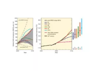
Stippling means 90% of models or more agree in the sign of change. Stippling means 90% or more of models agree in the sign of change. What is behind agreement/disagreement: A distribution of projected changes. Looking at regional averages of temperature change.

E N D
Stippling means 90% of models or more agree in the sign of change
Stippling means 90% or more of models agree in the sign of change
What is behind agreement/disagreement: A distribution of projected changes Looking at regional averages of temperature change
What is behind agreement/disagreement: A distribution of projected changes Looking at regional averages of % precipitation change
Extremes from GCMs Frost Days
Extremes from GCMs Heat Waves Duration
Extremes from GCMs Precipitation Intensity
Extremes from GCMs Dry Days
Return level curves for four climate extreme variables, estimated on the basis of annual maxima from the period 1950-1999 at a location in Contra Costa county. The four variables are, from left to roght, top to bottom, maximum temperature, 3-day average maximum temperature, minimum temperature and 3-day average minimum temperature. Black solid line is curve estimated from observed dataset. Blue line are curves estimated from the 6 downscaled 20C3M simulations downscaled by BCSD, green line are the subset of three simulations downscaled by Analog.Dashed lines are corresponding 95% Confidence intervals.
Return level curves for annual maxima of maximum temperatures (top) and maximum 3-day temperatures (bottom) for BCSD (left) and Analog (right) downscaled datasets. Each panel compares three sets of curves. Black: current climate simulations (20C3M, 1950-1999), Orange SRES B1 (2050-2099) . Red SRES A2 (2050-2099). Results for a grid point centered within the Contra Costa county.
Frequency of freezing spells (7 consecutive days or more with minimum temperatures below 0 degrees C) for 58 locations in California representative of the 58 counties. Dots represent observed frequencies over the 50 years 1951-2000 (NCDC coop station data). Black lines indicate the range of 20th Century simulations (1951-2000) across 6 GCMs and 2 downscaling methods. Orange and red lines represent ranges of future frequencies under SRES A2 for, respectively, 2001-2050 and 2051-2100.