Download
1 / 14
140 likes | 237 Views
Learn about the transition from classic Roman characters to bold and expressive display fonts, their structure, stroke weights, and historical impact. Explore the development of typefaces through different eras, from Imperial Roman to modern experimental designs.

E N D
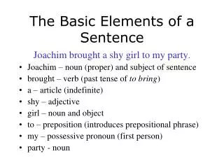
Characterized by a relatively consistent stroke weight, Imperial Roman characters form the basis for type design over subsequent millennia. In these forms, the essential structure and proportions of letters are codified.
Renaissance type designers looked to the archaic forms for inspiration but refined their structure and expression into the kinds of typefaces we call classical or _______________.
This term describes faces that evolved out of classical types but show a marked change in their structure. They appeared in England in the eighteenth century as type drawing began to move away from the written model and toward a more rational approach.
In the late eighteenth century, reference to the handdrawn form was diminished. The drawing of these sort of typefaces, although dependent on its derivation from brush or broad-nibbed pen, is a radical departure. The contrast in the strokes is extreme, with the thin strokes reduced to hairlines and the thick strokes made bolder; the axis of the curved forms is completely upright; and the brackets connecting the serifs to the stems have been removed, creating a stark and elegant juncture.
These typefaces are an outgrowth of “display types” of the nineteenth century—aggressively stylized faces designed for the Industrial Revolution’s new industry: advertising. They were designed to be as bizarre as possible or bold and simplified, stripped of nonessential details.
Another outgrowth of display types, the _______________ (or Egyptian) face is a hybrid form. Mixing the bold, solid presentation of a sans serif and the distinctive horizontal stress of a serif face, the _____________________ is characterized by an overall consistency in stroke weight.
These typefaces are the decorative, experimental children of the display fonts. Their visual qualities are expressive but not conducive to reading in a long text. This category of faces includes specimens like script faces, fancy and complex faces inspired by handwriting, and idiosyncratic faces that are conceptually interesting or illustrative.
Horizontal measure, for purposes of spacing, is divided into units based on the width of a typeface’s uppercase M at a given size. The square of this width, which vertically includes the depth of the descenders, is called the ______________.
A single ______________, never two, follows a period before the initial cap of the next sentence.
The spaces before and after a comma or quotation mark should be ____________; these mares carry additional space above or below them, respectively.
______________—specially drawn characters that correct spacing difficulties between letter pairs—provide a clue to optimal spacing. Ex: “fi”
_____________ is the vertical measure from the baseline of one line to the baseline of the line below it in a paragraph.
The block, or _____________, grid is structurally the simplest kind of grid. As the name implies, its base structure is a rectangular text area that takes up most of the page. Its job is to accommodate extensive continuous text, such as a book or long essay, and it developed from the tradition of written manuscript that eventually led to book printing.
Information that is discontinuous benefits from being organized into an arrangement of vertical columns. Because the columns can be dependent on each other for running text, independent for small blocks of text, or crossed over to make wider columns, the ____________ is very flexible.