Effective Graph Types for Data Visualization
80 likes | 103 Views
Learn how to utilize bar, line, and circle graphs to represent and interpret data accurately and efficiently. Discover the best graph type selection for different datasets examples included.

Effective Graph Types for Data Visualization
E N D
Presentation Transcript
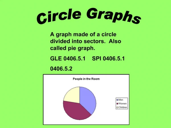
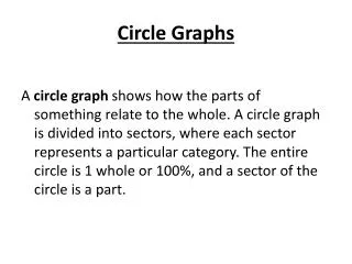
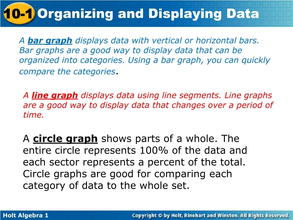
A bar graph displays data with vertical or horizontal bars. Bar graphs are a good way to display data that can be organized into categories. Using a bar graph, you can quickly compare the categories. A line graph displays data using line segments. Line graphs are a good way to display data that changes over a period of time. A circle graph shows parts of a whole. The entire circle represents 100% of the data and each sector represents a percent of the total. Circle graphs are good for comparing each category of data to the whole set.
Example 5: Reading and Interpreting Circle Graphs Use the graph to answer the question. 12.5% 12.5% 50% 25% Which ingredients are present in equal amounts? Lemon sherbet and pineapple juice. Look for same sized sectors.
Reading Math The sections of a circle graph are called sectors.
Degrees Held by Faculty Bachelor's: PhD: Master's: Example 6B: Choosing and Creating an Appropriate Display Use the given data to make a graph. Explain why you choose that type of graph. A circle graph is good for displaying categories that make up a whole. Step 1 Calculate the percent of total represented by each category.
Example 6B Continued Step 2 Find the angle measure for each sector of the graph. Since there are 360° in a circle, multiply each percent by 360°. PhD: 0.10 360° = 36° Master’s: 0.39 360° = 140.4° Bachelor’s: 0.51 360° = 183.6°
Example 6B Continued Step 3 Use a compass to draw a circle. Mark the center and use a straightedge to draw one radius. Then use a protractor to draw each central angle. Step 4 Title the graph and label each sector.
County Farms 248 Example 6C: Choosing and Creating an Appropriate Display Use the given data to make a graph. Explain why you choose that type of graph. A line graph is appropriate for this data because it will show the change over time. Step 1 Determine the scale and interval for each set of data. Time should be plotted on the horizontal axis because it is independent.
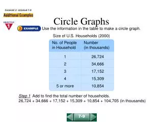
Lesson Quiz: Part II 4. The table shows how many orders were placed for each type of muffin at a bakery in one week. Use the data to make a graph. Explain why you chose that type of graph. A circle graph is used to compare each type of muffin to total muffin orders.