Download
1 / 19
190 likes | 361 Views
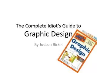
The Complete Idiot’s Guide to Graphic Design. By Judson Birkel. What is Graphic Design?. Communication through the use of text and image. An exciting process that turns raw marketing and promotion ideas into printed and electronic tools.

E N D
The Complete Idiot’s Guide to Graphic Design By Judson Birkel
What is Graphic Design? • Communication through the use of text and image. • An exciting process that turns raw marketing and promotion ideas into printed and electronic tools. • Good graphic design makes information more understandable and more appealing.
Who is my audience? Who you’re addressing will effect the type and style of piece you design. • Employees • Customers • Volunteers • Community Members • etc
What is your purpose? You need to decided what you want your piece to accomplish. • Generate new business • Reconnect with old customers • Garner support for a legislative issue • Raise money for a charity • Etc.
Find Examples • Look at what others have done that you like. • Create a Swipe file (a collection of examples of good work you’ve come across). • File away styles you like and images that inspire you.
Brainstorm • Sketch out symbols (look up words in symbol dictionaries such as www.symbols.com) • Figure out the 5 W’s • Who • What • Where • When • Why
Vector vs. Raster • Vector based images are created mathematically using a drawing program resulting in crisp clean lines. Easily scalable. Illustrator is an example of a vector based program. • Raster based images are represented as a collection of pixels. They don’t scale well. Photoshop is an example of a raster based program.
Design Elements • Point – A single spot on a page • Line – Show Direction • Shape – circles, squares, rectangles, and triangles used as building blocks. • Form – Three dimensional Perspective • Tone – Lightness and darkness • Texture – The character of a surface • Color – Primary, Secondary, Tertiary. Adds impact and interest to objects and design. • Letterform – text.
Design Principles • Balance – Symmetrical or asymmetrical • Contrast – size (big vs. small) and color (complimentary colors) • Cropping – Selecting elements of design we want the user to see • Hierarchy – Size, weight, and scale adding emphasis to objects. • Scale – Size of an object in relation or other objects in the design • Proportion – Pleasing ratios to the human eye (3:2, 5:2, 8:5, 1:1.62) • Pattern – repetition of elements
Strategies and Tools • Size – making your design the right size for what you’re making. • Substrate – print your design on something other than paper. • Be prepared to step away from convention!!!
Type vs. Font • Type – all characters in a typeset • Font – Describes each character
4 Major Typeface Categories • Serif – Typefaces with “tails”. Easiest to read on paper. (Times New Roman) • Sans Serif – Typefaces without tails. Easiest to read on computers. (Arial) • Decorative – Fancy Letters that can be difficult to read. (Comic Sans) • Script – calligraphy or handwritten Used for formal announcements. (Brush Script)
Visual Perception • Rule of Thirds – Divide a page into 3rds from left to right and from top to bottom. Where lines intersect is where the strongest locations to place focal points are. • Make design elements appear in order of importance. • Hierarchy can be ranked by position, size, scale, weight of type, or color of image.
Color Harmony • Use a color scheme based on analogous colors • Analogous = 3 tertiary colors that are side by side on the color wheel. • Use a color scheme based on complementary colors. • Complementary = direct opposites on a color wheel. • Note – A color can be percieved differently based on the background color
Color Theory • Value: lightness or darkness of a color. • Hue: the pure color itself. • Primary Colors – Red Yellow Blue. • Secondary Colors – Any combination of 2 primary colors
Paper Selection • Weight – How thick a sheet of paper is. • Texture – The actual feel of the paper.
Image Selection • Photographs – Best at showing subject matter • Suggest mood and style, enhancing overall reaction to your design • Illustrations – Great at showing added information that photographs alone can’t do.
Photography • Subject – Photo should match the idea you’re presenting. • Sizing – avoid distorting an image. Have a good resolution. • Cropping for Effect – Shift focus • Filters and Effects – Creating emphasis through color manipulation and collages.
Illustration • Technical – Present a true-to-life look at a product or process • Stylistic – Drawings and and paintings created using a variety of techniques, styles, and media. • Photo Realism – Looks almost like photographs • Scratchboard – scratches off the color of a board • Cartoon • Line art – Pen and Pencil Drawings • Etc.