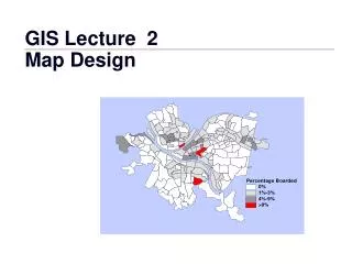
Map Design
Map Design. Map Layout and Design. Key components to consider when designing a map Legibility Visual Contrast Visual Balance Figure-Ground Relationship Hierarchical Organization. Legibility Make sure that graphic symbols are easy to read and understand

Map Design
E N D
Presentation Transcript
Map Layout and Design Key components to consider when designing a map Legibility Visual Contrast Visual Balance Figure-Ground Relationship Hierarchical Organization
Legibility Make sure that graphic symbols are easy to read and understand Size, color, pattern must be easily distinguishable Map Layout and Design
Visual Contrast Uniformity produces monotony Strive for contrast/variation (butdon’toverdoit) Variation can be expressed with Size Intensity Shape Color Map Layout andDesign
Map Layout and Design Visual Balance Keep things in balance Think about the graphic weight, visual weight Graphic weight is affected by darkness/lightness, intensity and density of map elements Visual center is slightly above the actual center (standard is 5%)
Visual center 5% of height 5% of height Portrait Landscape
Map Layout and Design Figure-Ground Relationship Complex, automatic reaction of eye and brain to a graphic display Figure: stands outGround: recedes
Map Layout and Design Figure-Ground Relationship All other things being equal, there are factors that are likely to cause an object to be perceived as figure (i.e. stand out from background) Articulation & detail Objects that are complete (e.g. land areas contained within a map border) Smaller areas (relative to large background areas) Darker areas
Map Layout and Design Color Conventions “Normal” colors that we’ve become accustomed to seeing (these are somewhat standard worldwide, but can be culturally specific) Part of the figure – ground relationship Common Examples Water = blue Forests = green Elevation: low = dark high = light (because mountains can have snow on top) Roads in a road atlas: Interstate = blue Highway = red Small road = gray
Map Layout and Design Figure-Ground Relationship Very difficult to develop a hard and fast rule with figure ground, relies on a mix of factors
Map Layout and Design Hierarchical Organization Use of graphical organization schemes to focus reader’s attention Types Extensional Stereogrammatic Subdivisional
Hierarchical Organization Extensional “Ranks Features on the Map” Use of different sized line symbols for roads
Hierarchical Organization Subdivisional Portrays the internal divisions of a hierarchy Example: Regions of North Carolina
Hierarchical Organization Stereogrammatic Gives the impression that classes of features lie at different levels on the map Those on top are most important
P i e d m o n t W e s t e r n C o a s t a l P l a i n M o u n i s
Text: Selection and Placement POINT AREA LINE
Example Map Types • We will consider five thematic map types • Choropleth • Proportional symbol • Dot density • Isoline Maps • Cartograms
Choropleth Maps • Greek: choros (place) + plethos (filled)
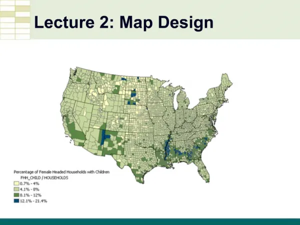
Choropleth Maps Source: http://www.gis.psu.edu/geog121/pop.html
Choropleth Maps • These use polygonal enumeration units • E.g. census tract, counties, watersheds, etc. • Data values are generally classified into ranges • Polygons can produce misleading impressions • Area/size of polygon vs. quantity of thematic data value
Thematic Mapping Issue:Modifiable Area Unit Problem • Assumption: • Mapped phenomena are uniformly spatially distributed within each polygon unit • This is usually not true! • Boundaries of enumeration units are frequently unrelated to the spatial distribution of the phenomena being mapped • This issue is always present when dealing with data collected or aggregated by polygon units
MAUP Modifiable Areal Unit Problem: (numbers represents the polygon mean)Scale Effects (a,b) Zoning Effects (c,d) The following numbers refer to quantities per unit area a)b) c) d) Summary: As you “scale up” or choose different zoning boundaries, results change.
Review: Generalizing Spatial Objects Representing an object as a point, a line, or a polygon? Depends on Scale (small or large area) Data Purpose of your research Example: House Point (small scale mapping) Polygon 3D object (modeling a city block)
Review: Generalizing Spatial Objects • Scale effects how an object is generalized • Left houses appear to have length & width (polygons) • Right houses appear as points
Generalizing Data by Attribute So generalization can mean abstracting a real-world geographic feature to a data (GIS) or map object But generalization can also refer to how we convey attribute information on a map through the use of symbols, colors, etc. This process is generally referred to as classifying
Classifying Thematic Data • Data values are classified into ranges for many thematic maps (especially choropleth) • This aids the reader’s interpretation of map • Trade-off: • Presenting the underlying data accurately • VS. • Generalizing data using classes • Goal is to meaningfully classify the data • Group features with similar values • Assign them the same symbol/color • But how to meaningfully classify the data?
Creating Classes • How many classes should we use? • Too few - obscures patterns • Too many - confuses map reader • Difficult to recognize more than 4-5 classes
Creating Classes Methods to create classes Assign classes manually Equal intervals This ignores the data distribution Natural breaks Quantiles quartiles E.g., quartiles - top 25%, 25% above middle, 25% below middle, bottom 25% (quintiles uses 20%) standard deviation Mean +/- 1 standard deviation, mean +/- 2 standard deviations …
The Effect of Classification Equal Interval Splits data into user-specified number of classes of equal width Each class has a different number of observations
The Effect of Classification Quantiles Data divided so that there are an equal number of observations are in each class Some classes can have quite narrow intervals
The Effect of Classification Natural Breaks Splits data into classes based on natural breaks represented in the data histogram
The Effect of Classification Standard Deviation Mean + or – Std. Deviation(s)
Natural Breaks Quantiles Equal Interval Standard Deviation
Thematic Mapping Issue:Counts Vs. Ratios When mapping count data, a problem frequently occurs where smaller enumeration units have lower counts than larger enumeration units simply because of their size. This masks the actual spatial distribution of the phenomena. Solution: map densities by area E.g., population density, per capita income, automobile accidents per road mile, etc.
Thematic Mapping Issue:Counts Vs. Ratios • Raw count (absolute) values may present a misleading picture • Solution: • Normalize the data • E.g., ratio values
Proportional Symbol Maps • Size of symbol is proportional to size of datavalue • Also called graduated symbol maps • Frequently used for mapping points’ attributes • Easily avoids distortions due to area size as seen in choropleth maps by using both size and color
Dot Density Maps • Dot density maps provide an immediate picture of density over area • 1 dot = some quantity of data value • E.g. 1 dot = 500 persons • The quantity is generally associated with polygon enumeration unit • MAUP still exists • Placement of dots within polygon enumeration units can be an issue, especially with sparse data
Dot Density Maps Population by county
Dot Density Maps Map credits/source: Division of HIV/AIDS Prevention, National Center for HIV, STD, and TB Prevention (NCHSTP), Centers for Disease Control.
Isoline Maps Lines on the map that are used to visualize a surface Isolines are best for continuous data (raster), but frequently applied to discrete data (vector) too Drawing the lines (or data) in-between the data points utilizes the processes of interpolation Interpolation: “The action of introducing or inserting among other things or between the members of any series”
Making Isolines Can you draw Isolines with an interval of 5 units?