Chapter 4 Displaying Quantitative Data
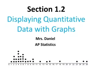
Chapter 4 Displaying Quantitative Data. Graphs for Quantitative Data. Dotplot. Used with numerical data (either discrete or continuous) Made by putting dots (or X’s) on a number line Can make comparative dotplots by using the same axis for multiple groups. Be sure to label the boxplots.

Chapter 4 Displaying Quantitative Data
E N D
Presentation Transcript
Dotplot • Used with numerical data (either discrete or continuous) • Made by putting dots (or X’s) on a number line • Can make comparative dotplots by using the same axis for multiple groups. Be sure to label the boxplots. • Used for small sets of data.
Symmetrical • refers to data in which both sides are (more or less) the same when the graph is folded vertically down the middle • bell-shaped is a special type • has a center mound with two sloping tails
Uniform • refers to data in which every class has equal or approximately equal frequency
Skewed (left/negatively or right/positively) • refers to data in which one side (tail) is longer than the other side • the direction of skewness is on the side of the longer tail
Bimodal (multi-modal) • refers to data in which two (or more) classes have the largest frequency & are separated by at least one other class
What strikes you as the most distinctive difference among the distributions of exam scores in classes A, B, & C ?
1. Center • discuss where the middle of the data falls • three types of central tendency • mean, median, & mode
Class What strikes you as the most distinctive difference among the distributions of scores in classes D, E, & F?
2. Spread • discuss how spread out the data is • refers to the variability of the data • Range, standard deviation, IQR
What strikes you as the most distinctive difference among the distributions of exam scores in classes G, H, & I ?
3. Shape • refers to the overall shape of the distribution • symmetrical, uniform, skewed, or bimodal
J What strikes you as the most distinctive difference among the distribution of exam scores in class J ?
K What strikes you as the most distinctive difference among the distribution of exam scores in class K ?
4. Unusual occurrences • outliers - value that lies away from the rest of the data • gaps • clusters • anything else unusual
L What strikes you as the most distinctive difference among the distribution of exam scores in class L ?
5. In context • You must write your answer in reference to the specifics in the problem, using correct statistical vocabulary and using complete sentences!
Stemplots (Stem & Leaf Plots) • Used with univariate, numerical data • Must have key so that we know how to read numbers • Can split stems when you have long list of leaves • Can have a comparative stemplot with two groups Would a stemplot be a good graph for the number of pieces of gun chewed per day by AP Stat students? Why or why not? Would a stemplot be a good graph for the number of pairs of shoes owned by AP Stat students? Why or why not?
Example: The following data are price per ounce for various brands of dandruff shampoo at a local grocery store. 0.32 0.21 0.29 0.54 0.17 0.28 0.36 0.23 Can you make a stemplot with this data?
Example: Tobacco use in G-rated Movies Total tobacco exposure time (in seconds) for Disney movies: 223 176 548 37 158 51 299 37 11 165 74 9 2 6 23 206 9 Total tobacco exposure time (in seconds) for other studios’ movies: 205 162 6 1 117 5 91 155 24 55 17 Make a comparative (back-to-back) stemplot.
Histograms • Used with numerical data • Bars touch on histograms • Two types • Discrete • Bars are centered over discrete values • Continuous • Bars cover a class (interval) of values • For comparative histograms – use two separate graphs with the same scale on the horizontal axis Would a histogram be a good graph for the fastest speed driven by AP Stat students? Why or why not? Would a histogram be a good graph for the number of pieces of gum chewed per day by AP Stat students? Why or why not?
The two histograms below display the distribution of heights of gymnasts and the distribution of heights of female basketball players. Which is which? Why? Heights – Figure A Heights – Figure B
Suppose you found a pair of size 6 shoes left outside the locker room. Which team would you go to first to find the owner of the shoes? Why? Suppose a tall woman (5 ft 11 in) tells you see is looking for her sister who is practicing with a gym. To which team would you send her? Why? What aspects of the graphs helped you answer these questions?
Electronic Components Example • Manufacturing an electronic component requires attaching very fine wires to a semiconductor wafer. If the strength of the bond is weak, the component may fail. Here are the measurements of the breaking strength (in pounds) of 23 connections. 0 0 550 750 950 950 1150 1150 1150 1150 1150 1250 1250 1350 1450 1450 1450 1550 1550 1550 1850 2050 3150
Scatterplot • Shows the relationship between two quantitative variables measured on the same individual • The values of one individual appear on the horizontal axis, and the values of the other variable appear on the vertical axis.
Timeplots • Display data that change over time • Successive values are usually connected with lines to show trends more clearly.
Cumulative Relative Frequency Plot(Ogive) • . . . is used to answer questions about percentiles. • Percentiles are the percent of individuals that are at or below a certain value. • Quartiles are located every 25% of the data. The first quartile (Q1) is the 25th percentile, while the third quartile (Q3) is the 75th percentile. What is the special name for Q2? • Interquartile Range (IQR) is the range of the middle half (50%) of the data. IQR = Q3 – Q1