1.2 Displaying Quantitative Data with Graphs
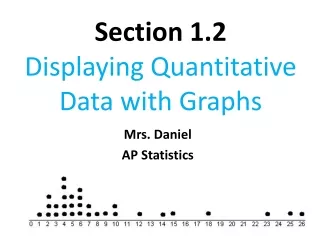
1.2 Displaying Quantitative Data with Graphs. Dotplots. Very simple to create with each dot representing a data value. Best for non continuous data but can be made for and quantitative data 2004 US Women’s Soccer Team Goals (34 Games) How to create the Dotplot :

1.2 Displaying Quantitative Data with Graphs
E N D
Presentation Transcript
Dotplots • Very simple to create with each dot representing a data value. Best for non continuous data but can be made for and quantitative data 2004 US Women’s Soccer Team Goals (34 Games) How to create the Dotplot: • Draw and scale the horizontal axis be sure to label it • Mark a dot above the location of its value, evenly space the dots vertically so the heights indicate relative heights
Describing a Distribution* (S.O.C.S.) • You will asked to “describe” a distribution often and this needs to trigger the ideas of S.O.C.S. • SHAPE –describe the overall pattern of the data • OUTLIERS – note data values that are far outside the range of the rest of the data or are deviations from the general pattern • CENTER – Give an appropriate measure of center (more on this soon). • SPREAD – Give an appropriate measure of center (more later).
Describing Shape • Mode: peaks of the data (most common values) • Unimodal – there is one peak in the data • Bimodal – there are two peaks in the data • Symmetric: if the left side and right side are roughly mirror images of eachother • Skew: • Right skewed if the right half (larger values) is much longer than the left • Left skewed if the left half (lower values) is much longer than the right. • Gaps: Any notable span of values in the range of the data with no observations should be noted.
UNIMODAL BIMODAL Even though the bimodal data has one peak that is the MOST common result, the fact that there are two distinct modes in the data is a notable characteristic of the data and should be mention in describing its shape.
Symmetric Data has a left and right side that are approximately mirror images of each other. It can be unimodal or multimodal data and still be symmetric. The skew of a distribution refers to the TAILSnot the “peaks”. Since the left graph has a larger and longer tail on the left, it is left (negatively) skewed. The graph on the right has the larger tail on the right or higher values so it is called right (positively) skewed. Skewed Left (Negatively ) Skewed Right (Positively)
Describing Center • Median: The data value that has half of the observed values above it and half below it. It is the middle value. Best used if the distribution is skewed because extreme values do not affect the Median too much. • Mean: The average of value of the data. Extreme values and outliers have a very LARGE impact on the mean and so the mean should be used for symmetric data.
Describing Spread • Range: a very simple and not very descriptive value to show the spread from the lowest value to the highest value. • Standard Deviation: A way of measuring each data value’s distance from the mean and combining those distances into a calculation that describes the spread (more on this soon). • Interquartile Range: The distance between the value with one-fourth of the data below it and the value with three-fourths of the data below it (more soon).
Describing Outliers • Don’t declare something an outlier unless you KNOW it is (you’ll learn how in the next section). If you’re not sure, say it is a “possible” outlier • We want to note anything that lies outside the overall pattern of the rest of the distribution. • Very large or very small values • Clusters of values that are away from the rest of the data • DON’T IGNORE OUTLIERS! Outliers can just be an error in measurement but the may also indicate something important and further investigation should be made to discover why it was an outlier.
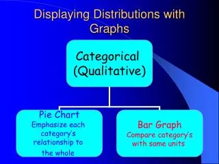
Comparing Distributions • It is insufficient to simply describe each distribution (S.O.C.S.) • You must explicitly compare the two using descriptions like “greater than”, “less than” or “about the same”. • Describe clearly how the shape, center and spread of one distribution compares to the shape, center and spread of the other distribution
Stemplots (Stem and Leaf Plot) • A quick way to see the distribution of the data • Let’s you see the actual values in the data • Some data sets can be difficult for stemplots • How to make a stemplot: • Separate the data values into stems which are all but the last digit of the value and write them down a vertical column from smallest to largest. • Include all stems from minimum value to the maximum value even if there are no observations for that stem. • Write each leaf which is the last digit of the value with the smallest leaf closest to the stem going outward to the largest leaf. • Provide a key that explains the context of the data and • the meaning of the stems and leafs (scale).
Number of shoes owned by 20 female students from our school: MAKE A STEMPLOT OF THE DATA: The data ranges from 13 to 57 so we will need stems from 1 to 5. Every single data value has its own leaf even if it is a repeated value. 13 occurs three times in the data set so there are three leaves for the “1” stem that are shown as a 3 ***This one is your completed stemplot
Splitting Stems • Sometimes the values in a data set all fall within just a few stems, to get a better “picture” of the data we can split the stems. Number of shoes owned by 20 MALE students in our school: Normal Stems: Split Stems:top stem is leaves that are 0-4 and bottom is leaves from 5-9 for 5-9 The split stems give a better picture of the distribution
Back to Back Stemplots • Allows you to show two distributions on the same stems. • Makes it easy to compare the distributions Number of pairs of shoes
Warnings about Stemplots • Stemplots do not work well for large data sets where each stem has a large number of leaves • There is no magic number of stems to use but a good rule is to have at least 5 of them. Too few or too many make it difficult to see the shape of the distribution. • If you split stems make sure that each stem has the same number of possible leaves in it. 2 stems with 5 possible leaves or 5 stems with 2 possible leaves would be fine. 3 stems with 4 leaves in one and 3 leaves in the other two would not be ok. • Rounding the data so that the final digit is suitable as a leaf helps give a good stem plot from data with too many digits. For example if the data value was $42,581, could round it to $43,000 and have a 4 as the stem and a 3 as the leaf.
Check your understanding This data is the percent of a states population that is 65 or over. All 50 states are shown in the stemplot. The low outlier is Alaska. What percent of Alaska residents are 65 or older? Ignoring the outlier, describe the shape of the distribution The center of the distribution is close to what percent?
Histograms! • Histograms group data that is close together into “classes” and shows how many or what percentage of the data fall into each “class”. • It is important that no data value belongs to more than one “class” so it is important that we clearly label the classes in our histogram on the horizontal axis. • The vertical axis must indicate if we are showing counts or percentages and scaled appropriately.
How to make a histogram • Divide the range of your data into equal sized groups called classes • Define the range of each class • Count how many values fall into each class (or find the percentage in each class • Each bar should be equal width and the height reflects the count or percentage • Do not skip classes with no values in them. The data ranges from 1.2 to 27.2 so we’ll make our classes be 5 wide. We will include the bottom value in each class: 0 to <5 5 to <10 10 to <15 15 to <20 20 to <25 25 to <30
Class Size in a Histogram • Just like stemplots, we want to find the right number of classes to show a good picture of the data. • Too few classes result in a “skyscraper” effect where all the data lies in just a few classes. • Too many classes will “flatten” the data and give many short bars in the histogram. • Use your judgment as to how many classes are needed to give a clear picture of the distribution of the data.
Warnings About Histograms • Don’t confuse Histograms with Bar Graphs • Don’t use counts in a frequency table as data • Use percents instead of counts when comparing distributions with a different number of observations. • Just because a graph looks nice doesn’t make it a meaningful display of data