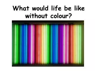
Color in Interaction Design: Perception, Deficiencies, and Cultural Influences
This article explores the human perceptual system in relation to color perception, including issues such as color deficiencies and cultural influences. It also discusses the use of color in interaction design and the considerations that need to be taken into account.

Color in Interaction Design: Perception, Deficiencies, and Cultural Influences
E N D
Presentation Transcript
The Human Perceptual System Using Colour in Interaction Design Colour Concerns for Interaction Design Technical Issues Concerning Colour Chapter 9: Colour
The Human Perceptual System • Colour Perception • Colour Deficiencies • Individual and Cultural Issues
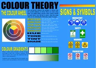
Colour Perception • Human colour perception depends on the way in which light waves interact with objects in the environment • Some light waves are absorbed some pass through • Opaque • Translucent • Transparent • Those that are blocked are what we see • The frequencies of the reflected waves determine the colour we perceive
Colour Perception The perceived colour of an object can change drastically under different lighting situations • The colour of an object depends on the light source and the nature of the light it emits (Metamerism) • Red/blue light bulb party • However computer screens usually emit enough light for colour not be effected. • Too much external light is of course a problem outside
Colour Perception • The Human Visual System (rods and cones) • The cones are sensitive to colour and are more prevalent in the central part of the retina • Cones don’t work well in low light (ie night) • The rods are situated mostly in the periphery of the retina and are sensitive to motion and low-light environments • Rods are dominant vision receptors at night • Interesting site http://www.hhmi.org/senses
Colour Perception - Visual Limitations Avoid using blue for text and small screen elements Our ability to distinguish colour is directly related to the size of an object colour perception is weak in our peripheral vision Do not rely only on colour to delineate shape
Colour Deficiencies – colour blindness • Photoreceptors vary greatly from person to person • Many people are colour blind • 8% of male individuals • 0.4% of female individuals • The most common form is red-green, known as deuteranomaly • 5% of male individuals • 95% of colour deficiencies in female individuals • Online checker http://www.vischeck.com/vischeck/vischeckImage.php
Colour Deficiencies • Factors affecting colour perception: • Culture • Age • Fatigue • Emotions • Ambient light • Light sources • Blood oxygen levels
Individual and Cultural Issues • Ask a person to name a favorite colour and what it reminds him of, then ask another person about the same colour • There are some (not many), standards… • Unfortunately this one isn’t good if you are red green colour blind
Individual and Cultural Issues • Globalization—Localization • Emotions: Associations with yellow range from grace and nobility in Japan, to cowardice and caution in the United States, to happiness and prosperity in Egypt (Russo & Boor, 1993) • Age: People of different generations have observable and often contrasting preferences in colour • Gender: In most cultures gender can greatly influence colour decisions • Fashion: colours fashions come and go (even on computer interfaces • Physical Appearance: Mail box colours
Using colour in Interaction Design • Clarification, Relation, and Differentiation • Searching • Comprehension, Retention, and Recall • Tasks and Performance • Redundant Coding
Using colour in Interaction Design • Clarification, Relation, and Differentiation • Colour can be used to clarify differences and similarities and communicate relationships • Colour codes can be used to support a logical information structure.
Using Colour in Interaction Design Colour can be used to catch the attention of the user
Using Colour in Interaction Design • Tasks and Performance • Colour improves performance in the following tasks: (Hoadley) • Recall task • Search-and-locate task • Retention task • Decision judgment task
Using Colour in Interaction Design • Redundant Coding A clear structure and presentation must already be present before colour is introduced • Studies have shown that people are better at search tasks when the targets of the search are coded using more than one parameter, for instance, colour and shape (Thorell & Smith, 1990)
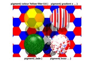
Colour Concerns for Interaction Design • Indistinguishable Differences • Optimal colours • Number of colours • Incompatible Differences • colour Backgrounds
Colour Concerns for Interaction Design • Indistinguishable Differences Our ability to perceive subtle changes varies from colour to colour Target objects must use highly diverse colours from those in their surroundings
Colour Concerns for Interaction Design • Number of colours • To remember a colour and then recognize it later, we should use only a few distinct colours • To be able to tell the difference between two adjacent colour-coded objects, we can use more colours Interface colours should never distract the user or compete with content
Colour Concerns for Interaction Design • Incompatible Differences • colours at opposing ends of the spectrum such as red and blue require the eye to use two different focal lengths • Positive contrast makes characters appear to glow (Halation)
Colour Concerns for Interaction Design • Colour Backgrounds The perceived colour of an object is affected by the colour of its background
Technical Issues Concerning Colour • Self study from the text book • colour Displays • Computing Environment • Colour Systems • Colour Contrast • Colour Space • Web-Based colour • The Colour Picker
Technical Issues Concerning Colour • Colour Displays • Computer screens create colour by mixing red, green, and blue (RGB) light • This is an additive process • We must work within the limitations of the human perceptual system and within the limitations of computer screen technology
Technical Issues Concerning Colour • The use of colour in interaction design involves the following four components: • Human perception • Display technology • User tasks • Computing environment
Technical Issues Concerning Colour • Colours with the same brightness levels can appear lighter or darker than each other • a really quick check is to print in black and white Light and dark colours Light and dark colours—grayscale
Technical Issues Concerning Colour • Colour Space • There are numerous colour pickers and generally you work with what is available. • The hue, saturation, and value (HSV) colour space
Making a Colour scheme • Quite a number of tools have predefined colour schemes • Companies often have an existing colour scheme (look at logos, stationary, brochures)
Finally • Colour is part of the aesthetics of a interface • and • Aesthetics are very important!!! • ‘nice’ interfaces work better.