Download
1 / 6

E N D
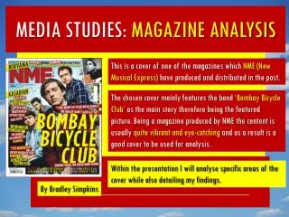
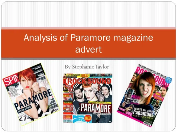
Analysis of Paramore magazine advert By Stephanie Taylor
Front cover Header: The header indicates what's in the magazine, by using “win!” connotes a message to the audience of succession and receiving some sort of price, a competition draws the audience in and allows them to be interested in purchasing the magazine. Mas thread: “KERRANG!” is clearly shown to the buyers of the popular magazine which is stretched out at the top of this publication., which takes up almost a fifth of the page and uses a dramatic front style almost like broken glass shattered which suggests rebellion and anger, which is associated with the rock genre. The sell lines/ cover lines: the main sell line anchors the main image “I have nothing left to prove” this suggests that Hayley has reaches her destination in music and has finally done what she can. Again with the capital letters on the font throughout the cover proposes a strong message of importance with the typography sans serif. Main cover line: by using Paramore in capital letters emphasises the bands name and how important this is, however the line having very strong heavy messages portrayed with the use of black connotes negativity, rather than more sophisticated feel that a female magazine usually has. Background: The background and overall layout of the magazine is very plain and bland with the white back drop to allow the audience gaze to be at her the artists and the main cover lines, which could give an impression of how women like to be neat and tidy, this gives a stereotypical view on how the audience would read and could look at the front cover. Rule of thirds: the layout observes the rule of thirds to add interest to the target audience. The cover image dominates and feels very busy and almost cluttered on the left third of the magazine, this could suggests a unconventional readership of rock magazines and the none conformists who break the rules of intersection enables the reader to directly look at those points. Language: The use of written language on the front cover is very direct and commanding ensuring that the reader does what the magazine wants (to entice them in). Colour: by using 3 main colours throughout this music magazine gives more stylised, cohesive structure to the magazine. The colours whites, blacks and yellows connote a message that it’s a new and original yet sticks to the theme of being a rock magazine, by using the colour yellow it symbolises a different approach to target a wider range of people. By contrasting the image with white gives the magazine a more different approach to what Kerrrang normally follows. Footer: the footer is almost represented as a banner which is a strip running along the bottom of the magazine. The footer simply lists other bands and artists that will feature in the magazine, the use of the word “plus” at the beginning of it suggests there will be a lot going in in the magazine.
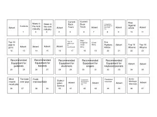
Contents page: ‘bring me to the horizon’ is a cover line used here targeted at the audience. However Karrang have used this lexis in this case to suggest they are above any level of music which reveals a connotation of higher authority, empowerment and confidence. Rule of thirds: This has been used again where Karrang have followed the typical conventions of a music magazine to allow the attraction of the ‘Gaze’ to fall on these hotspots of the magazine . For example the first box draws attention to the photography insert and the main background image behind. Footer- being used at the top to show the importance of the magazine and frames the page. Background, layout & composition- The background image and overall style is very clutters on the contents page compared to the front cover, which shows that a lot is going on in this magazine and that t is busy. By splitting the page into two separate sections; main image at the top and contended at the bottom gives it a different methods which possibly gain interest for some readers. Editors note: The editors note on the let third of the magazine helps the readers feel more involved and engaged in what's happening by the use of 2nd person using words such as ‘we’ in the introduction acknowledges the audience to feel connected. Also the editor has hand drawn her signature herself which shows he contrast between the other typed lettering. Subscription box: is being used to allow audiences to be a member of the Karrang club and be part of all news, gossips, actions ect. By adding the contact details it promotes forward that you should ring then to get people involved, also the price is indicated so that you are getting false gimmicks. Masthead: the masthead has been consistent throughout the magazine which suggests the unified style/theme to the magazine and does not need to be changed as Karrang targets the audience who read there publication entirely. By using the same big shattered glass lettering advocates that they are powerful, strong and determined in there music. Page numbers & brief summary: this allows the readers to navigate through the magazine and find what they need quick and easy for the reader. Sub heading blocked out into black sub-sections: by using the blocked out background and a bold type on to draw attention to the sub-section. By-line: This is used in indicate who the images and text is written by. The contents page is split up into 5 columns which can be confusing and look chaotic, however Karrang has chosen to represent it in this way to show the busy lifestyle Kerrang music play.
Background: Is very dull, dark and can almost see a skyline in the near distant this suggests that the ‘paramore’ are on tour somewhere whilst playing there music or a backdrop to allow the audience not to focus on the background and the image it self. Double page spread Main heading: ‘Paramore’ is main typography here which illustrates the band in this photograph by placing this here beside it gives new audiences indication of who this band is. Main image: this double page spread is very image based with only the band paramour. The fact that this is very image manipulated is to attract maybe a target audience who do not prefer to read large amounts of text, which could give a stereotypical point in the readership of kerrang magazine are uneducated and are only interested in purely images. Hayley Williams is the core focus here as she is exposed to be in colour to her band members and the overall image. Karrang may have chosen to do this as a target audience is predominantly males and this would suggest that she is portrayed as a sex object to entice men. Hayley’s hair is bright orange which elements of blonde in, which may connote that she is force and ready to rock almost all the time music is what she lives for, also the blonde in her hair could imply that she is female and sometimes blonde is stereotyped as being ‘dumb’ and to have ‘blonde moments’ as though she is placed in a male surrounding of rock has features of being feminine. Rule of thirds: Kerrang have followed the emblematic convention of a music magazine to allow the attraction of the audiences gaze to fall on these hotspots of the magazine especially when this double page spread is dominantly image lead. For example on the right third this is focusing entirely on Hayley Williams as she the attraction to men being the only female who is associated with men which does straightaway draws attention to the photograph and its intersection points. By-line: This could have been used in this magazine to show who the photographer of this specific publication was where as in the NME magazine they have, but it has been used to indicate who the copy has been written by. Anchor- ‘in semiology any caption or key elements that fixes the meaning od an image and directs the viewer towards a preferred reading. For example the main heading ‘Paramore’ on the left hand side of the page is a terminal area where most people wouldn’t look however it is there to relate to the main image and what the copy is about but also the bright yellow colour which is empathises the title.
Analysis of written article • The article of Kerrang talks about how Paramore become as a band and how they are preparing the set for there next big video. • The text talks about how they formed to become unison and how they met. Although there blend of emo-pop and slick, rock &roll eventually made them stars. Paramore began humbly enough in franklin, where Hayley Williams met brothers josh and ZacFarro after moving to the town Mississippi. • The style of the article is very informal with some us of slang which suggests that they are targeting a specific audience, which could relate to a stereotype of how rock viewers are uneducated this is revealed from the double page spread when using image based pictures. The article is written in one short column with approx100-120 words which indicates that it will not disinterests the reader. • The main heading is quite dramatic with the use of bold chunky handwriting which gives an impression that its not hand written and sans-serif font. The use of this is that it wants to show the importance of the article and make sure audiences are drawn to it.
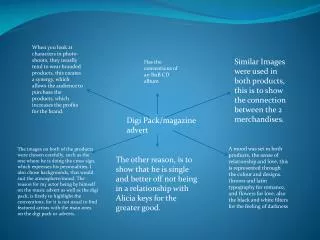
Advert for there album The band name is plain and simplistic typography. This helps us to recognise who the advert is about and allows the name to be easily need. A plain white background behind the black text also allows it to stand out more and the brightness of the white jumps out off the page, making it the first place you look at. The sticky tape around the edges gives connotations of a arty, creative people which are offered connotations of bands in particular rock and indie rock bands. It gives a casual and fun appeal to the poster and can be thought to be giving references to teenagers. Teenagers often stick pictures up around their mirrors or make collages. This image reinforces the youth culture of the band and aims specifically at a younger target audience. In this advert I feel that the advert could challenge the main target audience for this song. The image is the main focus point on the page, it features all the members of the band with Hayley Williams: the main singer at the front. I feel that Andrew Godwin's theory of music videos can apply to magazine adverts also. Each member of the band makes reference to the motion of looking, they are each giving the audience eye contact. Hayley in particular seems to be looking up to the audience which for fans can be inspirational. The setting of the picture compliments the rest of the picture, it is set in a dark, grungy, urban environment which are typical conventions of a rock band. For fans seeing Hayley at the front makes the poster easily recognisable. Hayley is leaning towards the camera with a lot of skin on show this could represent the male gaze theory. The more important texts have been made clearer to read and have been made to look like old bits of paper. The way they have a number to text for the ringtone is a good promotional techniques and is likely to be made for a younger audience. Them having Paramore songs as ring tones will increase the circulation of the song and in turn hopefully crate more interest in the band and will increase the fan base. The main image appears as a picture that has been stuck to a wooden board. This once more gives connotations of a pin-ups and a youth culture. It also gives off a fun care free vibe, which could be a message that is relayed in many more of their songs. At the bottom, surrounded by a white background in the important information on that must been seen such as a production company and logo. It is out of the way to not distract attention from the band, but made bold to stand out so that they are given credit too.