Download

1 / 3
40 likes | 485 Views
Media Studies – School Magazine Analysis.

E N D
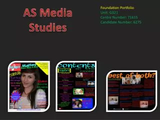
Media Studies – School Magazine Analysis Dateline shown above masthead. This is maybe due to the fact that while the title is unlikely to change the date of each issue will. Consumers may wish to know what issue the magazine is as soon as they have picked the magazine up and as the dateline is shown above the title, they may know the issue before evening reading the title. The title is written in a large, bold, font with Sans Serif lettering. It is also written completely in capital letters to stand out well not only well against the plain light background but also to quickly gain the attention of potential buyers. While it is positioned slightly lower than the dateline, with its large capital letters, it maybe one of the first pieces of the text seen on the cover by consumers. Photos shown slanted, making the magazine resemble a scrapbook. This makes the magazine seem informal and appealing to younger audiences who are more used to see slanted images on magazines than more mature adult audiences. The student shown here is positioned to the left of the page to allow room for other images and text of less importance. Despite this, the image of her is the largest on the page and therefore the most important, perhaps relating to the cover story headline. She is also shown wearing the colour white, which possesses connotations of purity and innocence and also using direct address, creates not only personal relationships with consumers but also a good image of pupils from that particular school. She is also using two props, including a bag and notepad, which are both typical classroom items, often associated with stereotypes of students. Headlines shown in red while details are shown in black in order for the two different pieces of information to be seen clearly. “Exclusive” is used when referring to the prom photos and makes the magazine seem worth buying as the content will not be available in any other magazines. They are not written in bold capitals, perhaps to appeal more towards female audiences? Rhetorical question – Consumers may wish to answer this and find out more in page 14.
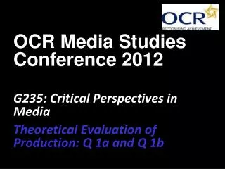
Title and dateline are positioned near the top of the page but slightly to the left to give room to the school log. Again, these are shown around the top to give consumers ideas about the magazine almost immediately after picking the magazine up. The title is shown in lower case font, appealing to female audiences. The title and date are also different colours in order for consumers to keep these pieces of information as two separate pieces in their minds. Image showing silhouettes of two students. They are shown from below, giving them a power appearance. The lack of facial features in the image allows audiences to imagine themselves in the minds of the two students as they could be almost anyone. School logo is shown. Like the masthead, this is a simple feature that consumers/target audiences will come to recognise in the future and will help separate this magazine from others which may have similar features. Headline in large bold font. Like the title, it is positioned to the left to make way for other elements of the cover. A exclamation mark is used to make the headline seem as if it is being spoken aloud to consumers, suggesting that the topic of the headline is of high importance. The page relating to the headline is also shown below in a brighter colour and full lower case font, grabbing attention and appealing to female audiences. The lower case font also makes the magazine seem more informal. School building is shown in the background behind the students. The placement of the students in front of (or in other words, before) the school may have been used to suggest that the magazine focuses more on the students, who to some people may seem more important than the school itself. Boy is shown slightly higher than the girl. This reinforces the stereotype about men’s power being higher than that of women. He is wearing typical uniform/school clothing also, suggesting he is ready for work and also proud to show that he is committed to his school life.
Masthead is written in large bold letters in the colour green, seen around many other parts of the magazine. Like that of the previous magazine, it is positioned to the left to give room to other pieces of text and the school logo. Direct address used, making the magazine seem personal/important to various consumers including those of the target audience age range. The student shown here is positioned to the right of the page to allow room for other images and text of less importance. Despite this, the image of her is the largest on the page and therefore the most important, perhaps relating to the cover story headline. She is also shown wearing the colour white, which possesses connotations of purity and innocence and also using direct address, creates not only personal relationships with consumers but also a good image of pupils from that particular school. She is also using three props, including a bag, folder and notepad, which are both typical classroom items, often associated with stereotypes of students. Main headline written in a certain type of font that resembles hand-writing or graffiti. Handwriting and graffiti are often associated with students, for good reasons and bad reasons. Shadow is also used to make this particular piece of text seem as if it is “jumping” out of the page or in other words, 3D. Additional headlines and main headline details are also including, give consumers many ideas about the subjects of the magazine.