Screen Design
Screen Design. Guidelines for controls (Dix et al.). Place controls that are functionally related together. If controls are used sequentially, organize them sequentially. Make the most frequently-used controls the most accessible.

Screen Design
E N D
Presentation Transcript
Guidelines for controls (Dix et al.) • Place controls that are functionally related together. • If controls are used sequentially, organize them sequentially. • Make the most frequently-used controls the most accessible. • Don’t place a destructive control next to a frequently used one.
Issues in screen design • Layout: do you optimize, or let the user customize? How to organize?
Layout issues Some ways of optimizing layout: • Layout by function, sequence, or frequency • Automatic layouts: consistent location, cascading objects, tiling • Stick to conventions Or: You can let (make) the user choose.
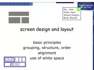
Grids • Horizontal and vertical lines to locate window components • aligns related components • Organization • contrast for dominant elements • element groupings by proximity • organizational structure • alignment • Consistency • location • format • element repetition • organization Format of variable contents Message text in Arial 14, left adjusted Standard icon set Widget to widget spacing No Ok window to widget spacing Fixed components
No regard for order andorganization IBM's Aptiva Communication Center
Haphazard layout Mullet & Sano
Repairing the layout Mullet & Sano
Issues in screen design • Layout: do you optimize, or let the user customize? How to organize? • How will you manage screen clutter and increase signal-to-noise? Edward Tufte on Screen design
Edward Tufte on visual clutter “Various elements collected together on the screen can create all sorts of incidental patterns simply by their combined presence. In these screen sketches, visual clutter results from prison grids of window frames, empty paths, and rectangles and blocks… Note also the effect of dark overscan borders, provoking vivid but content-free shapes around screen images.” Tufte, E. (1989). Visual Design of the User Interface. IBM:Armonk NY, p. 8
A better design: “Here is a before/after redesign that seeks to reduce… noise. Above is a sketch of a conventional screen, with strong grid frames marching around everywhere, doing little to show data. What we seek is a more modest visual means, appropriate to the elementary task of delineating a window. Below, a de-gridded design, simple and elegant, which uses color to define edges.” Tufte, E. (1989). Visual Design of the User Interface. IBM:Armonk NY, p. 9
Screen elements interact. The whole is not the sum of the parts!! Consider the whole screen, not just the individual elements. Review Gestalt principles: Proximity, similarity, good continuation, closure
Good designs: pay attention to layout, color, typography, icons, graphics, and coherence. do not consist of superficial cosmeticmatters or simply decorative touches.
Here, 3-D elements are used both functionally (good!) and decoratively (bad!). This makes the window too cluttered (and suggests an affordance where there shouldn’t be one).
Avoid uninformative elements How do you chose when you can’t even discriminate the choices from each other?
Issues in screen (& menu) design • Layout: do you optimize, or let the user customize? How to organize? • How will you manage screen clutter and increase signal-to-noise? • Should you represent all options at once, or limit options depending on the context?
How much info to provide: Tradeoff Breadth v. depth - trade off searching v. selecting
how can window navigation be reduced? • avoid long paths • avoid deep hierarchies • But: avoid information overload
Issues in screen design • Layout: do you optimize, or let the user customize? How to organize? • How will you manage screen clutter and increase signal-to-noise? • Should you represent all options at once, or limit options depending on the context? • How will you get the user’s attention?
Getting a user’s attention • Make it pop out • Make it darker • Make it move • Make it flash • Make it larger • Place it where the user is looking • Use sound • Use color
Using color on the screen (Tufte) • use color to enhance information • avoid strong colors that can produce after-images • when choosing colors, look at maps or nature for inspiration
Getting a user’s attention A caveat: “when every function on the user interface receives special visual emphasis, then nothing at all has gained emphasis - only visual noise has increased, as stronger and stronger elements compete with each other.” - Tufte (1989). Visual Design of the User Interface, IBM, Armonk, NY, p. 7
To get a user’s attention, use a modality that isn’t currently being used for the primary task, if possible (Baddeley’s theory of working memory) • But use interruptions sparingly. One study showed workers are interrupted every 11 minutes, then take 25 minutes to return to the previous task! (NYTimes Sunday Magazine, “Meet the Life Hackers” by Clive Thompson, 10/16/2005)
More issues in screen design • How to represent states, modes, or contexts? • How to use animation? • How to represent transitions between contexts? (the “where am I” problem) • How to represent dynamic information? • How to incorporate conventions? • What kind of representations to use?
Legibility and readability • typesetting • point size • word and line spacing • line length • indentation • color • font
Legibility and readability • Characters, symbols, graphical elements should be easily noticable and distinguishable TEXT SET INCAPITOLS Text set in Helvetica Text set in Braggadocio (sans-serif) Text set in Times Roman Text set in Courier (serif)
Which is easiest to read? What is the time? What is the time? What is the time? What is the time? What is the time?
These choices must be really important, or are they? Time & Chaos
Text orientation difficult to read Microsoft Word
Tabs excellent means for factoring related items but can be overdone
The power of a (good)representation • Important in problem-solving • Enables the user to make predictions • Provides a natural constraints and mappings • May suggest a useful metaphor • “Graphical” doesn’t mean easy to understand!
Imagery • Signs, icons, symbols • Range from concrete to abstract • Icon design is very hard • except for most familiar, always label them • Image position and type should be related • image “family” • Use images consistently Partial icon family
What do these images mean? One of the tabs is a glossary explaining these images! which one? Icons can be just as cryptic as words! Novell GroupWise 5.1
Space can be used to represent topic, relationships, temporal order, etc. - different views are possible
Some links about design: • GUI examples • Tufte on screen design • Norman: Three Teapots
Some references (suggested by Saul Greenberg) Principles of Effective Visual Communication for GUI design, p.425-441, In Baecker, R., Grudin, J., Buxton, W., and Greenberg, S., eds (1995). Readings in Human Computer Interaction: Towards the Year 2000.Morgan-Kaufmann. Designing visual interfaces: Communication oriented techniques. Mullet, K. and Sano, D. (1995). Sunsoft Press. The Non-Designer's Design Book. Williams, Robin (1994). Peachpit Press Inc.
Terrible alignment • no flow • Poor contrast • cannot distinguish colored labels from editable fields • Poor repetition • buttons do not look like buttons Webforms
Redesigning a layout using alignment and factoring Mullet & Sano