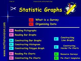
Tables Charts & Graphs
Relative Frequency. Tables Charts & Graphs. Reading Pie Charts. Constructing Pie Charts. Cumulative Frequency Tables. Cumulative Frequency Graphs. Dot Plots. Five Figure Summary. Box Plots. Starter Questions. Relative Frequency. Tables Charts & Graphs. Learning Intention.

Tables Charts & Graphs
E N D
Presentation Transcript
Relative Frequency Tables Charts & Graphs Reading Pie Charts Constructing Pie Charts Cumulative Frequency Tables Cumulative Frequency Graphs Dot Plots Five Figure Summary Box Plots
Relative Frequency Tables Charts & Graphs Learning Intention Success Criteria • Know the term relative frequency. • To understand the term relative frequency. • Calculate relative frequency from data given.
Relative Frequency always added up to 1 Relative Frequency Relative Frequency How often an event happens compared to the total number of events. Tables Charts & Graphs Example : Wine sold in a shop over one week 0.5 180 ÷ 360 = 0.25 90 ÷ 360 = 0.25 90 ÷ 360 = 1 360
Relative Frequency Relative Frequency How often an event happens compared to the total number of events. Tables Charts & Graphs Example Calculate the relative frequency for boys and girls born in the Royal Infirmary hospital in December 2007. Relative Frequency adds up to 1 500 1 0.4 0.6
Tables Charts & Graphs Relative Frequency Now try Exercise 1 Ch10 (page 138)
Pie Charts Reading Pie Charts Learning Intention Success Criteria • Find the relative frequency for an angle with in a Pie Chart. • 1. To interpret information from Pie Charts. • 2. Use relative frequency to interpret Pie Chart information.
Reading Pie Charts Pie charts can be thought of as circle graphs. Two step process • 1. Work out relative frequency of each angle. • 2. Then multiply by the total amount that the circle represents.
Tea Coffee Tea 72o Squash 144o Milk 108o Coffee Squash 36o Milk Pie Charts A drinks machine dispenses 500 drinks on a Monday. The information is displayed in the pie chart. Use the information to find the number of each drink sold. Use the two step process
Tables Charts & Graphs Reading Pie Charts Now try Exercise 2 Ch10 (page 140)
Starter Questions 2cm 3cm 29o 4cm A C 70o 53o 8cm B
Pie Charts Constructing Pie Charts Learning Intention Success Criteria • Find fractions of 360o. • 1. To construct an accurate Pie-Chart from a given table using fractions of 360o. • 2. Use these fractions to construct a Pie Chart given in a table.
Drawing Pie Charts Favourite Sport In a survey, people were asked to indicate which one of five sports they liked best. The information is given in the table. Display the information in a pie chart. Rugby 75 Football 90 Cricket 45 Ice Hockey 60 Squash 30 Total 300
Drawing Pie Charts Favourite Sport In a survey, people were asked to indicate which one of five sports they liked best. The information is given in the table. Display the information in a pie chart. Rugby 75 Football 90 Cricket 45 Ice Hockey 60 Squash 30 Total 300 Rugby
Drawing Pie Charts Favourite Sport In a survey, people were asked to indicate which one of five sports they liked best. The information is given in the table. Display the information in a pie chart. Rugby 75 Football 90 Cricket 45 Ice Hockey 60 Squash 30 Rugby Total 300
Drawing Pie Charts Favourite Sport In a survey, people were asked to indicate which one of five sports they liked best. The information is given in the table. Display the information in a pie chart. Rugby 75 Football 90 Cricket 45 Ice Hockey 60 Squash 30 Rugby Total 300 Football
Drawing Pie Charts Favourite Sport In a survey, people were asked to indicate which one of five sports they liked best. The information is given in the table. Display the information in a pie chart. Rugby 75 Football 90 Cricket 45 Ice Hockey 60 Squash 30 Rugby Football Total 300
Drawing Pie Charts Favourite Sport In a survey, people were asked to indicate which one of five sports they liked best. The information is given in the table. Display the information in a pie chart. Rugby 75 Football 90 Cricket 45 Ice Hockey 60 Squash 30 Rugby Football Total 300 Cricket
Drawing Pie Charts Favourite Sport In a survey, people were asked to indicate which one of five sports they liked best. The information is given in the table. Display the information in a pie chart. Rugby 75 Football 90 Cricket 45 Ice Hockey 60 Squash 30 Rugby Football Total 300 Cricket
Drawing Pie Charts Favourite Sport In a survey, people were asked to indicate which one of five sports they liked best. The information is given in the table. Display the information in a pie chart. Rugby 75 Football 90 Cricket 45 Ice Hockey 60 Squash 30 Rugby Football Total 300 Cricket Squash Ice Hockey
Drawing Pie Charts Favourite Sport In a survey, people were asked to indicate which one of five sports they liked best. The information is given in the table. Display the information in a pie chart. Rugby 75 Football 90 Cricket 45 Ice Hockey 60 Squash 30 Football Rugby Total 300 90o 108o 36o 54o 72o Squash Cricket Ice Hockey
Worksheet Constructing a Pie Chart Drawing Pie Charts FavouriteSport In a survey, people were asked to indicate which one of five sports they liked best. The information is given in the table. Display the information in a pie chart. Rugby 75 Football 90 Cricket 45 Ice Hockey 60 Squash 30 Total
Constructing Pie Charts Now try Exercise 3 Ch10 (page 141)
Cumulative Frequency Tables Learning Intention Success Criteria • Add a third cumulative column to a frequency table. • 1. To explain how to construct a cumulative Frequency Table.
Cumulative Frequency Tables Example : This table shows the number of cars sold by a motor dealership each day over a seven day period. Cum. Freq. Total so far 1 2 2 A third column is added to keep a running total. This makes it easier to get the total number of items. 2 3 5 3 1 6 4 6 12 5 5 17 6 8 25 7 4 29
Cumulative Frequency Tables Construct a cumulative frequency table for this data Shoe Size 1 1 1 4 5 2 5 10 3 14 24 4 2 26 5 4 30 6 30
Cumulative Frequency Tables Now try Exercise 4 Ch10 (page 143)
Cumulative Frequency Tables Learning Intention Success Criteria • Be able to construct a cumulative frequency graph. • 1. To show how to construct a cumulative frequency graph from cumulative frequency table.
How to draw a cumulative frequency graph Cumulative FrequencyGraphs
Plot How to construct a Cumulative Frequency Graph
Cumulative FrequencyGraphs Sometimes called an S – curve graph Write down a question you could ask about this graph.
Cumulative FrequencyGraphs Now try Exercise 5 Ch10 (page 145)
Starter Questions 10cm 90o
Dot Plot Learning Intention Success Criteria • Be able to construct a dot and identify the key features of various plots. • 1. To show how to construct a dot plot and identify key feature..
Dot plots are a very simple yet useful way of getting a feel for data using the number line. Dot Plot
Write down as many key points that you can deduce from the plot. Lowest value is 56 BPM. Highest value is 74 BPM. Mode is 62. Median is also 62. Distribution is fairly flat. Dot Plot Example : A group of students measure their pulse rates when resting. The rates are 66, 69, 62, 58, 74, 56, 67, 72, 61, 62, 59 50 60 70 80
By looking at the shape of the distribution try and describe the 6 types we have. Dot Plot Common expressions for various dot plots. Symmetrical distribution Widely spread out distribution Uniform distribution Tightly clustered distribution Skewed to the right distribution Skewed to the left distribution
Dot Plot Now try Ex. 6 (page 147)
Five Figure Summary Learning Intention Success Criteria • Understand the terms • L , H, Q1, Q2 and Q3. • 1. To explain the meaning and show how to workout the five summary information for a set of data. • Be able to work • L , H, Q1, Q2 and Q3 • For a set of data
When a set of numbers are put in ORDER, it can be summarised by quoting five figures. Five Figure Summary 1. The highest number (H) 2. The lowest number (L) 3. The median, the number that halves the list (Q2) 4. The upper quartile, the median of the upper half (Q3) 5. The lower quartile, the median of the lower half (Q1)
Five Figure Summary Q2 = Median (middle value) Q1 = lower middle value Q3 = upper middle value Example Find the five figure summary for the data. 2, 4, 5, 5, 6, 7, 7, 7, 8, 9, 10 The 11 numbers are already in order ! 5 7 8 Q1 = Q2 = Q3 = 5 8 7 L = 2 H = 10 2 4 5 6 7 7 9 10
Five Figure Summary Q2 = Median (middle value) Q1 = lower middle value Q3 = upper middle value Example Find the five figure summary for the data. 2, 4, 5, 5, 6, 7, 7, 8, 9, 10 The 10 numbers are already in order ! 8 Q1 = Q2 = Q3 = 5 6.5 5 7 7 8 L = H = 10 2 2 4 5 6 9 10
Five Figure Summary Q2 = Median (middle value) Q1 = lower middle value Q3 = upper middle value Example Find the five figure summary for the data. 2, 4, 5, 5, 6, 7, 8, 9, 10 The 9 numbers are already in order ! 6 8.5 Q1 = Q2 = Q3 = 4.5 5 5 7 8 6 L = H = 10 2 2 4 9 10
Five Figure Summary Now try Exercise 7 Ch10 (page 150)
Box Plot Learning Intention Success Criteria • Be able to construct a box plot using the five figure summary data. • 1. To show how to construct a box plot using the five figure summary.