Download
1 / 13
130 likes | 153 Views
This magazine cover showcases the iconic indie style, with black, leather, and grungy clothing. The dark color scheme and relaxed body language appeal to rebellious indie teenagers. Famous indie singers and bands are featured, distinguishing the magazine's genre.

E N D
Indie magazine covers. The Cover image - allows the audience to distinguish this magazine cover as an indie magazine due to an icon for indie audiences (Alex turner), also indie magazines are not so heavy and dull comparing to rock magazines . Props and dress codes are black, leather, casual and grungy clothing emphasises the edgy look of indie genre. It is almost hipster style which highlights the indie genre rather than brutal and aggressive rock style (90’s look). This dark, simplistic colour scheme are aimed at young, rebellious, indie teenagers. NME magazine colours are appropriate to the genre- the black colour connotes sloppy and grungy, self-control etc. And these themes are showcased in this style of music. Their body language and facial expressions are relaxed confident and just about arrogant which is a big part of this genre- tranquil and ‘too cool for school’ sense, rather than aggressive pictures like rock- screaming and a screwing face. Moreover, the anchorage text include famous indie singers and bands which also allows the audience to distinguish the genre of the magazine. The font is not so aggressive as a rock magazine font would be- it is more laid back and laid-back like the indie style (AM magazine).
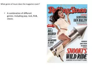
Hip hop magazine covers The black, white and red colour scheme seems to be common in the hip hop magazine. The red colour suggests aggressiveness, savageness and danger; themes associated with the style of music. Moreover, the main image includes famous and iconic hip hop singers or rappers which the audience can immediately tell that it is a ‘rap’ magazine as they are easily recognisable. Especially 2pac who played a big role in this genre. The pictures are also taking from underneath giving the artist more power and authority which relates to most rap lyrics. The artists wearing black clothing like a hat is a convention to a gangster look. Grills, and tattoos incorporates an intimidated look but also a wealthy rapper promoting gold grills and chains- a big give away of a hip hop as it connotes a ‘bad boy’ and violent look style. The coverlines and famous words used by artist seem to be conventional to rap magazines (“young, fly & flashy”). This catchy list of three is also related to the rap theme, words are often catchy and fun. It is aimed at teenage boys and early adulthood as some contains slang and informal language which may interest that age group (15-21).The overall look of the magazine has been made to look quite threatening and give a sense of a bad boy look. The fonts are usually bold and sans serif making a much more serious mood rather than childish and fashion (serif)
Pop magazine covers Pop magazines on the other hand is very busy in terms of colour schemes and cover lines. Pop magazines seems to be more ‘trashy’ compared to the other magazine genres as it is very colourful and has a lot going on. Moreover, different magazine edition seem to be aimed at different audiences; for example, the Jessie J magazine is very glittery and pink which is aimed at young girls. Also, one of the puffs (“Who’s the fittest”) is also aimed at young female as boys would not often have a contribution to this discussion. Other covers such as the Justin Bieber cover implies that the magazine is for autumn edition due to the orange and yellow colours. Pop magazines also include various pictures of famous pop stars which are easily recognisable by the audience allowing them to distinguish that this magazine genre will be pop. The image is often with bright lighting and taken in a studio. Their face expression are generally smiling creating a much more friendly magazine. Furthermore, pop audiences/fans are often young teenagers; pop magazines are intended at more immature part of society (colours, tips that may interest teenagers, etc..) it would be very rare to find an adult reading pop magazine. In other genres, there generally would not have discussions about better looking artists nor tips for your “most embarrassing body worries”. However, pop does, being a more shabby and adolescent magazine.
Rock magazine covers Now we can clearly see the difference between indie and rock genre. Rock has more brutal and violent images compared to indie where it is more relaxed i.e. nirvana (Kurt Cobain) or slipknot cover has the main singer (Corey) which is again, very recognisable amongst the rock style. The image is very belligerent, intimidating and dull which associates with the genre. Moreover, the photography are mainly taken from underneath to show a much powerful character, and if often taken from concerts compared to pop where they prefer to use studio and photoshoot photos. The coverlines are also brusque and brutal; “make us jump up and break stuff” which relates to real rock fans. The puffs are very chaotic and represents drumming and madness linking back to the genre. The bold font also sets a much serious tone to the magazine, contrasting to pop where the fonts are much more fancier. Colour scheme in rock magazines are predominantly bold, solid colours like black, grey and red represents threat which is linked to the style of music (very heavy) Props and dress codes such as black leather, masks, heavy makeup and guitar also suggest that it is a rock magazine, because rock doesn’t normally include pianos of flutes. The mask shows a rebellious nature of the genre. Their body language are also very unrestrained and fierce connoting rock- very gothic and dark opposing to other genres such as classical or pop. Thus, the style of this magazine isn’t targeted at younger audiences.
Country/western magazine covers Country genre is not very popular in the 21st century. Thus, the magazine have a very old fashions layout and the image is not as professional compared to a pop magazine were it is preferred to be taken in a studio. This old-fashioned theme is shown through the props and dress code; hairstyles are very 80’s compared to the 21st century popular hairstyles. Moreover, props such as hats, boots and guitars are stereotypes for western/country genre- they are used in western films which allows the audience to distinguish this magazine to this genre. The colours are minimal, neutral and washed-out (blue and red) contrasting to a pop magazine, again. It is aimed more for older adults (40’s) since it is an older genre, today’s youth would very rarely listen to western music and more to hip hop for example- trendy.
Classical magazine covers The masthead and fonts for classical genre are usually serif which emphasises a much sophisticated look and indicates more up class classical music. Bold solid colours such as white and red stand out against the background. The simplistic colour scheme also highlights superiority and upper class. The black and white magazine also symbolises the colours of piano keys which also gives away to the audience that it is a classical magazine. After all, it is a classical genre and it should be classier with minimal and powerful colours contrasting to pop where it is more un-classy. The dress codes are very different to a hip hop magazine- dresses and white clothing suggest purity and simplicity conveying elegancy, whereas a hip hop magazine often included perhaps shirtless artists and baggy clothing to emphasise a bad boy look. Props such as violin is mostly used for this kind of genre. Hermeneutic codes entice the audience with intrigue and exclusivity. Like western magazines, the target audience is also for elder adults and mainly mother of a family. The cover lines (“Can Suzy Digby turn young people on with Bach?”) such as this rhetorical question will be aimed at classical music fans, young people in the 21st century would not be able to answer this question as they probably would have no idea who Suzy Digby is- more like Drake or Rihanna.