Graphing
Graphing. Why are we looking at graphs in an ELA class?. In surveys, you represent data with a graph Graphs may be manipulated to make answers look different than they really are Affects what audience believes We will learn how to read graphs. Types of Graphs. 3 basic types:


Graphing
E N D
Presentation Transcript
Why are we looking at graphs in an ELA class? • In surveys, you represent data with a graph • Graphs may be manipulated to make answers look different than they really are • Affects what audience believes • We will learn how to read graphs
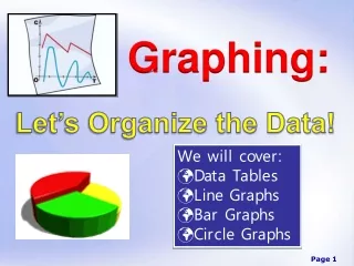
Types of Graphs • 3 basic types: • pie charts, • bar graphs, • line graphs • Choose the type of graph based on the characteristics of your data.
Pie chart • show the relationship of parts to a whole. • helps the reader to visualize the magnitude of the differences
Bar graphs • compare values in a category or between categories
Line graphs • another way to show the relationship between two variables
Basic graphing rules • The horizontal axis (x-axis) is used for the quantity that can be controlled or adjusted: the independent variable. • The vertical axis (y-axis) is used for the quantity that responds to the changes in the quantity on the x-axis: the dependent variable. • The graph should fill most of the paper. • Each regularly spaced division on the graph paper should equal some constant value. • An axis does not have to start at zero. • Label each axis with the quantity and unit that you are graphing. • For example : “Temperature, °C.” • Plot each point. If you plot more than one curve on the same graph, use different colors. • Title your graph.