Population
120 likes | 364 Views
Population. A Closer Look. Population Equation. r = (b-d)+(I-e) Birth rate Death rate Immigration Emigration The growth rate (r) is expressed in a percentage. Reproductive strategies. Survivorship Curves. Human Population. A Look at the Human Race. Different Worlds.

Population
E N D
Presentation Transcript
Population A Closer Look
Population Equation • r = (b-d)+(I-e) • Birth rate • Death rate • Immigration • Emigration • The growth rate (r) is expressed in a percentage
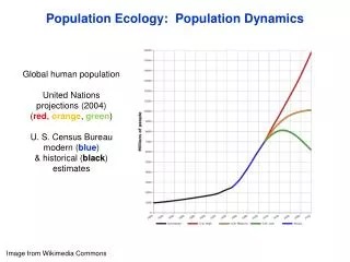
Human Population A Look at the Human Race
Different Worlds • Rich Nations/Poor Nations • 3 main economic categories in 2 classes • Developed countries - high income, highly developed, industrialized countries(US, Canada, Japan, E. Asia, Western Europe)
Developing countries • Middle income, moderately developed- Latin America, West Africa, E. Asia, E, Europe, Former USSR, Brazil • Low income countries - E. Central Africa, India, Central Asia, Ethiopia
21%of the population is in developed countries. They control 80% of the world’s wealth • General Pyramid structures
FEMALES To the right MALES To the left POPULATION STRUCTURE The population pyramid displays the age and sex structure of a country or given area OLD DEPENDANTS ECONOMICALLY ACTIVE YOUNG DEPENDANTS Population in Five Year Age bands Usually, but not always, In % to make for easier comparisons between countries
What Population Pyramids Show Us KEY Economically More Developed Country Economically Less Developed Country slope of pyramid indicate the death rate width of the base is related to birth rate/fertility rate proportions of men and women can suggest male or female migrations height of graph can indicate life expectancy (ignore the very thin end of the wedge as occurs on graph B as these people are a definite minority) "kinks" indicate dramatic reductions in birth rate or increases in death rate in the past area of graph indicates total population - compare areas of differentpopulation age groups or different sex on one graph The overall shape of the population pyramid can indicate whether it is an Economically More Developed Country or Economically Less Developed Country
Population Pyramids related to the Demographic Transition Model Stage 1 Stage 2 Stage 3 Stage 4 IMPLICATIONS IMPLICATIONS IMPLICATIONS IMPLICATIONS Both birth rates and Death rates are High, so population growth rates are slow but population Is usually restored Due to high birth Rate. Short life Expectancy EXAMPLES Population continues to grow but at slower rate. Low C Death Rate. Dramatically declining Crude Birth Rate. EXAMPLES Low Crude Birth Rate and Crude Death Rate Higher dependancy ratio and longer life expectancy Crude Death Rate does Rise slightly because of The ageing population EXAMPLES Population starts to grow at an exponential rate due to fall in Crude Death Rate. More living In middle age. Life expectancy rises Infant mortality rate falls. EXAMPLES Japan, USA Republic of Congo New Guinea Algeria, Tunisia Morocco There is some merit in including or considering a Stage 5 today with a declining population