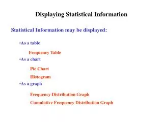
Displaying Statistical Information
Displaying Statistical Information Statistical Information may be displayed: As a table As a chart As a graph Frequency Table Pie Chart Histogram Frequency Distribution Graph Cumulative Frequency Distribution Graph Constructing a Frequency Table

Displaying Statistical Information
E N D
Presentation Transcript
Displaying Statistical Information Statistical Information may be displayed: • As a table • As a chart • As a graph Frequency Table Pie Chart Histogram Frequency Distribution Graph Cumulative Frequency Distribution Graph
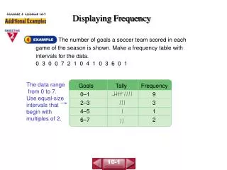
Constructing a Frequency Table Suppose that we record the daily high temperature in Poughkeepsie, NY for the month of September over a period of two years and obtain the following values: 87, 85, 79, 75, 81, 88, 92, 86, 77, 72, 75, 77, 81, 80, 77, 73, 69, 71, 76, 79, 83, 81, 78, 75, 68, 67, 71, 73, 78, 75, 84, 81, 79, 82, 87, 89, 85, 81, 79, 77, 81, 78, 74, 76, 82, 85, 86, 81, 72, 69, 65, 71, 73, 78, 81, 77, 74, 77, 72, 68 We wish to present this information in the form of a table
Constructing a Frequency Table The information about the range of high temperatures in Poughkeepsie in the month of September would be have more meaning to the reader if the 60 individual readings were grouped into groups called classes. To construct a frequency table, the author must first decide: The number of classes to form The size of each class
Constructing a Frequency Table Depending upon the number of individual observations are present in the data set, the number of classes should usually be somewhere between 5 and 10. The size (width) of each class should be the same. The width will depend upon the number of classes and the range of values in the original data set. The number of classes and class width should be chosen so that a reasonable number of the data points lie within each of the classes (particularly the central classes) Definition: The difference between the smallest and largest elements in a data set is called the range.
Constructing a Frequency Table 87, 85, 79, 75, 81, 88, 92, 86, 77, 72, 75, 77, 81, 80, 77, 73, 69, 71, 76, 79, 83, 81, 78, 75, 68, 67, 71, 73, 78, 75, 84, 81, 79, 82, 87, 89, 85, 81, 79, 77, 81, 78, 74, 76, 82, 85, 86, 81, 72, 69, 65, 71, 73, 78, 81, 77, 74, 77, 72, 68 The high and low readings in the above data set are 65 and 92 Range = 92 – 65 = 27 Let’s decide to create a table with 6 classes of width 5
Constructing a Frequency Table Lower class limits: 65, 70, 75, 80, 85, 90 Upper class limits: 69, 74, 79, 84, 89, 94 Note! No (discrete) data point can belong to more than one class. Class boundaries: 64.5, 69.5, 74.5, 79.5, 84.5, 89.5, 94.5 In a discrete distribution, the class boundaries lie in the gaps between the upper limit and lower limit of adjacent classes. No actual data point will lie on a class boundary. Definition: The class width is the difference between two successive class boundaries (or between two successive lower limits)
Constructing a Frequency Table Once the number of classes and class boundaries have been determined, the next job is to count how many of the data points lie in each class. 87, 85, 79, 75, 81, 88, 92, 86, 77, 72, 75, 77, 81, 80, 77, 73, 69, 71, 76, 79, 83, 81, 78, 75, 68, 67, 71, 73, 78, 75, 84, 81, 79, 82, 87, 89, 85, 81, 79, 77, 81, 78, 74, 76, 82, 85, 86, 81, 72, 69, 65, 71, 73, 78, 81, 77, 74, 77, 72, 68 ClassTallyFrequency 65-69 x x x x x x 6 70-74 x x x x x x x x x x x 11 75-79 x x x x x x x x x x x x x x x x x x x x 20 80-84 x x x x x x x x x x x x x 13 85-89 x x x x x x x x x x 9 90-94 x 1
Constructing a Discrete Frequency Graph Constructing a Frequency Graph from a Frequency Table • Use the midpoint of each class to represent the value for the class. • Class midpoint = (lower class boundary + upper boundary)/2 In the previous frequency table we obtain: ClassClass MidpointTotalFrequency 64.5 - 69 .5 67 6 0.100 69.5 – 74.5 72 11 0. 183 74.5 – 79.5 77 20 0.333 79.5 – 84.5 82 13 0.217 84.5 – 89.5 87 9 0.150 89.5 – 94.5 92 1 0.0167
Constructing a Discrete Frequency Distribution Graph Frequency % 42 39 36 33 30 27 24 21 18 15 12 9 6 3 0 x x x x x x x 67 72 77 82 87 92 Temperature
Constructing A Histogram Another way of displaying the information contained in the frequency table is by use of a chart. Let’s explore the construction of a Histogram. Instead of associating the entire weight of the class with a single point – the midpoint of the class – as was done in constructing the discrete frequency distribution graph, the histogram is a bar graph that represents the weight of the class as a bar extending over the class interval.
Frequency % Constructing A Histogram 42 39 36 33 30 27 24 21 18 15 12 9 6 3 0 Temperature 64.5 69.5 74.5 79.5 84.5 89.5 94.5
Other Visual Displays Some data does not naturally break down into a relatively small number of fixed size intervals. • Preferences for flavors of ice cream • Percentage of people earning different levels of income
Other Graphical Displays Consider the following set of data: • Favorite Ice Cream Flavors • Vanilla 40% • Chocolate 25% • Strawberry 15% • Chocolate Chip 10% • Pistachio 5% • Other 5%
Other Graphical Displays To make a pie chart we need to determine the number of degrees corresponding to each percentage. 100% of the arc of a circle = 360 degrees 40% of 360 = 144 degrees 25% of 360 = 90 degrees 15% of 360 = 54 degrees 10% of 360 = 36 degrees 5% of 360 = 18 degrees
other 5% pistachio 5% Other Graphical Displays Chocolate Chip 10% Vanilla 40% Strawberry 15% Chocolate 25% Favorite Ice Cream Flavors
Scatterplots Consider the following tabulated values of monthly energy consumption and average monthly temperature Electricity Ave. Daily Time period Consumed (kWh) Temp. (Fo) Year 1: Jan/Feb 3375 26 Year 1: Mar/Apr 2661 34 Year 1: May/June 2073 58 Year 1: July/Aug 2579 72 Year 1: Sept/Oct 2858 67 Year 1: Nov/Dec 2296 48 Year 2: Jan/Feb 2812 33 Year 2: Mar/Apr 2433 39 Year 2: May/June 2266 66 Year 2: July/Aug 3128 71
Scatterplots To construct a scatterplot of the previous table we first pair each of the temperature and kWh readings (26, 3375), (34, 2661), (58, 2073), (72, 2579), (67, 2858), (48, 2296), (33, 2812), (39, 2433), (66, 2266), (71, 3128) We will plotthese paired values as points on a graph where the x-axis will be the temperature reading and the y-axis, the kWh of electricity used.
Scatterplots From the previous data we see that the temperatures range from 26 to 72 degrees, and the energy usage ranges from 2073 to 3375 kWh. (26, 3375), (34, 2661), (58, 2073), (72, 2579), (67, 2858), (48, 2296), (33, 2812), (39, 2433), (66, 2266), (71, 3128) While it is desirable to have the scale for both the x and y axis to begin at 0 and have the same interval size, that is not possible for these readings. We will let the temperature scale on the x-axis begin at 0 and be marked in increments of 8 degrees up to 80. The scale for the energy consumption readings on the y-axis will start at 2000 and be marked in increments of 250 kWh up to 3500.
(58, 2073) (71, 3128) (72, 2579) (67, 2858) (39, 2433) (33, 2812) (48, 2296) (66, 2266) (34, 2661) Scatterplots kWh 3500 3250 3000 2750 2500 2250 2000 x x x x x x x x x x 0 8 16 24 32 40 48 56 64 72 80 Temp Fo (26, 3375)