Displaying Data
Cal State Northridge 320 Andrew Ainsworth PhD. Displaying Data. Procedures for Displaying Data. The variable : scores on a 60 question exam for 20 students 50, 46, 58, 49, 50, 57, 49, 48, 53, 45, 50, 55, 43, 49, 46, 48, 44, 56, 57, 44. Procedures for Displaying Data. First Step

Displaying Data
E N D
Presentation Transcript
Cal State Northridge 320 Andrew Ainsworth PhD Displaying Data
Procedures for Displaying Data • The variable: scores on a 60 question exam for 20 students 50, 46, 58, 49, 50, 57, 49, 48, 53, 45, 50, 55, 43, 49, 46, 48, 44, 56, 57, 44 Psy 320 - Cal State Northridge
Procedures for Displaying Data • First Step • Order the Data 43, 44, 44, 45, 46, 46, 48, 48, 49, 49, 49, 50, 50, 50, 53, 55, 56, 57, 57, 58 Psy 320 - Cal State Northridge
Ungrouped Frequency Distribution Psy 320 - Cal State Northridge
Ungrouped Frequency Distribution Psy 320 - Cal State Northridge
Grouped Distributions • When sets of data become very large with a large number of response categories (e.g. continuous data) it is sometimes easier to see a clear pattern in the data by grouping them into class intervals. • One can then form a Grouped Frequency Distribution, especially if the data are assumed to be continuous. Psy 320 - Cal State Northridge
Construct classes of data, where number of classes varies between 10 – 20 (depending upon the range of scores). Size of the class interval is: For our example: Grouped Distributions Psy 320 - Cal State Northridge
Grouped Frequency Distribution of Testing Example rf =f/n, e.g.,1/20 = .05 crf =cf/n Psy 320 - Cal State Northridge
Class interval: 25-29 Class interval: 30-34 Class interval: 20-24 Lower Stated Limit Upper Stated Limit Lower Stated Limit Upper Stated Limit 20 21 22 23 24 25 26 27 28 29 30 31 32 33 34 Midpoint Lower real limit (25-29 interval) Upper real limit (20-24 interval) Lower real limit (30-34 interval) Upper real limit (25-29 interval) Psy 320 - Cal State Northridge
Unit of difference = Level of Accuracy If the smallest unit of measurement is $1,000 this is the level of accuracy/unit of difference Class Interval, Class Limits & Unit of Difference (American income data) Real lower limit = apparent lower limit - 0.5(unit of difference) Real upper limit = apparent upper limit + 0.5(unit of difference) Class interval = i = Real upper limit – real lower limit (25,500 – 20,500=5,000) Psy 320 - Cal State Northridge
Note that where a given case is classified depends on the unit difference or measurement precision, i=5,000 Income rounded to $100 Income rounded to $1,000 Person earning $20,100 Nature of distribution will also depend upon number of classes used Psy 320 - Cal State Northridge
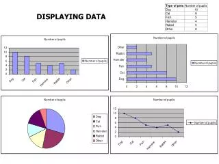
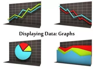
Graphical Displays • Histograms • Frequency Polygons • Bar Graphs • Pie-charts • Stem & Leaf plots Psy 320 - Cal State Northridge
Histogram Psy 320 - Cal State Northridge
Shape of Histogram & Number of Classes 10 classes 5 Classes 20 classes Psy 320 - Cal State Northridge
Histograms • Height of bar = # of responses in the interval • Width of bar = size of the interval • Bars touch representing grouped continuous data Psy 320 - Cal State Northridge
Frequency Polygon Psy 320 - Cal State Northridge
Qualitative Data & Bar Graphs Psy 320 - Cal State Northridge
Bar Graphs • Like Histograms • The height indicates the frequency • Unlike Histograms • Bars represent categories • Width is Meaningless • Bars DO NOT touch Discrete Data Psy 320 - Cal State Northridge
Pie-Charts • Pie-charts are especially good when showing distributions of a few qualitative classes and one wishes to emphasize the relative frequencies that fall into each class. • However, not as effective with • large number of classes. • with numerical data because the circle is confusing when ordered classes are represented. Psy 320 - Cal State Northridge
Stem and Leaf Displays • A stem and leaf diagram provides a visual summary of your data. This diagram provides a partial sorting of the data and allows you to detect the distributional pattern of the data. • There are three steps for drawing a tem and leaf diagram. • Split the data into two pieces, the stem (left 1, 2, 3 digits, etc.) and the leaf (the right most digit). • Arrange the stems from low to high. • Attach each leaf to the appropriate stem. Psy 320 - Cal State Northridge
Stem and Leaf Displays • Ordered Testscore Data 43, 44, 44, 45, 46, 46, 48, 48, 49, 49, 49, 50, 50, 50, 53, 55, 56, 57, 57, 58 • What are the stems? • What are the leaves? Psy 320 - Cal State Northridge
Stem & Leaf Displays TESTSCOR Stem-and-Leaf Plot Frequency Stem & Leaf 3.00 4 . 344 8.00 4 . 56688999 4.00 5 . 0003 5.00 5 . 56778 Stem width: 10 Each leaf: 1 case(s) Here the stem width is ten because the stems represent numbers in the 10s place numerically Psy 320 - Cal State Northridge
Advantages & Disadvantages of Stem & Leaf Diagrams • Advantage: • Combines frequency distribution with histogram, thereby giving a pictorial description of data. • Disadvantages: • Only works with numerical data. • Works best with small and compact data sets (e.g., will not work well with 1,000 cases & data in the range of 20-40). Psy 320 - Cal State Northridge
Modality (“How many peaks are there?) Unimodal, bi-modal, multimodal Symmetric vs. Skewed Skewed positive (floor effect) Skewed negative (ceiling effect) Kurtosis (“How peaked is your data?”) Leptokurtic, Mesokurtic and Platykurtic Statistically Describing Distributions Psy 320 - Cal State Northridge