Download
1 / 38
380 likes | 451 Views
Explore the Big Concepts and principles of design such as size, color, contrast, alignment, repetition, and proximity. Learn about responsive web design strategies like progressive enhancement and standards compliance.

E N D
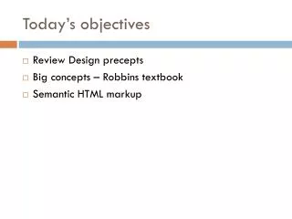
Today’s objectives • Review Design precepts • Big concepts – Robbins textbook • Semantic HTML markup
Common principles to show Relationships • Size • Color • Contrast shows relative important. Dramatic shifts in text-size or color will impart a message that something is different. • Alignment - creates order between elements. • Repetition - assigns relative meaning. If all important words are Blue, a blue word is important. • Proximity - separates elements from each other and creates sub-hierarchies.
Color- schemes (e.g., Greyscale With Bright Accents). Few colors to attract attention, to differentiate important information and elements.
Contrast shows relative important. Dramatic shifts in text-size or color will impart a message that something is different. Contrast - Color Contrast - Size
Alignment - creates order between elements. Information in columns is distinct.
Repetition - assigns relative meaning. Recurrence of a design element provides continuity, flow, direction forces etc. Source: http://www.fuelyourcreativity.com/the-lost-principles-of-design/
Proximity – objects near to one another are related. Separates elements from each other and creates sub-hierarchies.
Big Concepts - Robbins Textbook Way back in 2007, • relatively certain users visited our sites with desk-top computers, large monitor, speedy Internet connection. • 960 pixels was a popular page width. • Main concern was different browsers (e.g., IE, FireFox).
Big Concepts • Introduction of iPhone and Android smartphones and widespread 3G network caused huge shift in how, when, and where people surf web.
Big Concepts • What does this mean for us? • Designers must resist making assumptions about network speed and context based on the screen size.
Big Concepts • While viewing our designs on desktop machine is nice, it is not how they will likely be experienced by users. 2007 Today Tomorrow
So how do we deal with this diversity? Standards • Follow HTML, CSS, and JavaScript standards as documented by the World Wide Web Consortium (W3C) http://www.w3.org/ • Web standards helps ensure site is • consistent as possible on all standards-compliant browsers (about 99% of browsers in current use).
Web standards help ensure site is consistent as possible on all standards-compliant browsers (about 99% of browsers in current use). The way browsers, devices handle CSS, JS, etc. may vary. Similar to the way electrical specifications vary internationally. Source: Michael T. Travels http://michaelwtravels.boardingarea.com/2012/01/world-electrical-outlets-guide/#sthash.NimQtHNp.dpbs
Progressive Enhancement • We are faced with a range of browser capabilities—from basic HTML support to all the bells and whistles. • Progressive enhancement is one strategy for dealing with unknown browser capabilities.
Progressive Enhancement • Start with a baseline experience that makes the content or functionality available to most rudimentary browsers or assistive devices. • From there, you layer on more advanced features for the browsers that can handle them. • As Clark says, working from content out… Good book: Designing with Progressive Enhancement Todd Parker, Patty Toland, Scott Jehl, and Maggie Costello Wachs
Progressive Enhancement Authoring strategy • HTML document written in logical order. • Elements marked up in a meaningfulway. • Document is usable on the widest range of browsing environments, including old browsers, future browsers, and mobile and assistive devices • Clean HTMLdocument with elements accurately and thoroughly described.
Progressive Enhancement Styling strategy • Create layers of experience by taking advantage of the way browsers use style sheet rules. • E.g., Write style rules for enhanced and unenhanced browsers.
Progressive Enhancement Scripting strategy • JavaScript scripting language that makes web pages interactive and dynamic. • Make sure basic functionality is intact even when JavaScript is off.
Responsive Web Design • Responsive web design (RWD) a strategy for • providing custom layouts to devices • based on the size of the viewport (browser window). • RWD • serve a single HTML document to all devices, • applies different style sheets based on the screen size to provide optimized layout for that device. • A primary tool to cope with unknown viewport size.
Responsive Web Design • Ethan Marcotte first wrote about RWD and coined the phrase in his article “Responsive Web Design” on A List Apart in 2010 (www.alistapart.com/articles/responsive-web-design/). • Media Queries • @media screen and (max-width:320px) {/* Styles */} • @media only screen and (min-device-width : 768px) and (max-device-width : 1024px) { /* Styles */ }
Breakpoints: 320px | 480px | 768px | 1024px • @media screen and (max-width:320px) { • /* Styles */ • }
Responsive Web Design • Some contend that RWD based on viewport size is limited. • Viewport sizes will continue to change. • Start with a small screen. Every time the width of the main content grows wider than either 75 characters or 10 words, something should happen. These are your breakpoints. @media (max-width: 22em) { body { font-size: .9em; padding: 0 1.5em; } } Vasilis van Gemert http://www.smashingmagazine.com/2013/03/01/logical-breakpoints-responsive-design/
Accessibility • People access the Web in many different ways: • screen readers, • Braille output, • magnifiers, • Joysticks, and so on. • Build pages that create fewest barriers to getting information, regardless of the user’s ability and the device used to access the Web.
Accessibility • W3C started Web Accessibility Initiative (WAI) to address the need to make the Web usable for everyone. • WAI site (www.w3.org/WAI) is an good starting point for learning more about web accessibility. • Web Content Accessibility Guidelines (WCAG and WCAG 2.0). www.w3.org/WAI/intro/wcag.php.
Accessibility: things we can do • Provide text alternatives for any non-text content. • Provide alternatives for time-based media. • Make all functionality available from a keyboard. • Provide users enough time to read and use content. • Do not design content in a way that causes seizures. • Provide ways to help users navigate, find content, and determine where they are. • Make text content readable and understandable. • Make Web pages appear and operate in predictable ways. • Help users avoid and correct mistakes. http://www.w3.org/WAI/WCAG20/quickref/
Site Performance • Users expect a site to load in under two seconds, and nearly a third of your audience will leave your site for another if it doesn’t (Robbins, 2012). • Tolerable wait times have decreased to just 2 seconds (Fiona Fui-Hoon Nah). • Amazon.com found reducing page load times by 100ms resulted in a 1% increase in revenue.
Site Performance Akamai (2009) • 47% expect a page to load in 2 seconds or less. • 40% abandon page if takes more than 3 seconds to load. • 52% of online shoppers claim quick page loads are important for their loyalty. http://munchweb.com/effect-of-website-speed
Site Performance: What you can do. • Optimize images - small file size without sacrificing quality. • Minimize HTML and CSS documents - remove extra character spaces and line returns. • Keep JavaScript to minimum. • Don’t load unnecessary assets (such as images, scripts, or JavaScript libraries). • Reduce HTTP requests - number of times the browser makes requests of the server.
How can this content be structured? Page of text with an image.
How can this content be structured? How to tell browser what type of content is here.
<font face=“arial"> </font> <! doctype html> <html> <font size="5">…</font> <head> <title></title> </head> <font size=“2">… </font> <body> <font size=“2“ color="#0066CC">… </font> <img> <font size=“1">…</font> <body> <html>
<! doctype html> <header> <html> <h1>…</h1> <head> <title></title> </head> </header> <p>…</p> <body> <p>…</p> <code>…</code> <figure> <img> <figurecaption></figurecaption> </figure> <footer><p></p></footer> <body> <html>
Possible tags <html></html> <title></title> <body></body> <div></div> <header></header> <nav></nav> <section></section> <footer></footer> <aside></aside> <nav></nav> <ul></ul> <li></li> <h1></h1> <h2></h2> <h3></h3> <p></p> <img> <!--COMMENT--> http://www.w3schools.com/tags/default.asp