Download
1 / 6
60 likes | 203 Views
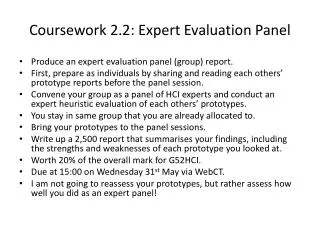
Evaluation of AS coursework. By Rocharna McNaughton . In what way does your media product use, develop or challenge the conventions of a real media product?. Rule of thirds. Masthead - has been placed under the central image of the front cover . Central image

E N D
Evaluation of AS coursework By Rocharna McNaughton
In what way does your media product use, develop or challenge the conventions of a real media product?
Rule of thirds Masthead - has been placed under the central image of the front cover Central image -The band on the central image are making eye contact with the camera/ the reader - Conventional for central image on a front cover to be taken in a studio Tag line ‘new musical express’ is hidden behind the teaser and the central image Teaser - Located at the front of the magazine in order to entice the reader • Feature Article • Feature article of this month is on the front cover Ears on left hand third -They are two different font sizes and two different colours are allocated Barcode -Located at the bottom right hand side of the front cover. - Consists of the NME website Pull quote - From article so reader can know the content and interesting topics Coverlines - Main article printed over the central image
Tag line under the masthead. Also a pun because you can tune a guitar Masthead Over my central image which is slightly unconventional however because this is a new magazine my brand is very important so that customers can recognise my magazine for repeat purchase • Teaser • - Located in the front of the magazine in order to attract my target audience, my research showed that my target audience responded to freebees Central image was taken in a studio which is very conventional. Also making eye contact with the reader which adds anchorage to my coverline Rule of thirdsI located all my ears on the left hand side third because my distributers to my readers would be supermarkets. This helps because of how it is stacked on shelves only this part will be displayed to the potential buyers. However this convention is changing because many magazines are displayed in bins Coverlines - I used slanted cover lines while is unconventional for most magazines is conventional for some NME magz as it portrays a rebellious audience Banner shows what else is in the magazine, which is very conventional
What’s featured in the magazine in numerical order is very conventional with the major article on separate – I used this convention because my feature article is my selling point for this magazine. • Subheading for example ‘live tours’ to show that our magazine does a range of articles • A promo at the bottom where the reader has to subscribe to GTAR which is conventional for nme. Also my target audience are teens so they are always looking to save money. • Conventionally the contents page contains many small images however I have challenged conventions like NME by using one image because my magazine is targeted at late teens who are used to a busy page. • Footer that contains the masthead, date and page number, this convention was used so that my audience could recognise my product.
Central image- Image is making direct address with the reader. Which encourages them to read the rest of the article. Image is conventionally on the left of the article however I have challenged this convention having my image and bleeds into the right Headline – I challenged the conventions of a music magazine headline by slightly slanting it. Furthermore I made it go across my double page spread. Conventionally the by-lines are located under the photo to give credit to the writer however I decided to put it under the headline so that it is more noticeable Instead of using a standfirst to introduce the band at the start of the article I used a separate article to inform the readers about them because this band may be considered not as mainstream and therefore not as known to the public Desirable house style had been kept the same through the whole magazine. Black, white and red however I have added yellow in this so that the important information stands out from the rest of the article and also because my target audience are used to seeing lots of colours on a page Footer- in the same on every page so that it is recognisable and they know what the page number is. Easy to direct from the contents page Pull quote – I have used more than one pull quote in this article which may be seen as unconventional because there is usually two. This highlights how good the band is I followed the conventional font size of 9pt in my magazine, using drop caps