Cautionary Insights on Interpreting Graphics in Probability and Statistics
90 likes | 209 Views
In this section, you'll learn how to critically evaluate graphics and identify common pitfalls that may lead to misunderstanding. Often, the visual representations of data can be deceptive. For example, graphs may distort perceptions of trends due to misleading scales or exaggerations. We explore cases of perceptual distortions, the importance of uniform axes, exponential scales, percentage changes, and the implications of pictographs. Understanding these elements can help you interpret data more accurately and make informed decisions.

Cautionary Insights on Interpreting Graphics in Probability and Statistics
E N D
Presentation Transcript
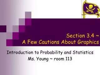
Section 3.4 ~ A Few Cautions About Graphics Introduction to Probability and Statistics Ms. Young ~ room 113
Objective Sec. 3.4 • In this section you will learn how to evaluate graphics and identify common ways in which graphics can be misleading
Sec. 3.4 Perceptual Distortions • Sometimes graphics are used to represent an increase or a decrease over time • The way that they are drawn can distort the perception of the actual increase or decrease • Example ~ The following graphics are used to represent the decrease in the value of a dollar in comparison to the year 1980 • The intention was that the length’s of the dollar bill would represent the ratio, but our eyes are drawn to the area of the dollar bill which is very deceiving because it appears as though it decreased much more than it did
Homes with Cable TV 18 million homes 73 million homes Sec. 3.4 Perceptual Distortions Cont’d… • Example ~ The following graphics are used to represent the increase in the number of homes with cable television from 1980 to 2005 • The intention was that the length’s of the TV’s would represent the comparison, but our eyes are drawn to the volume of the TV’s which are very deceiving because it appears as though there was a much larger increase than there really was
Sec. 3.4 Watch the Scales • Be cautious that the scales on the horizontal and/or vertical axes are uniform • If they are not, the graph may be misleading on the first impression • Example ~ The following graph represents the percentage of people owning their homes from 1960-2005 • It appears at first that the years spanning from 1960 to 2000 had a greater increase in home ownership than the more recent years, but if you look closer, the horizontal scale is not uniform • The first five categories are a decade apart, but the last two categories are only a couple years apart
Sec. 3.4 Watch the Scales Cont’d… • Example ~ the following graph represents the percentage of college students between 1910 and 2005 who were women • It appears as though there was a huge increase of women attending college after 1950, but if you look at the vertical scale, you should realize that it does not begin at zero and does not end at 100% • If you redraw the graph with the vertical axis covering the full range from 0% to 100%, you can see that the increase is not as substantial as it originally seemed to be.
Sec. 3.4 Exponential Scales • Be cautious about whether the scale is exponential or not • Example ~ the following graph represents the speed of a computer (calculations per second) from 1950 to 2000 • The first graph appears to be increasing linearly, but if you look closer at the scale, you realize that each tick mark represents a tenfold increase (grows by a power of 10) • These exponential scales are useful in displaying data that vary over a huge range of values • If you just used an ordinary graph, it makes it very hard to see any detail in the early years Exponential graph Ordinary graph
Sec. 3.4 Percentage Change Graphs • If the scale represents percent change (percent increase or percent decrease), a spike or a drop in the chart doesn’t represent the value increasing or decreasing, but rather the rate at which it changed • Example ~ the following graph represents the percent change from the previous year in college costs between private and public colleges • It appears as though the “price” dropped drastically for public colleges after 2004, but really it just means that the percent increase wasn’t as high as it was in previous years • If you redraw this graph with the actual cost as the scale, you can see that the cost steadily rises and doesn’t decrease at all
Sec. 3.4 Pictographs • Pictographs are graphs that are enhanced with additional artwork • Although it may make the graph more appealing, it can also distract or mislead • Example ~ the following diagram represents the world population from 1804 to 2054 • The bars represent the population fairly, but the pictures of people lining the globe give the impression that the population increases and then falls • In addition to the pictures being misleading, this graph does not use a uniform horizontal scale, which gives the impression that population has been rising (and will continue to rise) linearly