Choosing the Right Graph: Line, Bar, or Pie?
Understanding the different types of graphs - line, bar, and pie - to effectively show and compare data from experiments. Learn when to use each type of graph based on the nature of the data you have collected. Discover examples and applications for line, bar, and pie graphs.

Choosing the Right Graph: Line, Bar, or Pie?
E N D
Presentation Transcript
Graphing Which graph should I use?
What is a graph? A graph is a visual way to organize data collected during an experiment.
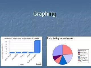
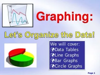
Types of Graphs • Line graph • Bar graph • Pie graph
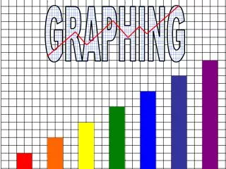
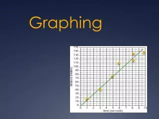
Does the graph show continuous data, such as changes over time? • Use a line graph • A line graph is used to compare two things and show how they are related • Often show changes over time
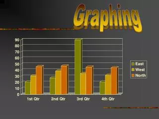
Is the graph comparing two categories of data? • Use a bar graph • Lets us compare groups of data
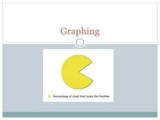
Does the graph use percentages to describe data? • Pie charts are used to show percentages. • The slices of “pie” represent percentages that must add up to 100.

