Scatter Diagrams and Linear Correlation
190 likes | 714 Views
Scatter Diagrams and Linear Correlation. Chapter 1-3 single variable data Examples or two variables: age of person vs. time to master cell phone task , grade point average vs. time studying, grade point average vs. time playing video games, amount of smoking vs. rate of lung cancer

Scatter Diagrams and Linear Correlation
E N D
Presentation Transcript
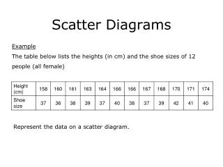
Scatter Diagrams and Linear Correlation • Chapter 1-3 single variable data • Examples or two variables: age of person vs. time to master cell phone task , grade point average vs. time studying, grade point average vs. time playing video games, amount of smoking vs. rate of lung cancer • Scatter diagram: (x,y) data plotted as individual points • x – explanatory variable (independent) • y – response variable (dependent) • Evaluate scatterplot data • y vs x values – shows relationship between 2 quantitative variables measured on the same individual
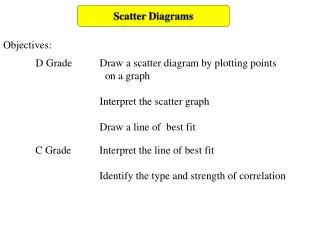
Scatter Diagrams and Linear Correlation • Look at overall pattern • Any striking deviation (outliers)? • Describe by a) form (linear or curved) b) direction - positively associated +slope negatively associated – slope c) strength - how closely do points follow form • Examples: age of person vs. time to master cell phone task , grade point average vs. time studying, grade point average vs. time playing video games, amount of smoking vs. rate of lung cancer
Scatter Diagrams and Linear Correlation • Tips for drawing scatterplot • Scale axis: intervals for each axis must be the same; scale can be different for each axis • Label both axis • Adopt a scale that uses entire grid (do not compress plot into 1 corner of grid
Scatter Diagrams and Linear Correlation • Correlation coefficient (r) • Assesses strength and direction of linear relationship between x and y. • Unit less • -1≤ r ≤ 1 r = -1 or 1 perfect correlation (all points exactly on the line) • Closer to 1or -1; better line describes relationship; better fit of data • r > 0 positive association at x, y • r < 0 negative association a x , y • x and y are interchangeable in calculating r • r does not change if either (or both) variables have unit changes (inches to cm, or F to C)
Scatter Diagrams and Linear Correlation • r = 1 Σ( x-x . y-y_) n-1 sx sy • Using TI-83 ex p.129 (number of police vs. muggings) • Cautions : Association does not imply causation • Lurking variables may play rate • r only good for linear models • Correlation between averages higher than between individual point.
Scatter Diagrams and Linear Correlation • Facts • No distinction between x and y variable. The value of r is unaffected by switching x and y • Both x and y must be quantitative • Only good for linear relationships • Not resistant to outliers • Correlation or r is not a complete description of 2-variable data, the x and y standard deviations and means should be included • HW: p131 2,4,6,8 a,b,c, 10 a,b,c, 12 a,b,cFor “c” use calculator to compute r
4.2 Least Squares Regression • Least Squares Regression • Method for finding a line (best fit) that summarizes the relationship between 2 variables a x (explanatory) and y (response) • Use the line to predict value of y for a given x • Must have specific response variable y and explanatory variable x (cannot switch like r)
4.2 Least Squares Regression • Least Squares Regression Line (LSRL) • Minimizes square of error (y-values) • Error = observed –predicted valueΣ(y-ŷ)2 (y actual value, ŷ is predicted value) (ŷ is called y hat) • Line of y on x that makes the sum of the squares of data points to fitted line as small as possible
4.2 Least Squares Regression • LSRL Equation ŷ = a + bx • ŷ predicted value of y • Slope b = r(sy/sx) • y – intercept a = y – bx • x and y are means for all x and y data, respectively and are on the LSLR (x, y) • sysx are std. deviations of x,y data • r correlation • ŷ predicted value of y
4.2 Least Squares Regression • TI-83 – enter data into L1, L2 (x,y) • Use STAT CALC , select #8:LinReg(a+bx) to get the best fit required • Slope: important for interpretation of data • Rate of change of y for each increase of x • Intercept – may not be practically important for problems.
4.2 Least Squares Regression • Plot LSLR: using formula ŷ = a + bx find 2 values on the line. • (x1, ŷ1) and (x2, ŷ2) make sure x1 and x2 are near opposite ends of the data • Influential observations and outliers • Influential – extreme in the x-directionif we remove an influential point it will affect the LSLR significantly • Outliers – extreme in the y-direction does not significantly change the LSLR
Coefficient of Determination • r2 – coefficient of determination • r – describes the strength and direction of a straight line relationship • r2 - fraction of variation in values of y that is explained by LSRL of y on x • r = 1, r2 = 1 perfect correlation 100% of the variation explained by LSRL • r = 0.7, r2 = 0.49 about 49% of y is explained by LSLR
Residuals • Residuals – difference between observed value and predicted value • Residual = y –ŷ • Mean of least square residuals = 0 • Residual plots – scatterplot of regression residuals against explanatory variable (x) • Useful in accessing fit of regression line i.e. do we have a straight line? • Linear –uniform scatter • Curved indicates relationship not linear • Increasing/ decreasing indicates predicting of y will be less accurate for larger x