The Dot-Plot
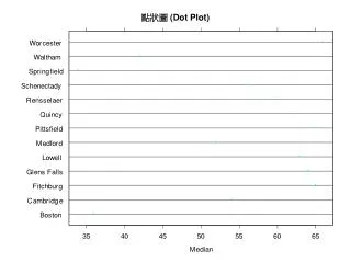
The Dot-Plot. Another Kind of Bar Graph. Representing Data. The data set {30, 25, 45, 60} can be represented with the dot-plot below. Finding The Mode. The mode is the data point with the most frequency.Ý In the dot plot below, the data is bimodal.Ý The modes are 300 and


The Dot-Plot
E N D
Presentation Transcript
The Dot-Plot Another Kind of Bar Graph
Representing Data The data set {30, 25, 45, 60} can be represented with the dot-plot below.
Finding The Mode The mode is the data point with the most frequency.Ý In the dot plot below, the data is bimodal.Ý The modes are 300 and 400.Ý Each appears twice.
Finding the Median The median is the middle data point or the average of the two middle data points.Ý In the dot plot below, the median is The median is 110 Yes, you have to count your way from each extreme until you reach the middle.
Finding The Range The range of the data below is 370 - 0Ý = 370.