Download
1 / 24
240 likes | 374 Views
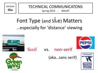
Lecture 05a. TECHNICAL COMMUNICATONS Spring 2014 - Althoff. Font Type (and S i z e ) Matters …especially for ‘distance’ viewing. Serif vs. non-serif (aka…sans serif). “Visual” Type. Computer Screen / Projection (think PowerPoint slides, then Internet browsing)

E N D
Lecture 05a TECHNICAL COMMUNICATONS Spring 2014 - Althoff Font Type (and Size) Matters…especially for ‘distance’ viewing Serifvs.non-serif (aka…sans serif)
“Visual” Type • Computer Screen / Projection (think PowerPoint slides, then Internet browsing) • Print (think handouts, exams, lab sheets, etc.) • Media (think TV) • Drive-bys (think street, business signs / signage, billboards)
Some background • “sans” is French for “_____________” • Can think of “extra” extensions as “_______” in the serif font group….or as “__________” Ex. Rio Grande • Times New Roman was designed for use in newspaper printing presses in 1932 and is not ideal for use in a modern printed book. It is also a very common font and can make a book appear amateurish—many “experts” strongly suggest selecting another serif font book type print.
Some more background…. • ____________ are not easily readable on computer monitors….the “little lines” may “flicker” more (although this is getting better with the improvement in monitor quality) • Size matters….too…but that’s another day (although will offer: ___________ than 24 ptfont is probably doing your audience/ students/colleagues a disservice)…suggest you at least go with 28 pt.
“Visual” Type • ________________________ - (think PowerPoint slides, then Internet browsing) Go with non-serif (sans-serif fonts) (except maybe scientific names) Arial Franklin Gothic Calibri Trebuchet Comic Sans Tahoma
“Visual” Type • ______ (think handouts, exams, lab sheets, etc.) Go with serif Times New Roman Georgia Century Garamond Etc. or san-serif Arial, Franklin Gothic, Calibri, Trebuchet, Comic Sans, Tahoma
“Visual” Type • Drive-bys (think street, business signs / signage, billboards – bulletin board “stuff”) Best use non-serif—especially for titles, headings, subheadings But, if expect “close-up” reading…._________
FONT TYPE & SIZE MATTER