Typography Guidelines: Mastering Fonts & Layouts
E N D
Presentation Transcript
TYPOGRAPHY Vocabulary & Guidelines
Ty•pog•ra•phy Noun the style and appearance of printed matter • The art or procedure of arranging type or processing data and printing from it.
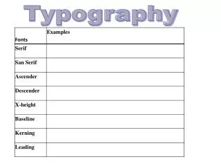
Vocabulary • Typefaces • Font • Case • Style • Size • Letterforms • X-height • Ascender • Descender • Kerning • Tracking • Leading • Alignment • Line Length • Margins
Typefaces vs. Fonts • Today, they are interchangeable • Technically…a typeface is a group of characters (Helvetica, Ariel, Times New Roman) • Technically…a font is a particular point size of a typeface. (i.e. - Ariel 9pt)
Type-face (GROUPS) • Serif font – readability for long extended text • Sans Serif font – legibility for HEADLINES, headings, captions • (both are variable spaced)
Type-faces • Monospace font • Fixed-pitch. Non-proportional • Traditional type-writer look. • Courier is a common monospacetf. OTHER TYPEFACES: Script, Decorative, Ornamental, Mimicry, Gaelic, Symbol. ~ALL FONTS HAVE TYPEFACES~
Font Examples USE REGULARLY Serif: Times, Garamond, Bookman San Serif: Arial, Verdana DON’T USE REGULARLY Decorative: Bauhaus, Showcard Script: Blackadder, Gabriola, Palace Monospace: Courier, Lucida
Font Guidelines • Use serif for long extended text; sans serif for “HEADLINES” • Use 1 – 2 fonts/typefaces (3 MAX) • Use of normal, italics, and bold is OK • Never use bold, italics, CAPITALS for large sections of text • Be careful of text/background color issues
TOO many fonts… …can be a bad thing
Communication • Don’t select your font by scrolling through the menu…THINK about who the audience will be • Who will be reading this? • What is the purpose of the document? • What feeling am I trying to convey?
Case • UPPER & lower case AVOID HEAVY USE OF ALL UPPER CASE • Studies have shown that mixed case promotes faster reading HOW MUCH FUN IS IT TO READ ALL OF THIS TEXT WHEN IT IS ALL IN CAPITALS AND YOU NEVER GET A REST. USE ALL CAPS FOR HEADLINES AND HEADINGS. How much better is it to read all of this mixed text? You are able to get a rest as you read, so use lower case for all of your regular text.
Style • Plain text • Italic text • Bold text
SIZE • Type is measured in points 10 point times 12 point times 14 point times 16 point times 18 point times 20 point times 24 point times
Points, Picas, Em’s • One Point = 1/72 of an inch • One Pica = 12 points • One inch = 6 picas or 72 points • POINTS are used to measure height • PICAS are used to measure width • Em’s are based on the square of the type size. They are relative and be used to scale text according to the specific font.
Size • Type sizes are NOT standard. They are based on old measurements of the piece of metal that was used. 24 pt Arial has a larger x-height than 24 pt Adobe Garamond • That makes it appear to be larger
Letterforms • Due to optical illusions, spacing between letterforms are not standard(one size), but are adjusted according to the shape of the letters (kern pairs).
Kerning • As previously stated, spacing is not uniform due to optical illusions. The spacing is based on the shapes of the two letters next to each other. These are called KERN PAIRS
Kerning vs. Tracking • The space between TWO letters is referred to as Kerning • The space AMONG more that 2 letters is Tracking
Linespacing (aka – Leading) • Line spacing is measured in points from baseline to baseline. • It is usually 20% larger than the point size of text. (10 pt type generally defaults to 12 pt leading)
Linespacing Guidelines • More line spacing generally results in greater legibility, until the lines seem to be seperated. Lines of text are generally more legible with more line spacing than defaults, until they appear to separate into distinct lines. When squinting, the paragraph should appear as regular and “gray” texture. Lines of text are generally more legible with more line spacing than defaults, until they appear to separate into distinct lines. When squinting, the paragraph should appear as regular and “gray” texture. Lines of text are generally more legible with more line spacing than defaults, until they appear to separate into distinct lines. When squinting, the paragraph should appear as regular and “gray” texture.
Alignment • Justified type results in irregular spacing between words, or between words and letters. It usually results in “rivers” of white space. BOTH impede legibility Justified type results in irregular spacing between words, or between words and letters. It also results in “rivers” of white space. both impede legibility. Newspapers historically only justify type for reasons of tradition and visual real estate ($ per inch).
Alignment • Flush left and ragged right is the most legible to western eyes. • Centered type (except in small amounts) is generally considered less legible.
Line Length • For text, the optimum line length is between 55-75 characters per line(spaces included).
Margins Here is a some flush-left text that does not have a margin on the right side. Not right ALWAYS provide a margin Lack of margins interfere with readability and legibility ALWAYS provide a margin Lack of margins interfere with readability and legibility Here is a some flush-left text that does have a margin on the right. Much better
Typographical Hierarchy • Provide structure based on similarity
Typographical Hierarchy+ Indentation • Two types of similarity = BETTER
Typography in ACTION • History of… (5:09) • Kinetic Type (2:45) • Unique report (1:09) • Daft Punk - Harder Better Faster Stronger (2:13) (GOOD) • The Hush Sound - Lions Roar (1:26) (GOOD) • Bruno Mars - When I Was Your Man (3:47) (BAD)
